Soii Idcf
SOII_IDCF_2008.doc
Survey of Occupational Injuries and Illnesses
SOII IDCF
OMB: 1220-0045
November 7, 2008
MEMORANDUM FOR Mario Turse
Branch of Occupation Statistics Surveys
Office of Field Operations
From: Kathy Downey
Office of Survey Methods Research
Subject: Summary of Expert Review of SOII IDCF Web Pages
Content of the Report
OSMR was asked by OFO to review the SOII IDCF Web Pages. The review team from OSMR consisted of Scott Fricker, Bill Mockovak, Jean Fox, Christine Rho and myself.
We pulled findings and recommendations from the three reports listed below. These recommendations were supported by our recent group review of the survey pages:
“Expert Review of the Survey of Occupational Injuries and Illnesses (SOII) on IDCF” by Scott Fricker and dated September 24, 2007 (termed “Fricker review” for this report)
“Results of the SOII-IDCF Usability Test” by Scott Fricker and dated November 16, 2007 (termed “Fricker usability” for this report)
“Summary of Eye-Tracking Study Using the SOII IDCF Instrument” by Bill Mockovak and dated September 8, 2008 (termed “Mockovak eye-tracking” for this report)
In addition, we generated a few additional recommendations from our recent review. Those recommendations have been incorporated into this report.
Because there are a lot of separate pages in the SOII instrument, only more important recommendations will be discussed in the body of this report. Pages without any recommendations, or with only very minor suggested changes, are covered in Appendix C.
The Rating System and Recommendations
To assist with the planning and revision process, OSMR developed a rating system for the recommendations shown in this report. These ratings reflect the amount of time we estimate changes will take to implement. For example, wording changes (short-term) could theoretically be done in a few days, unless they require an extensive review by multiple parties. On the other hand, changes in the order with which pages appear, or in the functionality of navigational elements (for example, buttons) are expected to take more time. The rating system is as follows:
“Short term” − wording changes only
“Mid term” − changes that affect the order of pages (flow), but seem simple to execute
“Long term” − changes with skip patterns (or associated buttons) that appear to be more complex and would require more testing
These ratings are based on OSMR’s understanding of the amount of programming, testing, and review involved in the changes. However, since OSMR did not ask professional developers to review these recommendations, they should be viewed with that limitation in mind.
List of Appendices
Appendix A − summary chart of the recommendations.
Appendix B − recommendations dealing with Gatekeeper issues (from Fricker usability report).
Appendix C − SOII pages with only very minor, or no, recommendations.
Appendix D − recommendations on reporting cases with days away from work (from Fricker review report).
Appendix E − recommendations on reporting cases with days away from work (from Fricker usability report).
Appendix F − recommendations on reporting cases with days away from work (from Mockovak eye-tracking report).
IDCF Logon Page
Although we did not include the logon page (see Figure 1) in our recent expert review, since it obviously affects the usability of the SOII instrument, we would like to note recommendations that were made in the Fricker usability report.
Figure 1: IDCF Logon Page
Recommendation 1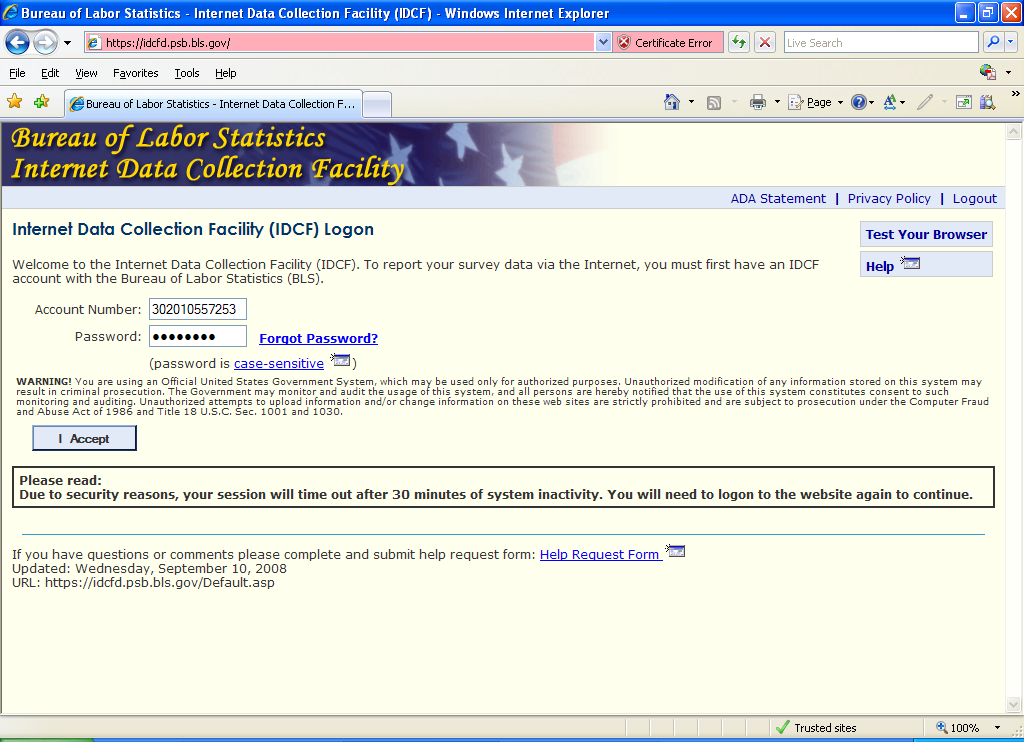

Recommendations
Recommendation 1 – Improving the readability of account numbers
Mid term
To improve readability and to eliminate possible keying errors resulting when long number strings are entered (Fricker usability report):
Shorten the length of the IDCF account numbers or, if that is not feasible, present them as smaller chunks of digits (i.e., in groups of 3 or 4 digits).
If the preceding change cannot be made, or is to difficult to make, avoid the use of consecutive number strings, such as ‘000,’ which can be difficult to discriminate when they appear in the middle of a longer string of numbers.
Recommendation 2 – Revise the gatekeeper message when someone tries to register twice with the same email
Short term
The revision below removes unnecessary words from the message and emphasizes the appropriate user action more clearly. (At the very least, the comma in the last sentence of the current wording should be changed to a semi-colon or a period.)
“Our records show that you already have an IDCF account for reporting data to this survey. That account number has been provided for you below. Please enter the permanent password for that account.”
Figure 1a. Already Registered Message for Multiple Reporters
Recommendation 2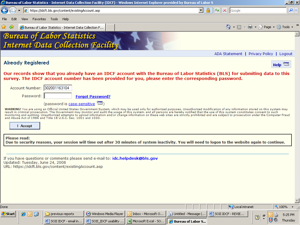

IDCF CREATE PASSWORD PAGE
This continues to be one of the more frustrating pages for users (based on Fricker usability report). The long list of criteria that a new password must meet is seldom read carefully until users have multiple failed attempts. Users who reach that point are frequently in such a hurry to ‘fix the problem’ that they then fail to select a Security Question and, as a result, another error message is generated.
Figure 2: IDCF Create Password Page
Recommendation 2
Recommendation 1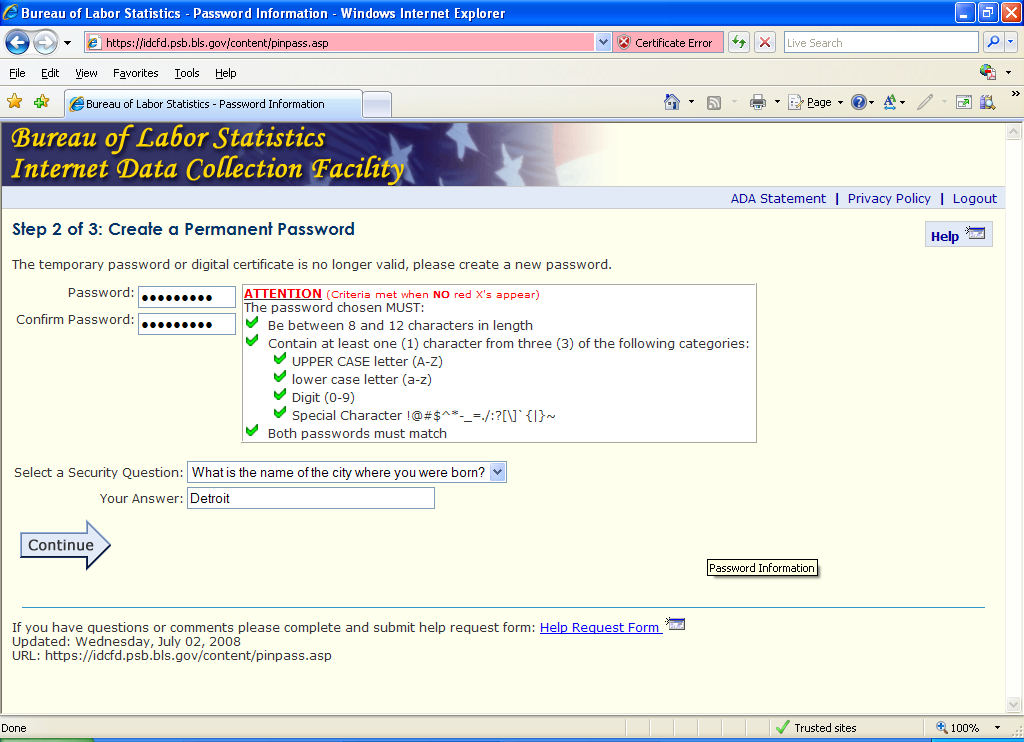


Recommendations
Recommendation 1 - Move the security question items
Mid-term
Consider moving the Security Question items to a separate page to avoid confusion and additional frustration. (Fricker usability report)
Recommendation 2 – Create a password page working team
Long term
Consider assembling a team of OTSP and OSMR staff to look into alternative approaches to this page that will maintain the necessary IDCF security but improve usability. (Fricker usability report)
Confirmation of IDCF Account Page
Figure 3: IDCF Account Confirmation Page
Recommendation 1
Recommendation 2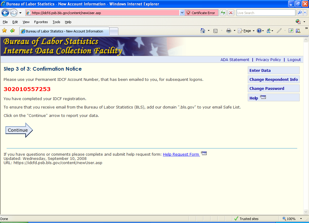


Recommendations
Recommendation 1: Abbreviation of IDCF
Short term
Write out “Internet Data Collection Facility (IDCF)” in the first sentence.
Recommendation 2: Change wording of screen
Short term
Change the wording on the screen to the following (Fricker usability report). It is also important to note that the page might have a typo where it says “.BLS.gov” and not “BLS.gov” as the domain.
“Your permanent Internet Data Collection Facility (IDCF) account number appears below. This will be emailed to you.
Please use this number and your new password when you logon in the future.
302010557253
You have completed your IDCF registration.
To ensure that you receive email from the Bureau of Labor Statistics (BLS), add our domain, “BLS.gov” to your email safe list.
Click on the Continue arrow to report your data.”
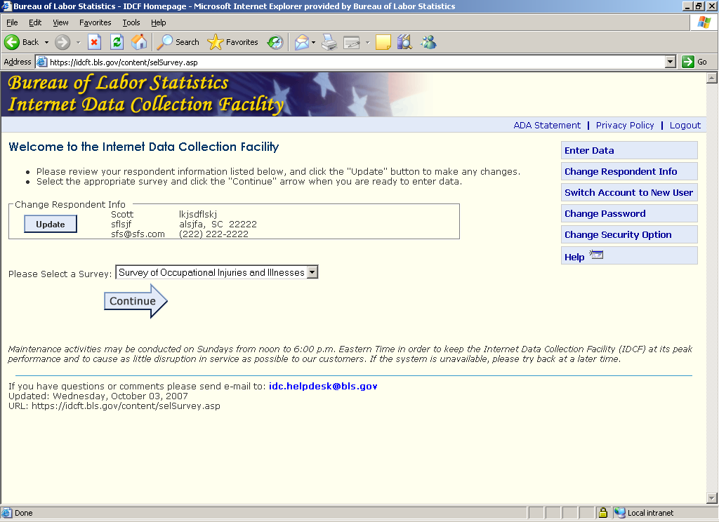
IDCF HOME PAGE
Figure 4: IDCF Home Page
Recommendation 1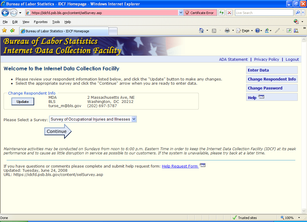


Recommendations
Recommendation 1: One button for changing respondent info
Mid term
During the expert review, the question was asked why there is a change respondent info button AND an update button on the same page since they do the same thing? It’s not an issue that these buttons need to be consistent with the rest of the survey, since they aren’t available once you leave this page and enter the survey. There should only be one button (based on the expert review).
Recommendation 2: Don’t require the respondent to select the survey, if only one is listed
Long term
From the Fricker Review report:
“We have commented about this screen several times in the past, but will mention it one more time. A computer-assisted interviewing system should be “smart” enough to know which survey a respondent is reporting for, especially after the respondent has just logged on with an account number and password for that survey. Requiring the respondent to “select” a survey in this case is unnecessary. It’s obviously not a fatal problem. It just makes our system seem poorly designed.”
We’ve been told that respondents aren’t truly selecting a survey as the reason that this change hasn’t been made. However, the task says to “please select a survey.”
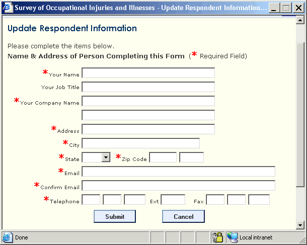
UPDATE RESPONDENT INFORMATION PAGE
Figure 5: Update Respondent Information Page
Recommendation 1
Recommendation 2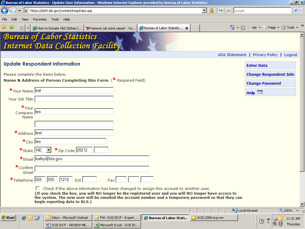


Recommendations
Recommendation 1: Delete the Change Respondent Info button
Mid term
Why is there the Change Respondent Info button on the right-hand side of the page? It links to this page, so really it isn’t needed and is confusing.
Recommendation 2: Editing Name and Email
Long term
Consider adding an edit on the Name and/or Email fields on the Update page. If changes are made to this information, users could be prompted to see if they are attempting to permanently switch their account to a new respondent. This could take the place of the check box at the bottom of the screen.
SOII Employer Instructions Page
Figure 6: SOII Instruction Page
Recommendation 1
Recommendation 2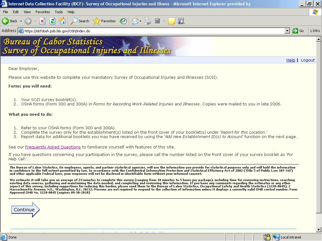


Recommendations
Recommendation 1: Delete all reference to survey booklets or forms
Short term
If the decision is made to send all SOII respondents only the 4-page instruction book that explains how to report on the Internet, the “Forms You Will Need” paragraph and the instruction about where to call for help that appears just above the privacy act information need to be revised, since respondents will not have the survey booklet. This applies for all of the survey screens.
Recommendation 2: Move the Continue arrow
Long term
Consider moving the continue arrow to the bottom right-hand side of the screen. In our recent expert review, one reviewer argued that people will more naturally look at the bottom right side of the page when they finish reading the instructions. However, since other reviewers disagreed with this suggestion, we hope to be able to test this in a future eye-tracking study. A possible short-term solution would be to place the continue arrow in both locations.
Add Establishment Page
As pointed out in the Fricker usability report, the wording on this screen (Figure 7) can lead to confusion in several possible ways. Users’ actions and comments during that test also showed that the graphic on this page did not help respondents enough when they attempted to fill out the Additional Establishment ID(s) field. The size of the text in the current graphic is very small. We like the use of the graphic on this page, but believe that a call-out should be used to make the Establishment ID more readable (see Figure 7b).
Figure 7: Add New Establishment Page
Recommendation 1
Recommendation 2
Recommendation 3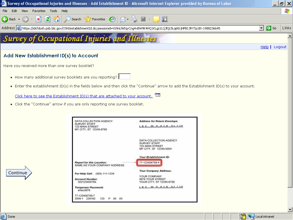


Referring to the instructions on this page, respondents are faced with a basic usability dilemma with the first question, “Have you received more than one survey booklet?” because there is no place to provide an answer. Instead, the question, “How many additional survey booklets are you reporting?” is immediately posed.
As noted in a personal communication with Mario Turse, based on his past experience with help desk calls, the word “additional” in the first bullet has been shown to be a stumbling block for respondents, because most respondents will be reporting for only one location.
Even if a respondent received more than one instruction booklet, if it was the right number given his/her situation, the respondent might either try to skip this question or enter a zero, since he/she would believe there are no “additional” booklets.
Also, when the respondent first comes to this page, and reads the instruction, “Enter the establishment ID(s) in the fields below…” there are NO fields displayed below on the page. The entry fields for the additional establishment ID are not displayed until the respondent makes an entry in the field that asks, “How many additional survey booklets are you reporting?” This approach can easily confuse respondents .
Furthermore, the instructions pertinent to completing the question about the number of booklets ( “How many additional survey booklets are you reporting?”) are listed below the question and entry field. Previous usability research has shown that respondents tend not to read instructions that follow an entry field. Relevant instructions should always come before or be placed next to the entry field.
In addition, once the person enters a non-zero in the survey booklet question, the instructions don’t change (see Figure 7a below). This is potentially confusing because part of the instructions apply to respondents who are reporting for only one establishment.
Figure 7a: Instructions for adding more establishments
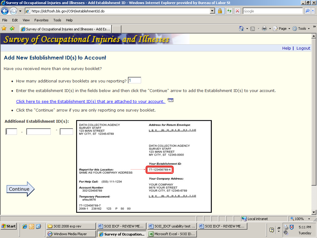
To summarize, there are four main issues with this page:
The term ‘additional booklets’ is confusing without some contextual reference.
The Additional Establishment ID(s) entry field does not appear unless users click Continue or in some other way move the cursor out of the How many booklets? box.
Users attempt to enter the Establishment ID exactly as it is listed on the front of their survey booklet (including the prefix), which results in an error.
The instructions for completing the first question come after the data entry box.
Recommendations
Recommendation 1: Change the graphic that highlights the establishment ID
Short term
Figure 7b. Recommendation - Use of a Call-out Box on Label Graphic, Add New Establishment ID(s) Page
Your Establishment ID:
56-
000112110
- 9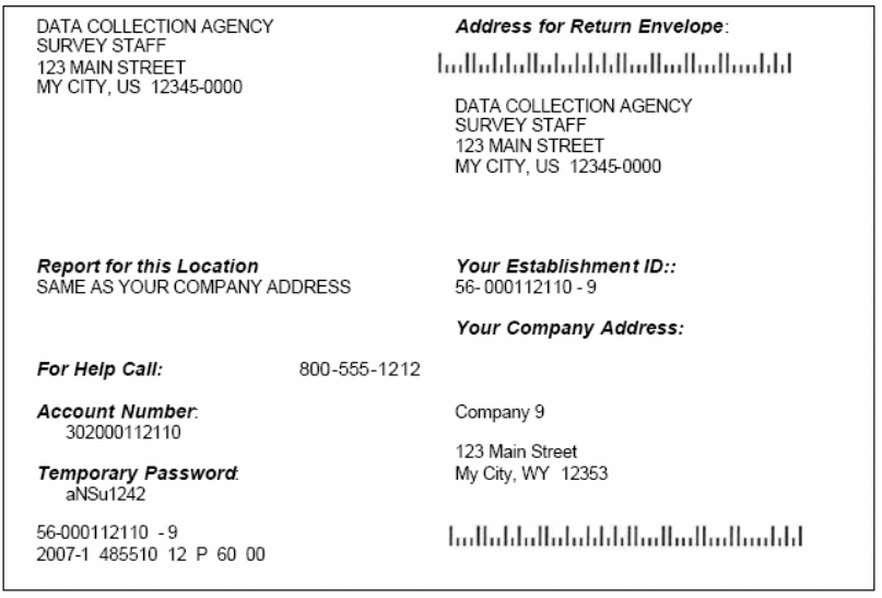


Recommendation 2: Provide establishment information on this page
Short term
Provide Establishment ID and company information on this page without requiring users to click on a link. This will provide immediate contextual information on the screen. Removing the link also reduces the amount of text on this page and improves readability. An alternative format for presenting this information is shown below in Figure 7c. The formatting in this example may also better direct users to click the Continue button after entering the number of additional booklets. Plus, this eliminates the problem of starting off with a question to respondents (“Have you received more than one survey booklet?”) for which there is no space to answer.
This recommendation was also mentioned in the Fricker Review report:
“Consider providing respondents with information about which account(s) they have registered and then give them the option of adding more booklets.”
Figure 7c: Recommendation – Change the Instructions for Adding New Establishments

Add New Establishment ID(s) to Account
You have registered to report data for the following establishment ID(s):
-
Establishment ID
Company Name
Unit Description
042192295-4
G W Hall & Son
Same as Your Company Address
Click the Continue arrow if you are only reporting for this one Establishment ID.
If you have more than one booklet to report:
Enter the number of additional survey booklets you are reporting: _____
Click the Continue arrow to add the Establishment ID(s) to your account.
Recommendation 3: Better establishment ID instructions
Short term
Another possible revision would be to include a note near the Additional Establishment ID(s) field that instructs users not to include the Establishment ID prefix or one that gives users an example of what they should enter. (Fricker usability report)
Recommendation 4: Eye-tracking study
Mid term
The SOII-IDCF development team should consider having OSMR conduct an eye-tracking study to determine if users are looking at the graphic on this page.
SOII LIST OF ESTABLISHMENTS SELECTION PAGE
Figure 8: Selection of establishment page
Recommendation 1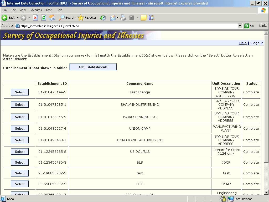

Recommendations
Recommendation 1: Delete references to SOII booklet
Short term
The first line of instructions needs to be changed if OCWC sends all respondents only the 4-page instruction booklet.
Recommendation 2: Delete for cases with only one establishment
Mid term
This page isn’t needed if there is only one establishment for data entry. It should be deleted in those cases, as it will make the task easier for the respondent.
SECTION 1: ESTABLISHMENT INFO
As noted in the Fricker usability report, many users will attempt to enter commas to improve the readability of large numbers in response to Questions 1 and 2 (Figure 9).
Figure 9: Establishment Info Section 1 Page
Recommendation 2
Recommendation 3
Recommendation 1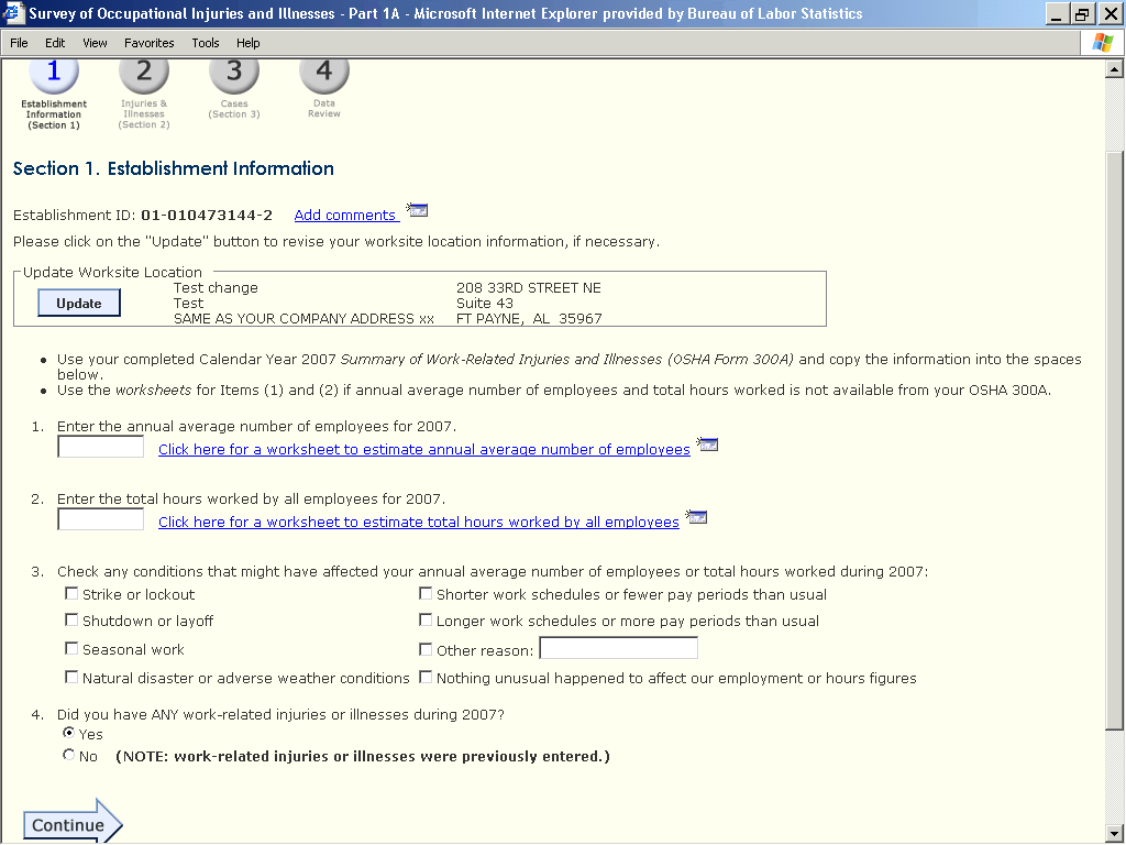


Recommendations
Recommendation 1: Relabel the “Add comments” link
Short term
As mentioned in the Fricker Review report, the “Add comments” link could be changed to something more descriptive, such as “Add comments (to explain unusual situations).”
Recommendation 2: Strip non-numeric characters in processing
Mid term
Allow users to enter commas in Question 1 (annual average number of employees), and Question 2 (hours worked). Strip out the commas during processing.
Recommendation 3: Renumber the page so that the Update button has a number by it.
Long term
This was mentioned in the Fricker Review report:
“The use of numbering, for example, 1, 2, 3, is a good approach for drawing attention to a desired entry and sequence of activities on the screen, but the “update worksite location” section is missing a number. So, although there is an Update button, users may not pay as much attention to this item as numbered items, or consider it part of the sequence of activities. This could be remedied by adding a number, as follows…”
This brings up the issue of whether the SOII web pages should attempt to exactly match the paper SOII booklet. When possible, we believe the IDCF instrument should take full advantage of the interactivity of the Web, even if it means causing some deviations from the paper form. However, this issue will require additional discussion.
WORKSHEETS
From the Fricker usability report:
Figure X shows a screenshot of the Worksheet for Estimating Total Hours Worked by All Employees. Only one participant was able to use this worksheet to correctly report the total hours worked, although he initially entered the wrong hourly information for full-time workers. Rather than summing the number of hours to get an annual figure (as required by the worksheet), he simply entered ‘40’ in the full-time workers field. (He had previously calculated the part-time workers’ annual hours on paper, so he entered the correct information in ‘B.’) When the user went back to Section 1’s main page he recognized that the total hours worked figure was too low (“That’s not right.”). He returned to the worksheet, read the instructions for a second time, and only then understood that he was supposed to calculate an annual figure per full-time employee. He fixed his entry and successfully completed the task.
The remainder of the participants inaccurately reported total hours worked data. The most common mistakes users made were: (1) entering ‘40’ for full-time workers’ hours rather than calculating their annual hours, (2) miscalculating the annual hours for “other” employees (e.g., entering the weekly hours worked, multiplying by the number of pay periods rather than the number of weeks in a year, etc.), and (3) failing to report anything in ‘B’ (i.e., excluding part-time employees altogether).
Figure 10: Worksheet # 1 Page
Recommendation 1
Recommendation 3
Recommendation 6
Recommendation 5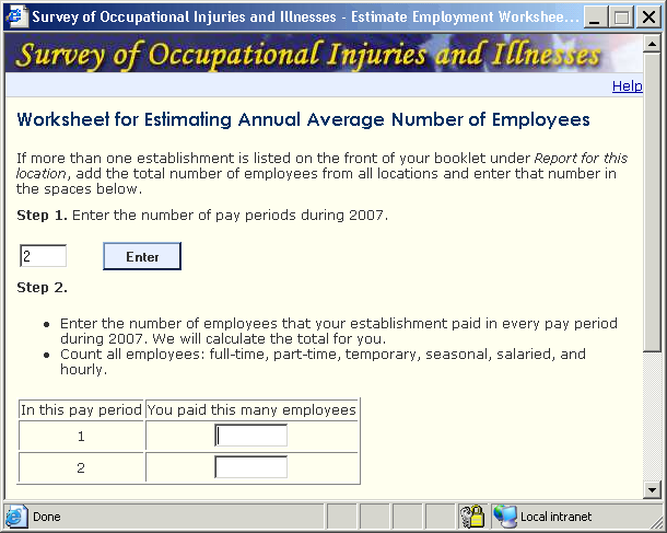


Figure 10a: Worksheet # 2 Page
Recommendation 4
Recommendation 2
Recommendation 7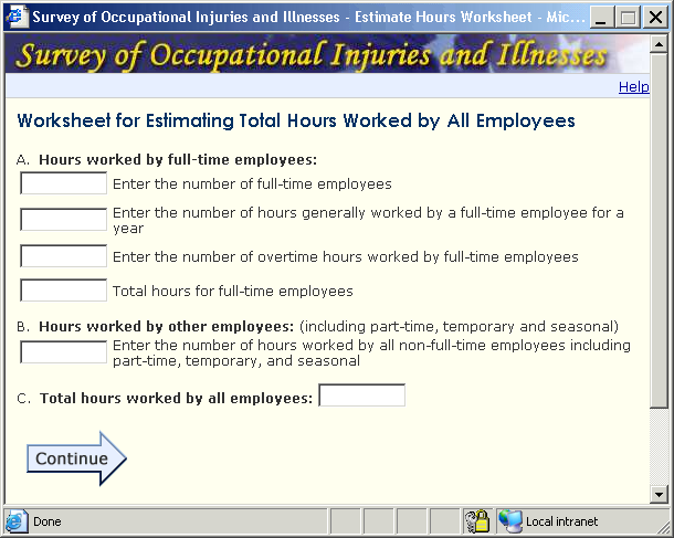


Recommendations
There are several possible options for improving this worksheet.
Recommendation 1: Delete references to survey booklet
Short term
As with the rest of the SOII pages, references to the survey should be deleted if hard copies are not included in the initial mailing.
Recommendation 2: Revise Instructions and bold selected text (i.e., “annual” and “for a year”)
Short term
Use “Total annual hours for full-time employees” in line 4 of Worksheet 2, section A.
Also use “Enter the annual hours worked…” in section B.
At the very least, bold “for a year” in the second line of the Worksheet 2, section A (Fricker usability report).
Recommendation 3: Move the instructions to where they will be used
Short term
The instruction above step 1 refers to step 2. It should be moved to step 2.
Recommendation 4: Provide example calculations
Short term
Next to the hours worked fields, provide examples of the type of calculations users should be doing.
“(e.g., 28 FT employees x 2,000 hours per year = 56,000 total FT hours)”
“(e.g., 10 PT employees x 500 hours per year = 5,000 total hours)”
Since the additional text likely will make the worksheet appear more cluttered, make the window larger and use more ‘white-space’ between fields/lines of the worksheet. (Fricker usability report)
Recommendation 5: Provide links to definitions
Mid term
Provide links to definitions that are potentially vague, such as “full-time,” and “employees.”
Recommendation 6: Enable the use of the enter key
Long term
People are used to entering a number in a data entry field and hitting the enter key in order to proceed. This functionality has been disabled on this page and the respondent has to click the enter button. Allowing the respondent to press the Enter key would simplify the task for some respondents.
Recommendation 7: Add space for typical or usual hours
Long term
Rather than requiring users to calculate annual hours for full-time employees themselves, add additional fields to this worksheet so users can provide (a) typical weekly hours and (b) usual weeks worked in a year. Let the worksheet do the annual hours calculations for the user. Break out section ‘B’ (i.e., hours worked by other employees) in a similar way. (Fricker usability report)
SECTION 2: SUMMARY OF INJURIES AND ILLNESSES
Figure 11: Summary of Injuries and Illnesses
Recommendation 1
Recommendation 2


Recommendations
Recommendation 1: Strip non-numeric characters in processing
Mid term
For instruction # 3, the system should be able to clean out any commas, letters, and symbols. Other IDCF instruments operate that way (for example, the CES). Doing this avoids the appearance of edit messages that may confuse respondents. This should be done for all SOII data entry pages.
Recommendation 2: Provide links to definitions
Mid term
There should be links to definitions for the terms “days away from work” and “restriction.”
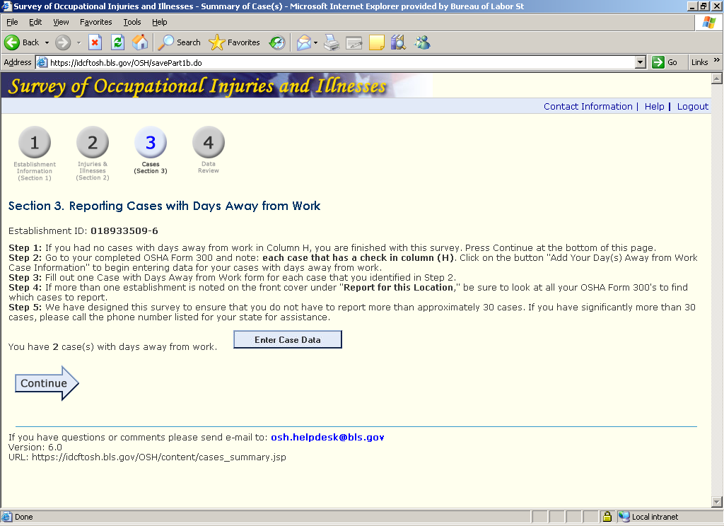
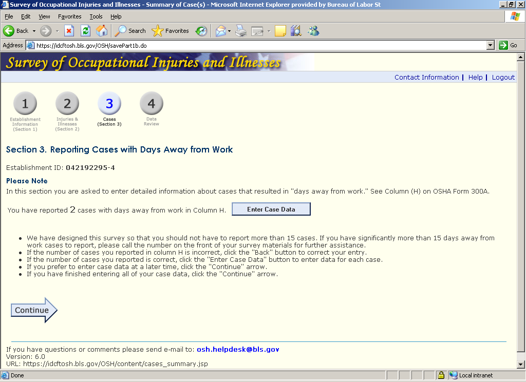
SECTION 3: REPORTING CASES WITH DAYS AWAY FROM WORK
This page, along with the Add Establishment Page, should be revised. It is important to note that the “Reporting Cases with Days Away From Work Page” (RCDAW; Figure 12) has already been tested extensively. Although there have been some changes made to the page since September 2007 (see Figure 12a for an earlier version of this page), we believe that the current page continues to pose significant usability problems. In the interest of brevity, excerpts from the following reports are listed.
Appendix D − recommendations on reporting cases with days away from work (from Fricker expert review report)
Appendix E − recommendations on reporting cases with days away from work (from Fricker usability report)
Appendix F − recommendations on reporting cases with days away from work (from Mockovak eye-tracking report)
Figure 12: Current RCDAW page
Recommendation 3
Recommendation 1
Recommendation 4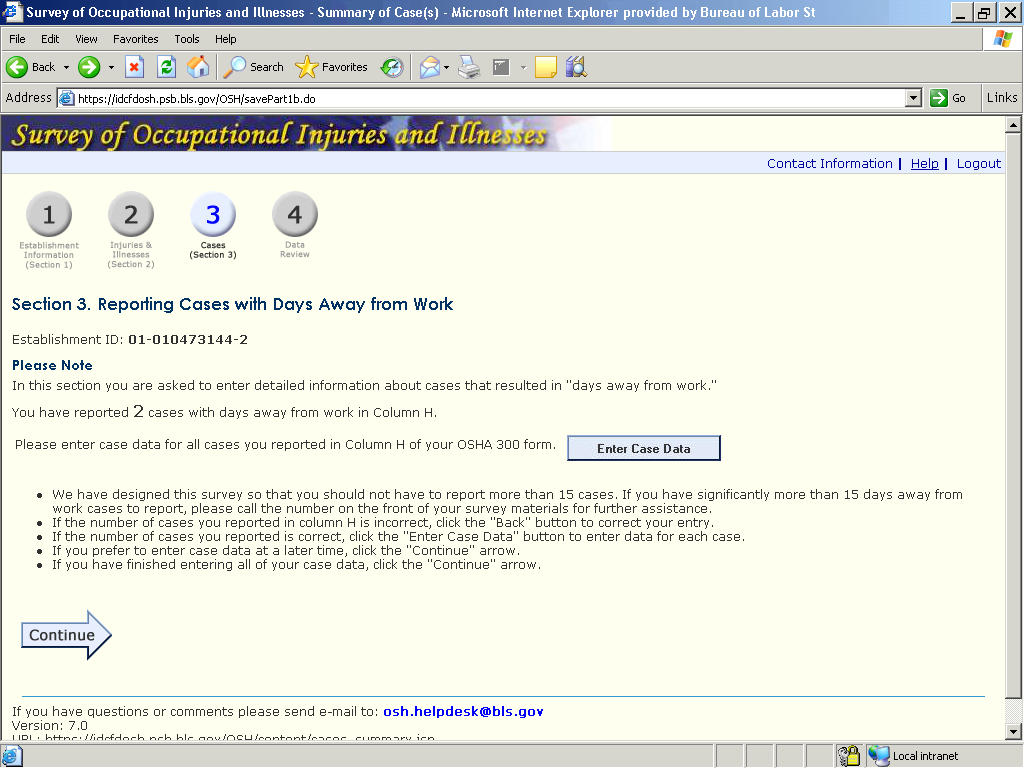


Figure 12a: September 2007 - RCDAW page
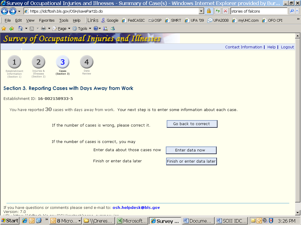
Ideally, it would not be necessary to display the RCDAW to respondents. The instrument will “know” based on entries in Part 2 if there are cases with "days away from work," i.e., cases that the respondent should provide detailed information about. We believe the maximum number of these cases is 30, with the mode about 2-3. However, it's important to note that a majority of respondents will have no cases to report. These respondents could be skipped automatically to the Submit Data/Review page, but since it's possible they made a keying error, it seems some type of confirmatory screen should appear in their path. This could be a very simple screen, maybe something like the following.
F
You
have reported no (0) cases that resulted in days missed from work. If
this is correct, click Continue
below.
If
this is not correct, click either the Back
arrow
on your browser
or
the Back
button below and correct your previous answer in
Item
H (Section 2)
Back
Continue
The Fricker review report suggested different screens for respondents reporting no cases, those who reported 1-30 cases, and those who reported more than 30 cases. The instructions respondents need in these different scenarios are fundamentally different.
For those respondents who have cases to enter, they will see the RCDAW page as shown in Figure 12d or Figure 12e, and they have three choices:
Return to Part 2 to correct the entries (this will probably be a rare event, so we would put it at the bottom).
Enter data now (this probably should be the top choice, since it will be the most common by far).
Exit the page, proceed to Review Data page, and complete survey later (data have been saved as they've progressed through the instrument).
Figure 12d: Revised RCDAW page – Alternative 1
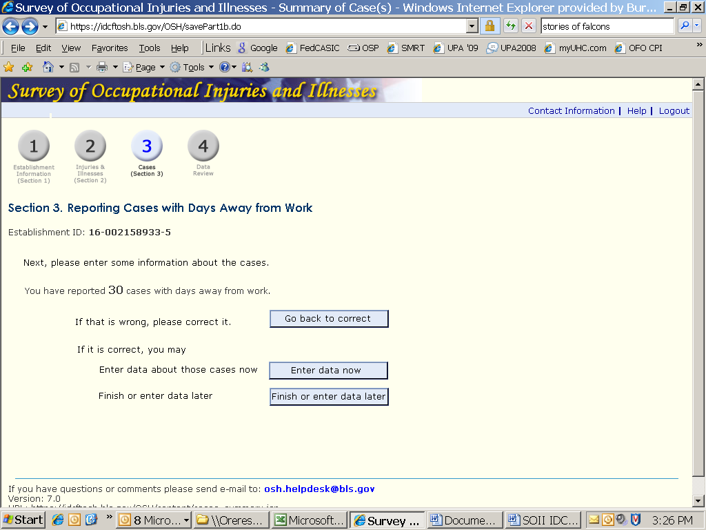
Figure 12d: Revised RCDAW page – Alternative 2
If respondents choose to enter data when this page appears, they will be taken to the Detailed Info page. When they are done entering data, the system should know if there are more cases to enter. If the respondents have no more data to enter, they should be taken to the DAW Save Case page.
Recommendations
Our main recommendation is to reformat this page (recommendation 4). Until this can be done, recommendations 1 through 3 should be implemented.
Recommendation 1: Fix the Continue and the Enter Case Data buttons
Short term
Fix the Continue and the Enter Case Data buttons. They go to different places, but the actions that result are not clear. Visually they are the same size and of equal weight. As noted in the Fricker usability report, respondents often skip over the Enter Case Data button.
Recommendation 2: Create a colloborative team
Mid term
A collaborative team should be formed to examine how the respondents and their data flow from this page through the rest of the survey. That way improvements could be tracked since it may take several iterations of the page to find the optimal flow and wording.
Recommendation 3: Move the Continue arrow
Long term
Consider moving the continue arrow to the bottom right-hand side of the screen. However, since other reviewers disagreed with this suggestion, we hope to be able to test this in a future eye-tracking study. A possible solution would be to place the continue arrow in both locations.
Recommendation 4: Reformat the page
Long term
Change the skip patterns and reformat the pages as discussed at length above. Again, this screen should be different for those with no DAW cases and those with cases. As note, a basic problem with this page is that it isn’t immediately clear what respondents need to do on this page.
DAW CASE INFORMATION
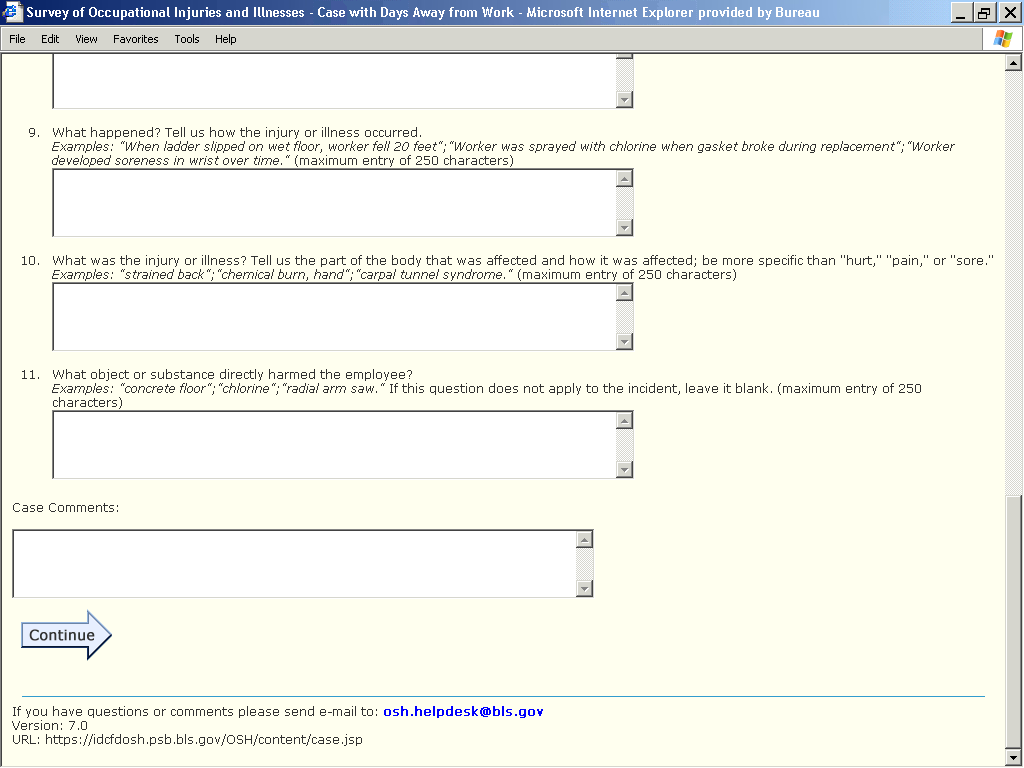
Figure 13: DAW Case information Page
Recommendation 2
Recommendation 5
Recommendation 3
Recommendation 1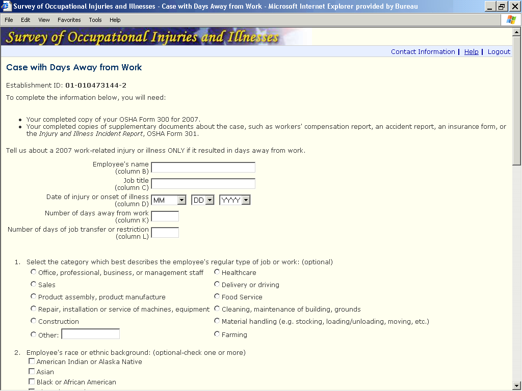


Recommendation 4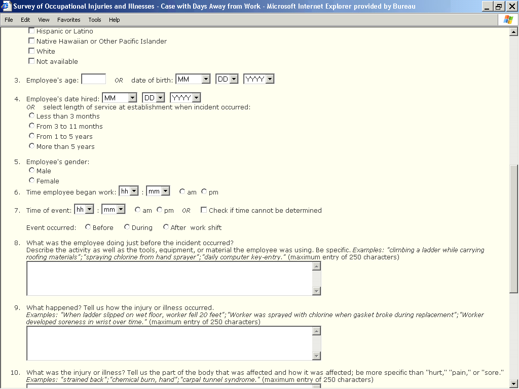

Recommendations
Recommendation 1: Give the entry fields a clearer format
Short term
As stated in the Fricker Review report:
“To give the form a “cleaner” look, the entry fields could be displayed as follows:
Employee’s name (Column B)
Employee’s name (Column B)
Date of injury or onset of illness (Column D)
mm/dd/yyyy
“There also is enough room to reference the specific form, as shown below:
Employee’s name (Column B, OSHA Form 300)
Recommendation 2: Links to definitions
Mid term
As recommended on other pages, there should be links for definitions, such as “onset of illness.” If respondents do not know what data are being requested, their data quality will be lower.
Recommendation 3: Improve the navigation among the data/month/year fields
Mid term
There are two problems with the implementation of the drop-down menus for the date/month/year fields. First, the tabbing order from the month field to the day field is messed up. Rather than moving from the month field to the day field when the tab key is pressed, the cursor goes to the ‘cleaning, maintenance of building, grounds’ item in section 1 on the page.
Second, the quick keys for the months could be improved. To demonstrate this, try tabbing to the month field from the ‘job title’ field and then typing “M” (for May), as many respondents are accustomed to do with date drop-down lists. Or, try typing “3” to get to March. Neither approach works. (You have to type in the number of the month, not the letter, and you have to type in the “0” for Jan – Sept.).
Recommendation 4: Number “Event occurred”
Long term
From the Fricker Review report:
“Is it possible to number the question between 7 and 8 (“Event occurred:”)? Otherwise, it might get missed.”
Again, the issue of whether or not the web pages have to match the SOII booklet should be revisited, especially since many respondents may not see the paper form.
Recommendation 5: Examine the race question
Long term
The race question should be changed to match the Census Bureau’s standards, which ask people to self-identify race with a check-all option.1
SECTION 3: DAYS AWAY FROM WORK (DAW) save case page
This page suffers from the lack of formatting of buttons and unclear instructions as on the RCDAW page. To begin, it isn’t clear that this is a summary page that shows the cases that have been entered. It also isn’t clear that respondents need to click the Enter Case Data page to enter their cases they have not finished.
Figure 14: DAW Save Case Page
Recommendation 1
Recommendation 2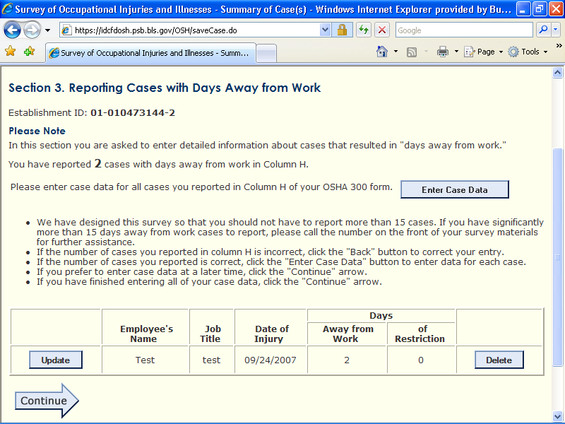


The revised DAW Save Case Page should look something like the example shown below. This is very similar to the suggestions made in the Fricker Review report.
F
Section 3. Entering Detailed Information about Cases With Days
Away from Work As
shown in the table below, you have entered information for 2 of 3
cases.
Click here to enter
information for additional cases now
Click Exit
below,
if you would like to enter this information later
Summary of Cases Entered
Days
Employee’s Name
Job Title
Date of Injury
of Restriction
away from work
Update
Joy
Engineer
12/10/2007
1
1
Delete
Update
James
QA
12/12/2007
0
1
Delete Exit
→
For the page in Figure 14a, if respondents want to enter the data now for the additional cases, they would return to the Detailed Info page/section. They could also click Exit to complete the form later. When they have no more cases to enter, the system should take them automatically to the Submit Data/Review page.
Recommendations
Recommendation 1: Move the Enter Case Data button
Short term
It has been noted per personal communication with Mario Turse that respondents have to click the “enter case data” button to enter the next case after the first one is entered. This is not intuitive. At a minimum, the text on the button should read “enter information for additional cases now”
Recommendation 2: Revise the page
Long term
Revise the page to that shown in Figure 14a.
SOII SUMMARY PAGE
We like this page. The use of formatting makes it very clear what is being summarized.
Figure 15: SOII Summary page
Recommendation 1
Recommendation 2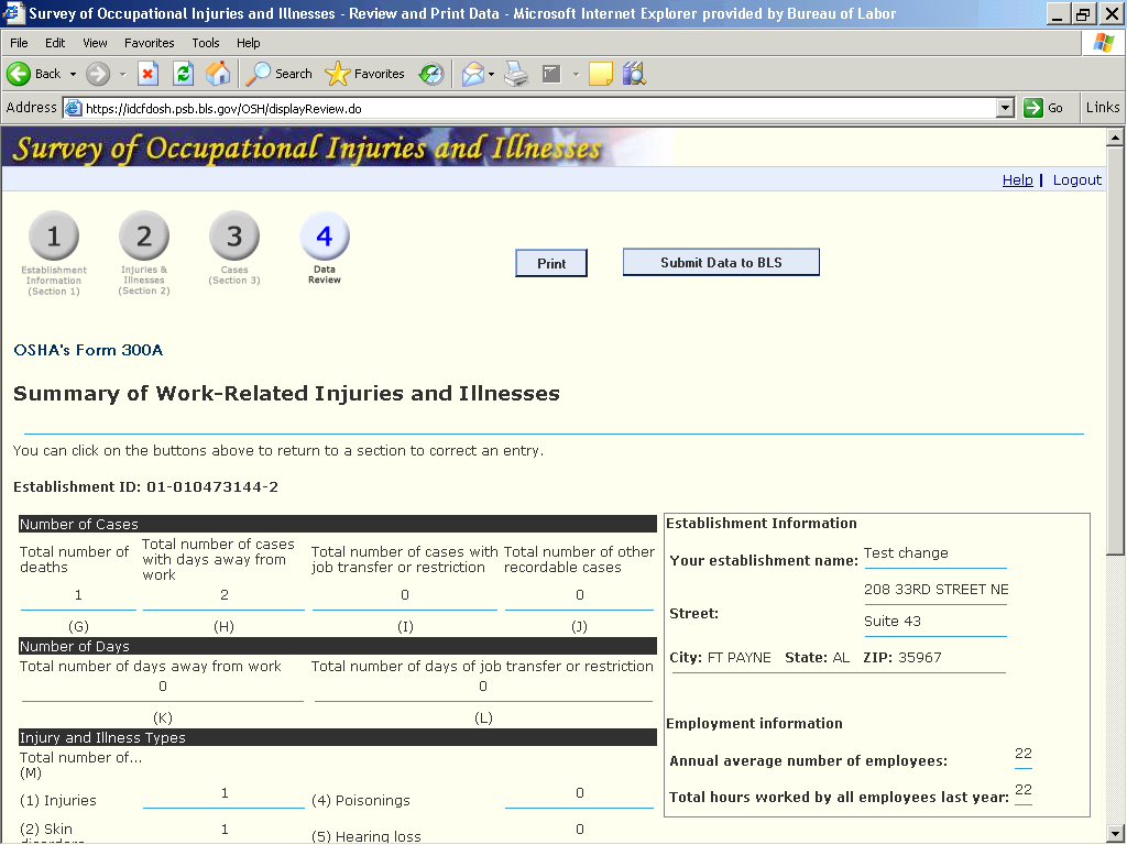

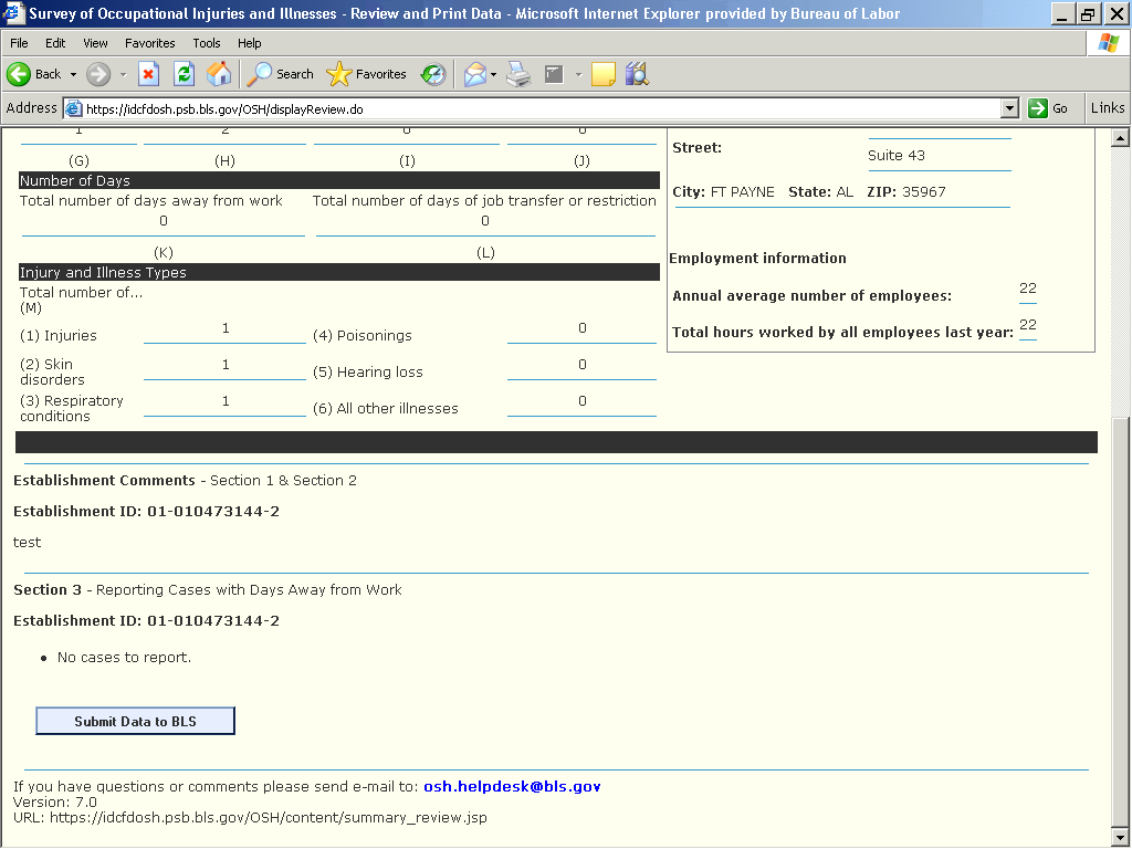
Recommendations
Recommendation 1: Change the Submit button
Short term
Visually, the “submit data to BLS” has the same weight as the “print” button, yet it is much more important. It should be larger.
Recommendation 2: Create a link or instructions for adding another establishment.
Mid term
It’s unclear what respondents should do if they need to enter another establishment. There needs to be a link or instructions for adding or reporting another establishment.
DATA SUBMISSION CONFIRMATION PAGE
Figure 16: Data submission page
Recommendation 1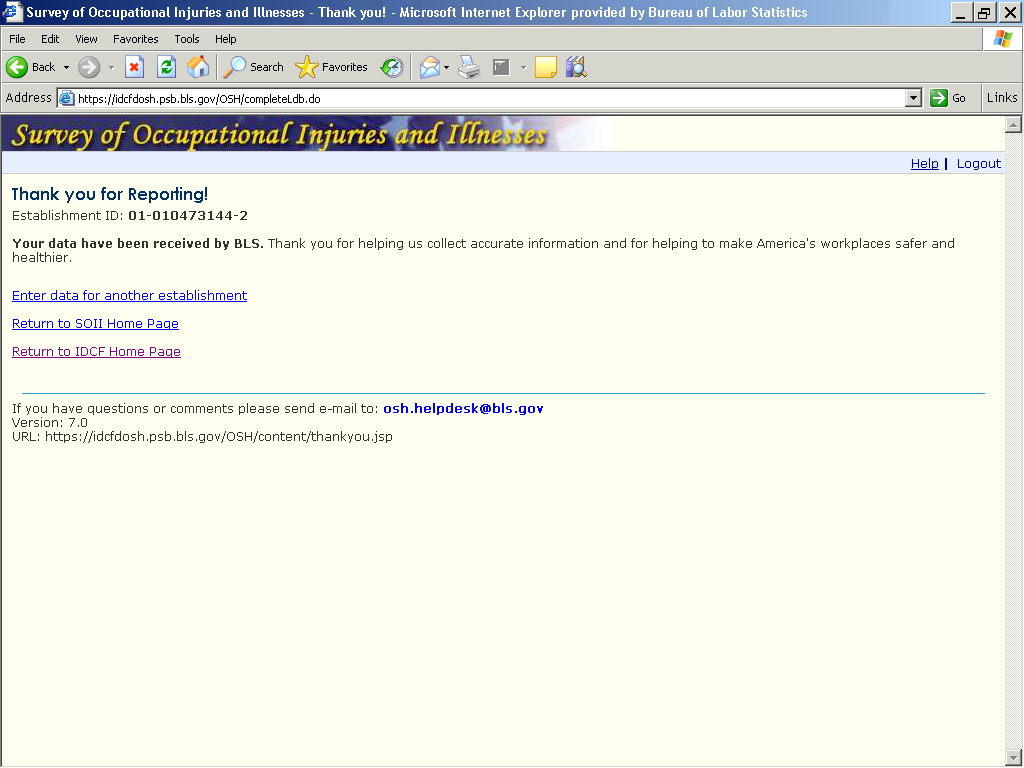

Recommendations
Recommendation 1: Spell out IDCF
Short term
For the last link, many respondents will not know what “IDCF” stands for. It should be spelled out.
other mid-term and LONG-TERM recommendations
Recommendation 1: Collaborative Research Team
Given the number and range of issues that remain in the SOII instrument, it would make sense to form a team to address them on a systematic basis. OSMR would be willing to work with OFO to create a long-term research agenda for the SOII.
Recommendation 2: Usability Testing
This could be started in calendar year 2009. The first area to focus on would be the Add Establishment ID page. The testing should include eye-tracking research.
We could recruit from the general population for testing in OSMR’s lab. This wouldn’t be as time-consuming as using actual respondents at their places of business, but remote testing of actual SOII respondents would be another option (eye-tracking research is not possible with remote testing).
Recommendation 3: Help Desk Ticket Analysis
OSMR briefly examined some help desk tickets sent to OSH.helpdesk. However, in order to know more about respondents’ issues with the IDCF Gatekeeper and the IDCF SOII instrument, a systematic analysis of these tickets should be performed.
Recommendation 4: Analyze Web Page Logs
If possible, it would be worthwhile to examine web page logs to summarize the behaviors of respondents as they complete the SOII instrument. For example, are there pages where a significant number of respondents exit the survey? Are edit messages appearing with great frequency? This analysis would provide additional information about pages that are causing problems.
Recommendation 5: Update Help System
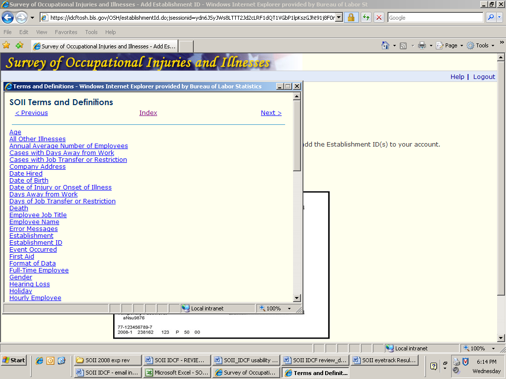
The help system, especially the SOII Help Index, is difficult to use. Users who have questions about definitions would probably rather give up than search through the cumbersome SOII Help Index. This directly affects data quality, as only when respondents are knowledgeable about what’s being asked of them, can they provide the correct data. Sample screens from the existing help system are shown in Figures 17 and 18.
Figure 17: SOII Help Index
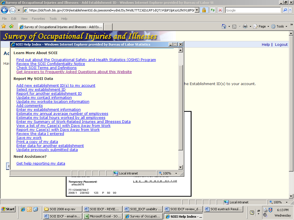
Figure 18: SOII Definitions Help page
APPENDIX A
SUMMARY OF RECOMMENDATIONS
RECOMMENDATIONS BY PRIORITY, SORTED BY PAGE |
|||
Priority |
Web Page Name |
Recommendation |
Row # |
Short term |
All pages |
Check for text that refers to “survey booklets” or visuals of survey booklets since they will or are being phased out |
1 |
Mid term |
IDCF Logon Page |
Improving the readability of account numbers |
2 |
Short term |
IDCF Logon Page |
Revise the gatekeeper message when someone tries to register twice with the same email |
3 |
Mid term |
IDCF Create Password Page |
Move the security question items |
4 |
Long term |
IDCF Create Password Page |
Create a password page working team |
5 |
Short term |
IDCF Account Confirmation Page |
Abbreviation of IDCF |
6 |
Short term |
IDCF Account Confirmation Page |
Change wording of screen |
7 |
Mid term |
IDCF Home Page |
One button for changing respondent info |
8 |
Long term |
IDCF Home Page |
Don’t require the respondent to select the survey, if only one is listed |
9 |
Mid term |
Update Respondent Information Page |
Delete the Change Respondent Info button |
10 |
Long term |
Update Respondent Information Page |
Editing Name and Email |
11 |
Short term |
SOII Instruction Page |
Delete all reference to survey booklets or forms |
12 |
Long term |
SOII Instruction Page |
Move the Continue arrow |
13 |
Short term |
Add New Establishment Page |
Change the graphic that highlights the establishment ID |
14 |
Short term |
Add New Establishment Page |
Provide establishment information on this page |
15 |
Short term |
Add New Establishment Page |
Better establishment ID instructions |
16 |
Mid term |
Add New Establishment Page |
Eye-tracking study |
17 |
Short term |
Selection of establishment page |
Delete references to SOII booklet |
18 |
Mid term |
Selection of establishment page |
Delete for cases with only one establishment |
19 |
Short term |
Establishment Info Section 1 Page |
Relabel the “Add comments” link |
20 |
Mid term |
Establishment Info Section 1 Page |
Strip non-numeric characters in processing |
21 |
Long term |
Establishment Info Section 1 Page |
Renumber the page so that the Update button has a number by it. |
22 |
Short term |
Worksheets |
Delete references to survey booklet |
23 |
Short term |
Worksheets |
Revise Instructions and bold selected text (i.e., “annual” and “for a year”) |
24 |
Short term |
Worksheets |
Move the instructions to where they will be used |
25 |
Short term |
Worksheets |
Provide example calculations |
26 |
Mid term |
Worksheets |
Provide links to definitions |
27 |
Long term |
Worksheets |
Enable the use of the enter key |
28 |
Long term |
Worksheets |
Add space for typical or usual hours |
29 |
Mid term |
Summary of Injuries and Illnesses |
Strip non-numeric characters in processing |
30 |
Mid term |
Summary of Injuries and Illnesses |
Provide links to definitions |
31 |
Short term |
Current RCDAW page |
Fix the Continue and the Enter Case Data buttons |
32 |
Mid term |
Current RCDAW page |
Create a colloborative team |
33 |
Long term |
Current RCDAW page |
Move the Continue arrow |
34 |
Long term |
Current RCDAW page |
Reformat the page |
35 |
Short term |
DAW Case information Page |
Give the entry fields a clearer format |
36 |
Mid term |
DAW Case information Page |
Links to definitions |
37 |
Mid term |
DAW Case information Page |
Improve the navigation among the data/month/year fields |
38 |
Long term |
DAW Case information Page |
Number “Event occurred” |
39 |
Long term |
DAW Case information Page |
Examine the race question |
40 |
Short term |
DAW Save Case Page |
Move the Enter Case Data button |
41 |
Long term |
DAW Save Case Page |
Revise the page |
42 |
Short term |
SOII Summary page |
Change the Submit button |
43 |
Mid term |
SOII Summary page |
Create a link or instructions for adding another establishment. |
44 |
Short term |
Data submission page |
Spell out IDCF |
45 |
Long term |
Global |
Collaborative Research Team |
46 |
Long term |
Global |
Usability Testing |
47 |
Long term |
Global |
Help Desk Ticket Analysis |
48 |
Long term |
Global |
Analyze Web Page Logs |
49 |
Long term |
Global |
Update Help System |
50 |
RECOMMENDATIONS BY PRIORITY, SORTED BY PRIORITY |
|||
Priority |
Web Page Name |
Recommendation |
Row # |
Short term |
Add New Establishment Page |
Change the graphic that highlights the establishment ID |
1 |
Short term |
Add New Establishment Page |
Provide establishment information on this page |
2 |
Short term |
Add New Establishment Page |
Better establishment ID instructions |
3 |
Short term |
All pages |
Check for text that refers to “survey booklets” or visuals of survey booklets since they will or are being phased out |
4 |
Short term |
Current RCDAW page |
Fix the Continue and the Enter Case Data buttons |
5 |
Short term |
Data submission page |
Spell out IDCF |
6 |
Short term |
DAW Case information Page |
Give the entry fields a clearer format |
7 |
Short term |
DAW Save Case Page |
Move the Enter Case Data button |
8 |
Short term |
Establishment Info Section 1 Page |
Relabel the “Add comments” link |
9 |
Short term |
IDCF Account Confirmation Page |
Abbreviation of IDCF |
10 |
Short term |
IDCF Account Confirmation Page |
Change wording of screen |
11 |
Short term |
IDCF Logon Page |
Revise the gatekeeper message when someone tries to register twice with the same email |
12 |
Short term |
Selection of establishment page |
Delete references to SOII booklet |
13 |
Short term |
SOII Instruction Page |
Delete all reference to survey booklets or forms |
14 |
Short term |
SOII Summary page |
Change the Submit button |
15 |
Short term |
Worksheets |
Delete references to survey booklet |
16 |
Short term |
Worksheets |
Revise Instructions and bold selected text (i.e., “annual” and “for a year”) |
17 |
Short term |
Worksheets |
Move the instructions to where they will be used |
18 |
Short term |
Worksheets |
Provide example calculations |
19 |
Mid term |
Add New Establishment Page |
Eye-tracking study |
20 |
Mid term |
Current RCDAW page |
Create a colloborative team |
21 |
Mid term |
DAW Case information Page |
Links to definitions |
22 |
Mid term |
DAW Case information Page |
Improve the navigation among the data/month/year fields |
23 |
Mid term |
Establishment Info Section 1 Page |
Strip non-numeric characters in processing |
24 |
Mid term |
IDCF Create Password Page |
Move the security question items |
25 |
Mid term |
IDCF Home Page |
One button for changing respondent info |
26 |
Mid term |
IDCF Logon Page |
Improving the readability of account numbers |
27 |
Mid term |
Selection of establishment page |
Delete for cases with only one establishment |
28 |
Mid term |
SOII Summary page |
Create a link or instructions for adding another establishment. |
29 |
Mid term |
Summary of Injuries and Illnesses |
Strip non-numeric characters in processing |
30 |
Mid term |
Summary of Injuries and Illnesses |
Provide links to definitions |
31 |
Mid term |
Update Respondent Information Page |
Delete the Change Respondent Info button |
32 |
Mid term |
Worksheets |
Provide links to definitions |
33 |
Long term |
Current RCDAW page |
Move the Continue arrow |
34 |
Long term |
Current RCDAW page |
Reformat the page |
35 |
Long term |
DAW Case information Page |
Number “Event occurred” |
36 |
Long term |
DAW Case information Page |
Examine the race question |
37 |
Long term |
DAW Save Case Page |
Revise the page |
38 |
Long term |
Establishment Info Section 1 Page |
Renumber the page so that the Update button has a number by it. |
39 |
Long term |
IDCF Create Password Page |
Create a password page working team |
40 |
Long term |
IDCF Home Page |
Don’t require the respondent to select the survey, if only one is listed |
41 |
Long term |
SOII Instruction Page |
Move the Continue arrow |
42 |
Long term |
Update Respondent Information Page |
Editing Name and Email |
43 |
Long term |
Worksheets |
Enable the use of the enter key |
44 |
Long term |
Worksheets |
Add space for typical or usual hours |
45 |
Long term |
Global |
Collaborative Research Team |
46 |
Long term |
Global |
Usability Testing |
47 |
Long term |
Global |
Help Desk Ticket Analysis |
48 |
Long term |
Global |
Analyze Web Page Logs |
49 |
Long term |
Global |
Update Help System |
50 |
APPENDIX B
PORTIONS OF SOII-IDCF USABILITY TESTING REPORT
3.2 Gatekeeper Issues
Getting to IDCF
On each task, users were provided the URL they would need to log on and begin reporting their SOII data (https://idcft.bls.gov/).2 The default start page for the first task was Google.com, and several users typed the IDCF URL into the Google search box. The search results did not return links to the IDCFT site, and the users spent time paging through the results before the facilitator intervened. (It is worth noting that Google fails to return an IDCF link if users type in the URL for the production site (https://idcf.bls.gov)). Some users will type in a URL in a search box rather than in their browser’s address bar, and Google typically returns a link to that website.
When users did attempt to type in the IDCF URL in the address bar, several issues occurred. The most common problem was that users were re-directed to the BLS Public Website (http://www.bls.gov) despite typing in the correct URL. This occurred for six out of the eight participants on at least half of the tasks. In addition, one user failed to include the “s” in https://. He read and understood the resulting “404” error message and was able to fix the problem/get to IDCF.
IDCF Logon
In general, users were able to log on to IDCF without significant problems using their account numbers and either their temporary and permanent passwords. One user complained about the length and composition of the account number (“Oh, it’s so long. How many zeros are there? Three? Four?”). Two users initially typed in their temporary password instead of their permanent password when re-entering the site, but they saw the resulting error message and were successful on their second logon attempt.
New User Information Page
Most respondents (6 out of 8 users) had no difficulties on this page. Two users made minor errors (e.g., entering a 3-digit rather than a 4-digit zip code extension, using dashes in the phone number field) that generated system edit/error messages. Both users saw the resulting error messages and were able to fix the problems on their next attempt.
Permanent Password Creation
None of the participants were able to create a valid permanent password on their first attempt. Half of the participants initially did not read the password criteria at all, and the other half quickly skimmed this information but did not attend to the criteria box functionality (i.e., green checks). Two users avoided getting an error message on this screen because they realized that their password was invalid when they could not select a Security Question and were able to fix the problem before hitting Continue. The remaining participants received at least one error message. Four failed to meet the password requirements, attempted to select a Security Question then clicked Continue anyway, and were able to fix the password on their second attempt. Two participants failed to meet password requirements and/or select a Security Question on multiple attempts, and the facilitator had to intervene. Both of these users indicated that they felt the criteria were too complicated, and that they were frustrated and would have quit if it had been an actual attempt to use the system.
IDCF Account Confirmation Page
One user expressed confusion about the phrase “permanent IDCF account” that appears in the first sentence on this page. “What is ‘IDCF’? ‘IDCF’ doesn’t mean anything to me—is that my SOII account?” He suggested that we at least write out “Internet Data Collection Facility (IDCF).” No other issues arose on this page.
IDCF Home Page
All participants were successful at getting to the SOII instrument from this page. Seven clicked the Continue button and one used the Enter Data link in the Gatekeeper menu.
Switching Account to New User
Only one user completed this task as intended—i.e., by clicking the Switch Account to New User link on IDCF home page (see Figure 1 below). Four participants used the Update button to enter in the new user information; one used the Change Respondent Information link. During debriefing, the latter respondent said that he had focused on the horizontal menu on the IDCF home page, and selected the first link that appeared relevant (Change Respondent Info appears above the Switch Account to New User link). He indicated that the first two words of that link (i.e., “change respondent”) had caught his attention the most. He asked, “What would happen if I had used the Change Respondent approach and just entered in entirely different contact information—would that have accomplished the same thing as using the Switch User page?” When we explored the Switch page, he said that he would have expected it to be blank—that is, that he would fill in the new user information only, and not be presented with any of his own contact information.
Figure 1. IDCF Home Page
One user logged onto the system and click past the IDCF home page altogether (i.e., didn’t notice the Switch Account to New User link). After searching in the SOII instrument for about 30 seconds for some way to change her contact information there, she logged off and then back on to the system. When she got to the IDCF home page, she clicked on the Update button rather than the Switch Account to New User link, and entered the new user information there.
Attempting to Register For a Second SOII Account Using the Same Email Address
Task 3 was designed in part to test the effectiveness of a new Gatekeeper error message that results when respondents attempt to register for more than one SOII-IDCF account using their same email address (see Figure 2).
Seven of the eight participants read and understood the resulting error message and were successful in logging on to their existing account on their first attempt. One user read the first half of the Gatekeeper error message out loud but failed to read the part that indicated that he needed to use his permanent password. He attempted to enter in the temporary password he had originally used for that account, and received another error message. He re-read the message more carefully and said, “Oh, that password. I didn’t read it [the message] all the way through the first time.” He was able to get into his existing account on his next attempt.
Figure 2. Already Registered Message for Multiple Reporters

Appendix C
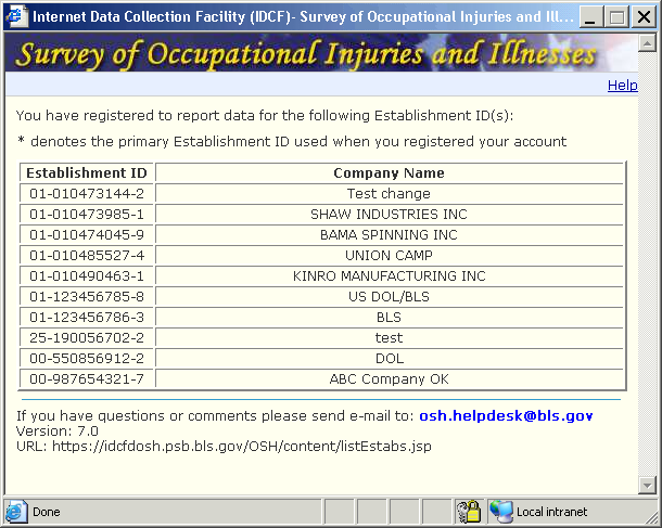
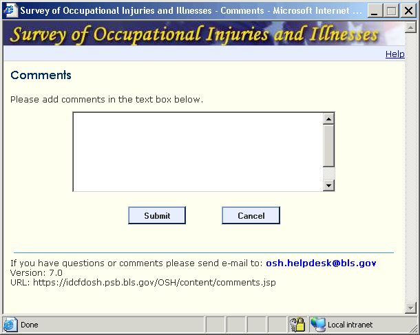
Pages with little or no changes
IDCF CHECK EMAIL PAGE
IDCF NEW USER INFORMATION PAGE
SOII List Of Establishments Page
COMMENT BOX
FAQ PAGE
UPDATE RESPONDENT INFO
Appendix D
Recommendations on Reporting cases with days away from work: Fricker review report
This screen has a dense, cluttered appearance, which will discourage careful reading. At a minimum, to improve readability, the formatting (specifically, the alignment of text should be improved), and there should a better use of white space so that instructions stand out more clearly.
The instructions as written are not actually “steps,” because steps imply a series of actions that should be accomplished in a certain order.
Our most significant criticism of this screen is that, given the current design the possibility exists that a respondent may not read the instructions carefully, click Continue, and then click Submit data on the Data Review page. If this happens, the respondent may never enter the detailed case data, which would result in missing data. This is a real possibility since early usability tests of this screen (albeit with different wording and screen design) led some persons to click Continue, rather than a button equivalent to the Enter Data button. Obviously, this is something that could be monitored in a future usability test.
As an alternative, something like the example that follows (A) could be displayed in large text for those respondents who reported any cases. Since there are a substantial number of them, an alternative screen (B) would be presented for those respondents who reported zero cases.
If the system knows that a respondent has reported more than 30 cases, a new screen (C) should appear.
A. Example of screen for respondents who reported cases
_______________________________________________________________________
Please Note
In this section you are asked to enter detailed information about cases that resulted in “days away from work.” See Column (H) on OSHA Form 300A.
You have reported (X) cases with “days away from work (Column H).”
If the number of cases you entered is incorrect, click the Back arrow to correct your entries.
If the number of cases you entered is correct, click Enter Case Data to enter data for each case.
If you prefer to enter case data at a later time, click Continue.
B. Example of screen for respondents who reported no (zero) cases
_______________________________________________________________________
Please Note
In this section you are asked to enter detailed information about cases that resulted in “days away from work.” See Column (H) on OSHA Form 300A.
You did not report any cases with “days away from work (Column H).”
If this is correct, click Continue. You are finished with this survey.
If this is incorrect, click the Back arrow to correct your entries.
C. Example of screen for respondents who report more than 30 cases
_______________________________________________________________________
Please Note
In this section you are asked to enter detailed information about cases that resulted in “days away from work.” See Column (H) on OSHA Form 300A.
You have reported (X) cases with “days away from work (Column H).”
We have designed this system so that you should not have to report more than 30 cases.
If the number of cases you entered is incorrect, click the Back arrow to correct your entries.
If the number of cases you entered is correct, please call the phone number listed for your State for assistance. For now, click Continue.
Appendix e
Recommendations on Reporting cases with days away from work: Fricker usability report
On the task in which participants had case data to report, five users correctly clicked the “Enter Case Data” button.
Figure 7. Section 3: Reporting Cases with Days Away From Work Page
Three users clicked Continue and were taken to the Data Review page, thereby inappropriately by-passing the Cases with Days Away from Work pages. One of these users realized his mistake and used the top navigation on the Data Review page (see Figure 8) to return to Section 3 and correct his mistake.
By contrast, five users incorrectly clicked the Enter Case Data button on the task in which there was no case data to report. This brought users to the Cases with Days Away from Work screen. Two users tried clicking Continue at the bottom of the Cases page without entering any data (e.g., “I’m trying to get to Section 4!”), but this produced an error message indicating that they needed to fill in the required fields. Eventually four of the five users realized their mistake, used the browser’s “Back” button, and were able to return to Section 3 to complete this part of the task successfully. One user became stuck and asked to skip the task.
See the report generated by the September 24, 2007 OSMR expert review of the SOII-IDCF instrument for suggested revisions to this page. At the very least, the Enter Case Data button should be inactive/grayed out if the user has not reported any cases with days away from work.
HIGH
Appendix F
Recommendations on Reporting cases with days away from work: mockovak eye-tracking report
When survey respondents who have reported “days away from work” cases encounter this page, they are supposed to click the Enter Case Data button, which will then take them to a different section of the form where they can enter detailed information about the case. In the illustration shown above, a respondent would be expected to enter detailed “days away from work” data for four cases, but in the interest of time, participants in this study entered data for only one case in each of the two establishments.
In past usability tests we observed that when some participants first encountered the Enter Case Data page, they clicked the Continue arrow instead of the Enter Case Data button. This action brought them to a Data Review screen. Because of the design of the IDCF instrument, this error was not a “show stopper” because participants could still return to the Enter Case Data screen using the Back arrow (and some respondents, in fact, did this). Nonetheless, the possibility exists that some proportion of actual survey respondents will succumb to this usability glitch, continue to the Review Data page, and submit their data without entering details about specific cases. Since the sample for SOII is quite large, even a relatively small proportion of respondents making this error could result in a large amount of missing data.
Summary of Findings and Recommendations
The preceding analyses support the following conclusions:
Some Instructions Draw Attention, Others are Ignored. It’s encouraging to note that some instructions, for example, the instructions following the “Please Note” heading and the single line of instructions before the Enter Case Data button drew a significant amount of attention. However, the gaze data do not strongly suggest that these lines were read carefully by most participants. Instead, it appears that they were mostly scanned. Other instructions, such as the detailed bullet list following the Enter Case Data button, drew very little attention, plus none of the gaze-plot data suggest that these bullets were read (there was evidence that the beginnings of some individual lines were scanned).
Familiarity Had an Impact. The heat map displays clearly show that there were fewer fixations when the participants completed the second establishment. Instead, participants tended to hone in on the critical information and navigation elements that they needed.
Parts of the Screen Are Essentially Ignored. Parts of the screen such as the banner area, the footer area, and the upper right quadrant receive very little, or no, attention. Therefore, they are superfluous to the task at hand.
What Are the Implications for Design of the Enter Case Data Page?
The current eye-tracking analysis, although cursory and largely subjective, strongly suggests that the existing Enter Case Data page should be redesigned. There are two key reasons for making this suggestion.
First, key instructions on the page (bullets following the Enter Case Data button) are routinely ignored and may be partially obscuring the Enter Case Data button. Moreover, even instructions that draw attention do not appear to be read carefully.
Second, the usability problem that had been observed in previous testing when respondents clicked the Continue arrow, rather than the Enter Case Data button, also occurred in this study in several of the cases. The instructions and screen design should make it clear that the Enter Case Data button is the first option on this screen.
Given the advantages of interactive survey instruments that can take into account previous entries made by a respondent, it’s not clear why the Enter Case Data page, as designed, is necessary at all. If survey respondents indicate that they have cases with days away from work in Section 2, it would seem that all the instrument needs to do is display a confirmatory page as shown below. After detailed information had been entered for a case, the next screen that appears would then show something like what appears in the “Follow-up Page” illustration below.
Confirmatory Page. If respondent indicated that there were cases with “days
away from work”
__________________________________________________________________
Your entries in Section 2 indicate that you had cases where employees either missed days of work or their work activities were restricted.
If this is correct, click the Continue arrow to provide additional information
about X of those cases.
If this is incorrect, click the Back button on your browser and correct your
previous answer in Item H (Section 2).
Continue →
__________________________________________________________________
Follow-up page, when detailed information is entered for more than one “days away from work” case
__________________________________________________________________
Section 3. Entering Detailed Information about Cases
As shown in the table below, you have entered information for 2 of Y cases.
Click here to enter information for additional cases
Click Exit, if you would like to enter this information later
|
Days |
|||||
|
Employee’s Name |
Job Title |
Date of Injury |
of Restriction |
away from work |
|
Update |
Joy |
Engineer |
12/10/2007 |
1 |
1 |
Delete |
Update |
James |
QA |
12/12/2007 |
0 |
1 |
Delete |
Exit →
__________________________________________________________________
1 Taken from http://www.census.gov/Press-Release/www/2001/raceqandas.html :
Question:
What are the race groups that federal agencies are to use to comply
with the Office of Management and Budget's guidance for civil rights
monitoring and enforcement?
Answer:
The categories (made available in
OMB Bulletin No. 00-02, "Guidance on Aggregation and Allocation
of Data on Race for Use in Civil Rights Monitoring and Enforcement")
to be used are:
American Indian and Alaska Native
Asian
Black or African American
Native Hawaiian and Other Pacific Islander
White
American Indian and Alaska Native and White
Asian and White
Black or African American and White
American Indian and Alaska Native and Black or African American
>1 percent: Fill in if applicable with multiracial combinations greater than 1% of the population
Balance of individuals reporting more than one race
Total
The use of these categories, including the identification of specific two or more race combinations greater than 1 percent, is mandatory for civil rights monitoring and enforcement agencies. For more information, see www.whitehouse.gov/omb/bulletins/b00-02.html
2 This was the URL for the Independent Test site, not the production site.
| File Type | application/msword |
| Author | dodson_c |
| Last Modified By | brown_tm |
| File Modified | 2010-04-19 |
| File Created | 2010-04-05 |
© 2026 OMB.report | Privacy Policy