Phase I Testing Report
Attachment D - CE Mobile Diary Phase I Testing Report (7-29-2013).docx
The Consumer Expenditure Surveys: The Quarterly Interview and the Diary
Phase I Testing Report
OMB: 1220-0050
Summary Report of the Phase I Usability Test of the
CE Mobile-Optimized Web Diary
Brandon Kopp, Jean Fox, and Erica Yu
Office of Survey Methods Research
Nhien To
Division of Consumer Expenditure Surveys
July 2013
Executive Summary
Following ten usability testing sessions conducted in the OSMR usability lab, the mobile diary testing team believes that there are some usability problems that should be addressed before additional testing is conducted. There are several additional problems that could be addressed in later versions of the diary instrument. The team has recommended solutions for each problem.
Recommendations |
||||||||||||
Issues to address in the future
At a minimum, we recommend that respondents be allowed to set their own username and password. This would make it more likely that they log in and fill out the diary. However, the full impact of the username and password requirements should be evaluated in future testing.
|
Overview
The Consumer Expenditure Survey (CE) Program currently uses a paper diary to collect household expenditures. As part of ongoing improvements to the survey, the Bureau of Labor Statistics (BLS) and the Census Bureau (Census) have begun field testing a web-based diary instrument. The web diary may help some respondents with data entry and it has the potential to lead to more complete responses through periodic data checks by field representatives during the collection period. It does not solve one recurring data collection problem however; collecting accurate data on those purchases that do not yield a receipt and/or are forgotten before one returns home to enter items into the diary. To help solve this issue, BLS and Census are designing a version of the web-diary specifically for use on a smartphone. The usability testing described below will provide feedback on an early prototype of a mobile Internet optimized CE diary survey.
Methods
2.1 Participants
Ten participants (9 female, 1 male) attended individual testing sessions that lasted an average of 40 minutes. Participants were compensated $40 for their time. Participants were screened based on their prior experience with smartphones. Specifically, only those who reported owning a smartphone and having “A moderate amount” or “A lot” of experience with it were eligible to participate in this study. Participants who reported having “None” or “A little” experience with smartphones were not invited to participate. Three participants reported having “A moderate amount” of experience with smartphones and seven reported having “A lot” of experience.
The sample was also stratified on participants’ experience with smartphone applications and on age. Five of the participants reported having “A moderate amount” of experience with smartphone applications and five reported “A lot” of experience. Five participants were 35 years of age or older and five were younger than 35 years of age.
2.2 Procedure
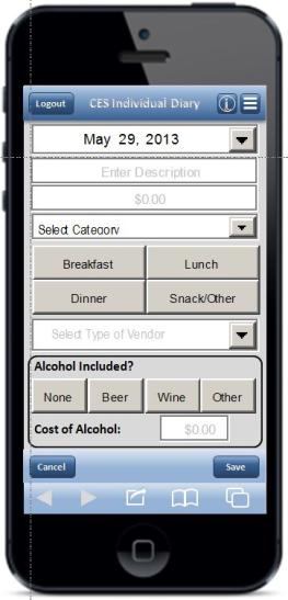
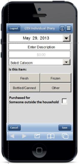
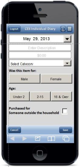
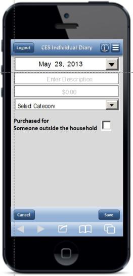
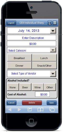
Participants came individually to the usability lab in the Office of Survey Methods Research at BLS. After the experimenter explained the purpose of the study and obtained informed consent, the participant sat in front of a computer running a simulation of the mobile diary instrument constructed using Microsoft PowerPoint (see Appendix A for screenshots) and Excel. The computer also ran Morae testing software to track the time spent on each task and present survey questions to the participant. Morae software also recorded the computer screen and the audio from the participant and experimenter interaction.
The experimenter remained in the room with the participant and walked him or her through the tasks and debriefing questions (described below). Several observers monitored each session from an adjacent room. The observers’ task was to watch a duplicate of the participant’s screen, listen to the conversation between the experimenter and participant, and take notes on any difficulty the participant had completing each task and any feedback (positive or negative) they expressed during the testing session. Observers used a specially designed form to record their feedback.
During each testing session the experimenter would read the task instructions, then the participant completed the task and rated how easy or difficult the task was to complete. There were 14 tasks, as described in the next section. After the 14 tasks were complete, the Morae software presented the participant with three questions about their overall experience with the mobile diary. Finally, the experimenter asked a series of follow-up questions about the participant’s experience with the diary.
It is important to note that a traditional “diary placement” explanation was not conducted during the testing session. This is because (1) the session needed to be completed in under 1 hour, (2) the mobile diary is intended to be an individual diary so not all household members will receive a full explanation from the field representative, and (3) the basic usability of the instrument (whether the processes involved in the tasks were self-explanatory) was the focus of this initial round of testing. Several of the recurring issues that arose during testing (e.g., level of detail needed for item descriptions) may be less common in regular data collection, when an explanation of terms and diary functions would be given to, at least, the primary respondent.
2.3 Tasks
The 14 tasks used in this study covered the basic tasks CE diary respondents would perform to complete the diary survey using a mobile device. That is, they would need to log in to the diary, perform the initial setup, enter a variety of purchases, and edit previous purchase entries.
The tasks were divided into two blocks, shown below. These two blocks were counterbalanced so that six of the ten participants received Block A then B and four of the ten received Block B then A. The Login and Start Date tasks were first and second, regardless of order.
Participants were read scenarios or given receipts for data entry for 12 of the 14 tasks. For two of the tasks, 3 and 11, participants entered expenses of their own. These non-directed tasks make the data entry more true to what a respondent’s experience would be with the mobile diary.
Block A
|
Task Name |
Text Read to Respondents |
1. |
Login #1 |
Let’s get started. First, I’d like you to use this username and password to login to the diary… |
2. |
Start Date |
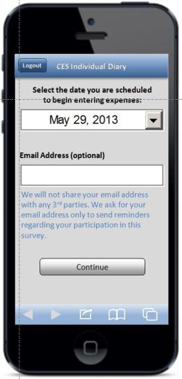
You will see a screen asking you to select your start date. Please select June 1st as your start date Below the start date, you will see that we ask for your e-mail address so that we can send you reminders during the period that you are assigned to enter your expenses. You can skip that box. Please select the “Continue” button. |
|
Info Screen1 |
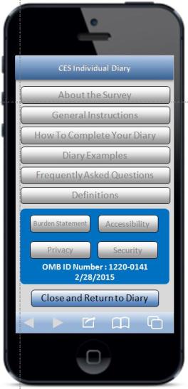
Looking at this screen, if you were interested in finding information about the survey, where would you go? |
3. |
Own Non-Food |
Think back to the last purchase you made, other than food. Please add that item to the diary as if the purchase was made on June 1st. |
4. |
Clothing |
Now, imagine that today is Sunday, June 2nd… You’re at the mall shopping and buy a pair of jeans for yourself for $61.95. Please add that item to the diary. |
5. |
Other Cleaners |
On your way home, you stop at the cleaners to pick-up some dry cleaning. You paid $32.50. Please enter that expense. |
6. |
Food Away |
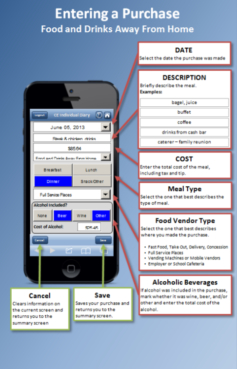
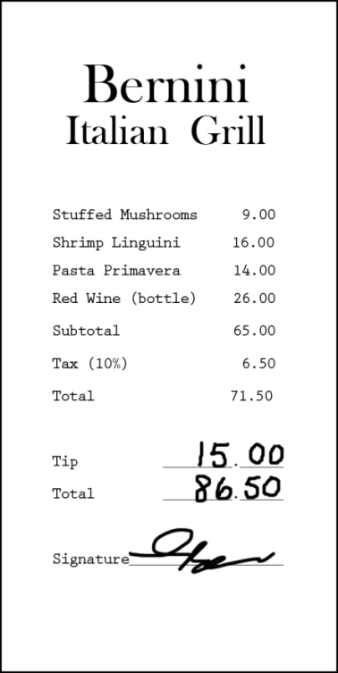
That evening, you meet up with a friend and buy dinner for you and your friend. Here is the receipt (see Appendix B): For meals out, we only need the total that you spent on the meal including tax and tip, not the cost of the individual items. |
7. |
Other DVD |
After dinner, you remember that earlier while shopping you had also purchased a DVD – you can’t remember exactly how much you paid but think it was approximately $15. Please enter that item. |
8. |
Edit Price |
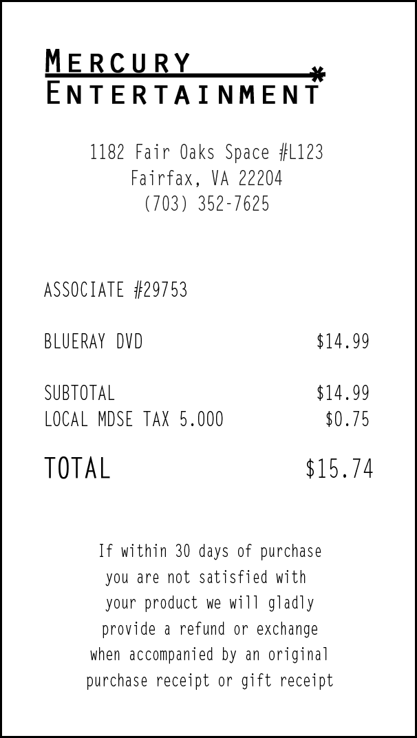
Later at home, you find the receipt for the DVD you bought earlier that day. Using this receipt (see Appendix B), please change the entry to reflect the correct price of the DVD. |
9. |
Delete Item |
The next day you decide that the jeans you bought were really too expensive and take it back to the store to return it. Please go back and delete that item. |
Block B
|
Task Name |
Text Read to Respondents |
10. |
Login #2 |
Now, I am going to have you log out of the diary and log back in. You can use the same UserID and Password |
11. |
Own Food |
Think back to the last food purchase you made. Please add that item to the diary as if the purchase was made on June 1st. |
12. |
Grocery List |
Now, imagine that today is Monday, June 3nd …
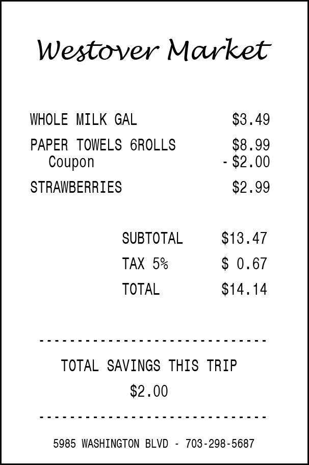
You just went to the grocery store to pick up a few items – enter the items you purchased using this receipt (see Appendix B): Please keep in mind that for multiple items purchased at a store, we would like you to enter the individual items separately. For each item, you can enter the item cost before tax but do include any coupons or discounts that are applied. |
13. |
Other Bill |
You then remember that you had written a check to pay your electric bill yesterday on Sunday, June 2nd but had forgotten to enter the expense. Add the $126.00 that you paid on Sunday, June 2nd for the electric bill. |
14. |
Edit Date |
Later on, you remember that the electric bill you paid was actually on Saturday, June 1st, not Sunday, June 2nd. Please change that entry to reflect the correct date. |
2.4 Test Metrics
2.4.1 Task Success. The session observers determined whether each task was fully successful, partially successful, or not successful for each task. Fully successful means that the participant completed the task as intended, without any difficulty. Partially successful means the participant completed most of the task but either did not complete a data element, required prompting from the experimenter, or required multiple attempts to complete the task. Another factor in determining partial success was whether an entry, even if misclassified, could still lead to a codable (acceptable) response2. Not successful means a participant did not complete the task or completed the task in a way that would not lead to a codable response (i.e., their data would not be categorizable in the production diary survey).
When only one observer was present, his or her rating of task success was used. When multiple observers were present, they did not always agree on their rating of task success. In this situation, the majority opinion was used. If there were an even number of observers and tie in ratings (e.g., one rates “Fully Successful”, another rates “Partially Successful”), an additional observer watched the video of that session and broke the tie.
Participants occasionally had difficulty with definitional issues, for example whether a gallon of milk should be classified as bottled/canned or fresh. With the exception of the situations mentioned in Footnote 2, these types of mistakes were not considered in evaluating the task success because these CE diary specific definitions were not explained prior to the task. Some definitional issues such as whether specific items or total cost were desired were explained to participants and were figured into success ratings.
2.4.2 Task Time. The amount of time spent on a task can give some indication of whether participants are having difficulty. Generally speaking, shorter times indicate less difficulty.
Morae tracked the time spent on each task. The experimenter asked the participant to click a “Start Task” button on the screen after the task was read and an “End Task” button once the task was complete. After completing several tasks, some participants anticipated the experimenter’s instructions to begin and clicked the start task button before the instructions had been read. Several participants also began the task without clicking the start button and the experimenter had to remind them. This introduced some error into the task timing, however the effect across 10 participants should be minimal. Times were only included in summary statistics if participants were partially or fully successful in completing the task.
2.4.3 Task Difficulty Ratings. Following each task, participants answered the question “How easy or difficult was it to complete this task?” using a 5-point scale with the response options “Very Difficult,” “Somewhat Difficult,” “Neither Easy nor Difficult,” “Somewhat Easy,” and “Very Easy.”
2.4.4 Overall Ratings. After participants completed all fourteen tasks, they answered the following three questions (with response options).
Was the mobile diary easy or difficult to use? (Very Difficult, Somewhat Difficult, Neither Easy Nor Difficult, Somewhat Easy, and Very Easy)
How confident did you feel in filling out the entries in the diary? (Not at all Confident, A Little Confident, Somewhat Confident, Very Confident, Extremely Confident)
How much training do you think the average person would need to get started using the diary? (None, A Little, A Moderate Amount, A Lot)
2.4.5 Debriefing Questions. Finally, the experimenter asked participants several open-ended questions regarding their experience with the mobile diary and their suggestions for improvements.
Results
3.1 Task Success.
Overall, participants had little trouble completing the tasks. Success ratings are shown in Table 1. To compute an overall success score for each participant, a value of 0 was assigned to “Not Successful,” 1 for “Partially Successful,” and 2 for “Fully Successful.” A sum of the scores for each task gives a cumulative score that could range from 0 (or failure to successfully complete all tasks) to 28 (successful completion of all tasks). The average score was 25, meaning that participants completed most tasks successfully. Two participants completed all tasks successfully. The lowest score on this measure was 19. There was a moderate difference between the group who received Block A first (overall score = 27) and the group who received Block B first (overall score = 23)3. Those with greater smartphone experience did not appear to be more successful at completing tasks than those with less experience.
Participants found it difficult to locate the button that leads to the information screen. Five participants were unable to find it or identified one of the “Internet browser buttons” at the bottom of the instrument first. One participant reported not seeing the button because it blended in with the title bar. Several participants said that they did not recognize the circle “i” button as leading to information.
Of the remaining tasks, none had more than one case where the participant was not successful at all. Two participants accounted for the six unsuccessful attempts at completing tasks. The experimenter did not probe about specific reasons for not completing the tasks in order to (1) maintain rapport and (2) not distract participants from completing the remaining tasks. Anecdotally, it appeared that the two participants who had difficulty completing tasks had poor eyesight. One of the participants commented that the writing was very small, while the other mistyped the password multiple times.
Table 1: Usability Metrics (Task Success, Task Time, and Task Rating) by Task.
|
Task Name |
Not Successful |
Partially Successful |
Fully Successful |
Task Time |
Task |
1. |
Login #1 |
1 |
0 |
9 |
32.06 |
4.80 |
2. |
Start Date |
0 |
0 |
10 |
14.40 |
4.90 |
|
Info Screen |
5 |
0 |
5 |
-- |
-- |
3. |
Own Non-Food |
0 |
3 |
7 |
45.30 |
5.00 |
4. |
Clothing |
0 |
3 |
7 |
37.89 |
5.00 |
5. |
Other Cleaners |
0 |
0 |
10 |
33.88 |
5.00 |
6. |
Food Away |
0 |
2 |
8 |
68.62 |
4.80 |
7. |
Other DVD |
0 |
1 |
9 |
32.78 |
5.00 |
8. |
Edit Price |
1 |
0 |
9 |
25.30 |
4.89 |
9. |
Delete Item |
1 |
0 |
9 |
22.96 |
4.90 |
10. |
Login #2 |
0 |
0 |
10 |
24.03 |
5.00 |
11. |
Own Food |
1 |
2 |
7 |
58.12 |
4.70 |
12. |
Grocery List |
1 |
4 |
5 |
117.51 |
4.50 |
13. |
Other Bill |
0 |
0 |
10 |
38.07 |
4.80 |
14. |
Edit Date |
1 |
0 |
9 |
19.41 |
5.00 |
Data Entry and Editing Problems |
Participants had trouble with several of the tasks.
Entering Vendor Name Or Multiple Expenses. The most common problem participants demonstrated was attempting to enter multiple items where a single entry was called for. It was apparent that several participants thought of their expenditures by the outlet at which they were purchased. These participants entered a store name for item description. Others entered several items on the same line. Entering a vendor name or multiple items on a single line account for 9 (or 60%) of the 15 cases where participants were partially successful.
Failure to Enter Information. Another problem that came up twice was the failure to enter information asked for by the survey instrument. One participant failed to enter an expense for alcohol in Task #6 (Food Away). That same respondent did not indicate their age when completing Task #4 (Clothing).
Misclassification of Expenditure Categories. Three participants classified dry cleaning expenses as clothing rather than a service. One participant misclassified the expense for “Jeans” as “All Other…”
Difficulty Entering Coupon. For Task 12 in which participants were asked to input three items from a grocery list, the most common problem was difficulty entering a discount price based on a coupon. One participant failed to enter it, while another included the original price and the coupon (e.g., “$8.99-2.00”). Another participant thought that there should be an additional box to enter the coupon information and was confused when they could not find one.
Editing Expense Information. One participant had difficulty with all three editing tasks; the participant did not see the edit button. For these tasks, the participant attempted to edit the previous entry by adding a new item with the correct information. |
3.2 Task Time
The amount of time it took for the participant to complete each task is shown in Table 1. Generally speaking, less time spent on a task indicates that it was easy to complete. Participants with smartphone and smartphone application experience were no quicker at successfully completing the tasks than those with less experience.
We also compared participants’ first login attempt with their second to see if there was an effect of greater experience with the instrument. In fact, there was. Participants were significantly faster logging in the second time. Initially it took participants 32 seconds to log in, while the second time took them, on average, 24 seconds.
3.3 Participant Task Ratings
Immediately following each task participants were asked to indicate, on a 1- 5 scale with 1 meaning “Very Difficult” and 5 meaning “Very Easy,” how easy or difficult they thought each task was. Participants’ ratings of task difficulty are shown in Table 1. Six of the fourteen tasks (Own Non-Food, Clothing, Other Cleaners, Other DVD, Login #2, and Edit Date) were rated as “Very Easy” by all participants. The rest of the tasks received a rating of 4.5 or higher.
3.4 General Reactions
Participants were uniformly positive in their overall ratings (see Table 2). Seven participants rated the mobile diary as Very Easy to use and said they were Extremely Confident while filling it out. Three participants rated the diary as Somewhat Easy to use and said they were either Very or Somewhat Confident while filling it out. Almost all participants said that the average person would be able to fill out the diary with little or no training.
Table 2: Frequency and average overall ratings of ease of use, confidence, and need for training. Note that for Question 3 regarding training, a lower score is preferable, while for the other two a higher score is preferred.
Question |
Response Options |
Frequency |
Average Score |
Was the mobile diary easy or difficult to use? |
Very Difficult (1) |
0 |
4.70 |
Somewhat Difficult (2) |
0 |
||
Neither Easy Nor Difficult (3) |
0 |
||
Somewhat Easy (4) |
3 |
||
Very Easy (5) |
7 |
||
|
|
|
|
How confident did you feel in filling out the entries in the diary? |
Not At All Confident (1) |
0 |
4.60 |
A Little Confident (2) |
0 |
||
Somewhat Confident (3) |
1 |
||
Very Confident (4) |
2 |
||
Extremely Confident (5) |
7 |
||
|
|
|
|
How much training do you think the average person would need to get started using the diary? |
None (0) |
5 |
0.60 |
A Little (1) |
4 |
||
A Moderate Amount (2) |
1 |
||
A Lot (3) |
0 |
3.5 Debriefing Questions
When asked the open-ended question “What do you think of the mobile diary?” most participants praised the diary as “simple,” “self-explanatory,” “easy to use,” and “convenient” because it could be used while they’re shopping or when they have a break in their day (e.g., while on public transportation). Several participants were less positive, saying that they found the data requirements to be burdensome (e.g., entering each item rather than a total for a store, answering several questions about each item). One participant bluntly said that she would not enter a shopping list worth of purchases
Participant Recommendations |
In the debriefing, participants provided the following suggestions about how the diary could be improved:
|
Conclusion
Overall, across all of the usability metrics and participant feedback, the current mobile diary tested very well. Eight of the ten participants were able to complete the tasks with little or no difficulty, receiving success scores of 25 or higher out of a total of 28. Only two participants experienced significant problems.
Participants were also able to complete the tasks fairly quickly, though with no benchmark values it is difficult to make comparisons. From these data, one can get a general sense of how long it will take respondents in the production diary to perform the core tasks. Participants spent an average of 28 seconds logging in to the instrument. Across the seven, single-item data entry tasks, participants spent an average 45 seconds entering each item. Across the three data editing tasks, participants spent an average of 23 seconds per task.
Participants also gave very positive ratings of ease for each of the tasks as well as for the instrument overall. The lowest task rating was 4.5 out of 5 for the Grocery List task. Across all 14 tasks, the average rating was 4.8. Overall, participants thought the mobile diary was easy to use, with all ten participants rating it as Somewhat Easy or Very Easy. Participants felt confident as they entered information into the diary, with their average confidence level rating 4.6 out of 5. Finally, only one participant said that the diary would require more than a little training.
4.1 Limitations
While the ratings of task success and ease of completion were largely positive, several limitations of the current usability test are worth noting. As mentioned in the recommendations, several of the most frequent issues were the result of limited explanation of the instrument and the data requirements for the diary, referred to as “diary placement.” While the omission of the diary placement during this phase of testing was intentional, the next round of testing should include a test of placement materials.
Secondly, during this study the tasks were conducted in quick succession. This does not accurately mimic the experience a production diary respondent would have with the mobile diary. For example, since the mobile diary logs the respondent out after 15 minutes, they would likely have to log in each time they entered an item. Logging in repeatedly could have potentially led to lower ratings of ease and open-ended feedback. This should also be incorporated into future testing.
As noted earlier, three items was the most a participant had to enter in a single task. Even with only three items, several participants remarked at how burdensome a task it was. Longer lists of items should be entered in future testing.
Finally, the simulated diary required input through a physical keyboard and mouse. Entering data through a virtual keyboard may be easier for some and more difficult for others. It is unlikely that participants accounted for this difference when rating the ease of completing the task.
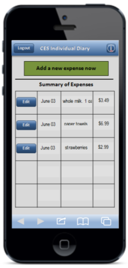
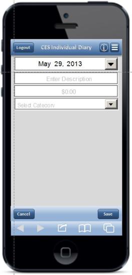
Appendix A: Mobile Diary Screenshots
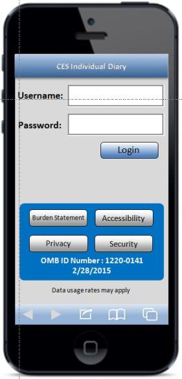
Login |
Initial Setup |
Information |
|
|
|
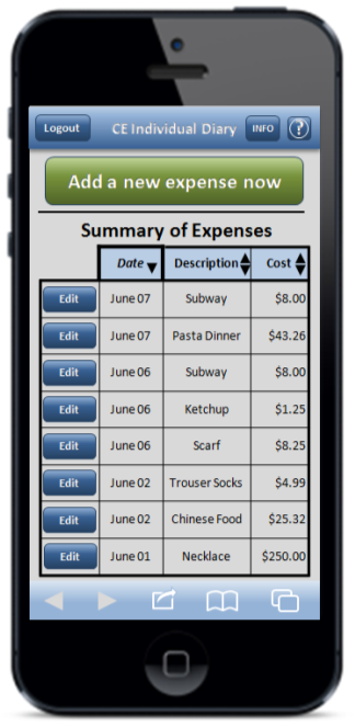
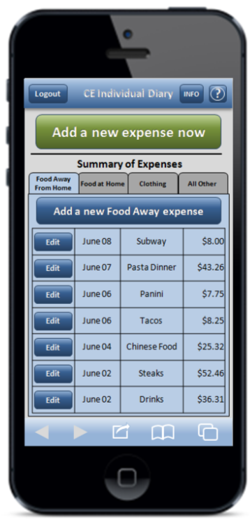
Expense Summary |
Common Entry |
Food Away From Home |
|
|
|
Food At Home |
Clothing |
Other Expense |
|
|
|
Edit |
|
|
|
NOTE: Edit screens look like the corresponding data entry screen, with the exceptions of the “Delete” button, the font color, and the fact that previously entered data is pre-filled. To save file size, the “Food Away From Home” Edit screen on the left is shown as an example. |
|
Task 6 – Food Away |
Task 8 – Edit Price |
Task 12 – Grocery List |
|
|
|
Appendix B: Receipts Used for Tasks
Appendix C: Comparison by Block Order
Task completion times by task in seconds. Note: ns = not significant at a p < 0.05 level
|
Task |
Overall |
Block A First |
Block B First |
Significance (A/B) |
1. |
Login #1 |
32.06 |
31.69 |
32.79 |
ns |
2. |
Start Date |
14.40 |
14.00 |
15.01 |
ns |
3. |
Own Non-Food |
45.30 |
44.23 |
46.91 |
ns |
4. |
Clothing |
37.89 |
39.36 |
35.71 |
ns |
5. |
Other Cleaners |
33.88 |
30.54 |
38.88 |
ns |
6. |
Food Away |
68.62 |
54.93 |
89.14 |
p = 0.01 |
7. |
Other DVD |
32.78 |
33.28 |
32.03 |
ns |
8. |
Edit Price |
25.30 |
24.73 |
26.25 |
ns |
9. |
Delete Item |
22.96 |
24.41 |
18.06 |
ns |
10. |
Login #2 |
24.03 |
22.30 |
26.62 |
ns |
11. |
Own Food |
58.12 |
42.06 |
90.25 |
p = 0.03 |
12. |
Grocery List |
117.51 |
113.45 |
125.62 |
ns |
13. |
Other Bill |
38.07 |
31.75 |
45.10 |
p = 0.05 |
14. |
Edit Date |
19.41 |
19.38 |
19.46 |
ns |
Average participant ease/difficulty rating by task. Note: Ratings are on a 1(Very Difficult) to 5 (Very Easy); ns = not significant at a p < 0.05 level
|
Task |
Overall |
Block A First |
Block B First |
Significance (A/B) |
1. |
Login #1 |
4.80 |
5.00 |
4.50 |
ns |
2. |
Start Date |
4.90 |
5.00 |
4.75 |
ns |
3. |
Own Non-Food |
5.00 |
5.00 |
5.00 |
ns |
4. |
Clothing |
5.00 |
5.00 |
5.00 |
ns |
5. |
Other Cleaners |
5.00 |
5.00 |
5.00 |
ns |
6. |
Food Away |
4.80 |
5.00 |
4.50 |
ns |
7. |
Other DVD |
5.00 |
5.00 |
5.00 |
ns |
8. |
Edit Price |
4.89 |
5.00 |
4.75 |
ns |
9. |
Delete Item |
4.90 |
4.83 |
5.00 |
ns |
10. |
Login #2 |
5.00 |
5.00 |
5.00 |
ns |
11. |
Own Food |
4.70 |
5.00 |
4.25 |
ns |
12. |
Grocery List |
4.50 |
4.83 |
4.00 |
p < 0.01 |
13. |
Other Bill |
4.80 |
5.00 |
4.50 |
ns |
14. |
Edit Date |
5.00 |
5.00 |
5.00 |
ns |
1 Participants were also asked to find the Information Screen which provides information on the mobile diary and on the survey itself. This was not treated as a separate task because participants were not asked to navigate within the instrument or to enter any information. Success or failure at completing this task was assessed, but none of the other metrics discussed below were collected.
2 Three participants miscategorized dry cleaning as “Clothing…” rather than as “All Other…” This was counted as fully successful (Task #5) because coders at the National Processing Center who examine and classify diary entries would be able to properly classify the data as “All Other…” and no additional data would be needed. One participant incorrectly categorized jeans as “All Other…” This was counted as partially successful (Task #4) because crucial information (i.e., gender and age) were not collected under the “All Other…” category.
3 This difference, which shows up in other metrics, showing that participants who received Block A first generally had an easier time completing the tasks, is likely due to the small sample size and/or a failure of random assignment and not a reflection of the instrument or the order of the tasks. That said, the task order will be altered for later testing. See Appendix C for detailed results.
| File Type | application/vnd.openxmlformats-officedocument.wordprocessingml.document |
| Author | kopp_b |
| File Modified | 0000-00-00 |
| File Created | 2021-01-27 |
© 2026 OMB.report | Privacy Policy
