Attachment H - Web Diary Usability Round 1
Attachment H - Web Diary Usability Round 1 (Final - 5.17.2012).docx
The Consumer Expenditure Surveys: The Quarterly Interview and the Diary
Attachment H - Web Diary Usability Round 1
OMB: 1220-0050
![]()
M E M O R A N D U M
To: Chris Stringer, John Gloster, and Lauren Kirkpatrick, DSD and the BLS Team
From: Kathy Ashenfelter, Larry Malakhoff, and Misa Gareau, CSM
Date: May 2012
Title: DRAFT Full Report from Pretesting of the Consumer Expenditure Web Diary Survey
Table of Contents
3.0 Results: Accuracy, Efficiency, and Autofill Analyses 4
4.0 Results from iPad testing 35
5.0 High-Priority Accessibility Findings 36
Appendix A: Recommended Revisions to FR Talking Points 45
Appendix B: Introductory Protocol 46
Appendix D: Participant Instructions and Data Lists 49
Appendix F: Demographic/Computer Background Questionnaire 65
Appendix G: Participant Task List 68
Appendix H: Satisfaction Questionnaire 69
Appendix I: Debriefing Questionnaire 71
1.0 Introduction
Usability testing was conducted on a prototype version of the Consumer Expenditure (CE) Web Diary Survey from January-April 2012.The CE diary examines the buying habits of people in the United States and the products and services that are bought by people in this country. Respondents to the CE Web Diary in the field complete the diary for two weeks for all of the items that they buy or for which they spend money (i.e., all of their “expenses”). 42 participants were run before the completion of this full report.
Three treatment groups were tested for this study based on the way the expenditures were organized when presented to the participants. Group 1 had the expenditures organized by day and person, Group 2 was presented with the expenditure items organized according to the type of purchase, and Group 3 was presented with the expenditure items with no organization. We hypothesized that Group 1 would be the 2 would be the most efficient and satisfactory way to organize the expenses. We thought Group 1’s organizational structure was better than Group 3’s lack of structure, which would prove to be the least efficient and satisfying organizational strategy.
These expectations were based on our examination of how the online diary is structured in comparison to the paper diary. The type of purchase tabs are the prominent feature of the online diary, unlike the paper diary, which asked for information about purchases by for types of expenditures nested within days. At the same time, we thought any organization of expenditures is apt to work better than a quasi-random presentation of purchases. We surmised, however, that many respondents may deal with this sort of conglomeration of receipts when attempting to complete the diary now. The “disorganized’ treatment thus may serve as a benchmark against which to measure the benefits of organization, if any.
This full report identifies high-priority usability issues across all three treatment groups and gives accuracy and efficiency results. Eye-tracking data accompanies the results, and participant comments from the think-aloud process are included which augment the data.
2.0 Procedure
42 participants were recruited internally and externally using a participant database, and tested on-site at Census Bureau Headquarters in Suitland, MD. 22 participants were male, and 20 were female, with ages ranging from 21 years old to 61 years old, with an average of 42.17 years old. All participants had at minimum a high school diploma.
Each participant was randomly assigned to Group 1, Group 2 or Group 3 (described above). Sessions were held in the Usability Lab, with the participants in a room with a computer and Tobii eye-tracking monitor, and the testing administrators (TA) in a separate room in which they could view the participant through one-way glass and through computer monitors. Participants and TAs could communicate via a system of microphones and speakers in the rooms. All sessions were recorded using digital video tapes.
TAs read an introductory protocol (Appendix B) to each participant, during which the purpose of the study was explained, and basic instructions were given. All participants signed a consent form (Appendix C). Prior to using the CE Web Diary website, each participant was instructed to “think aloud” as they used the Diary and participated in a short (approximately 1-2 minute) practice session for thinking aloud using the wtop.com news site. Each participant was calibrated for eye-tracking prior to using the CE Web Diary, and eye-tracking was performed using the Tobii eye-tracking monitor.
Following the introductory protocol, the TA read instructions for completing the Diary to the participants and provided each participant with login information, a list of purchases and household members (Appendix D), and a starting date for the Diary. The talking points can be found in Appendix E. The participants were told that they could either use their own email for the purposes of creating a Diary account, or that one would be provided for them.
The TA then left the room and requested that the participant complete a demographic questionnaire (Appendix F). Following this, a sound check was performed and the participants began the tasks, including item entry, item correction and data submission (Appendix G). Participants in each group received a purchase list corresponding to the group to which they had been assigned.
Once the participants had finished the tasks, the TA instructed the participant to complete a Satisfaction Questionnaire (Appendix H), and returned to the participant room to conduct a debriefing (Appendix I).
3.0 Results: Accuracy, Efficiency, and Autofill Analyses
3.1 Accuracy and Autofill
Across all groups, participants were able to successfully enter 86.09% of the data into the correct category. On average, participants successfully entered 9.64 out of 12 (80.35%) terms correctly into the “Food and Drink Away from Home” category, 1.79 out of 2 terms (89.5%) correctly into the “Accessories” category, and 10.76 out of 12 (89.67%) correctly into the “Other” category. It is interesting to note that participants in group one performed poorly in their accuracy scores as compared with participants from Groups 1 and 2.
Across all categories, Group 2 participants correctly categorized the data list 93.78% of the time, and used autofills for 33.74% of their entries. Group 2 on average correctly placed “Food and Drink Away from Home” items 85.71% of the time, “Food and Drink Away from Home” items 98.57% of the time, “Clothing, Food, Jewlery and Accessories” items 100% of the time, and “All Other Products and Services” items 98.81% of the time.
Across all categories, Group 3 participants correctly categorized the data list 89.82% of the time, and used autofills for 49.54% of their entries. Group 3 on average correctly placed “Food and Drink Away from Home” items 86.90% of the time, “Food and Drink Away from Home” items 91.84% of the time, “Clothing, Food, Jewlery and Accessories” items 89.29% of the time, and “All Other Products and Services” items 91.67% of the time.
Across all categories, Group 1 participants correctly categorized the data list 74.67% of the time, and used autofills for 44.09% of their entries. Group 1 on average correctly placed “Food and Drink Away from Home” items 68.45% of the time, “Food and Drink Away from Home” items 77.55% of the time, “Clothing, Food, Jewlery and Accessories” items 78.57% of the time, and “All Other Products and Services” items 78.57% of the time.
3.2 Efficiency Data
Time to complete the diary was measured from the time when the participant first arrived on the data entry page to when the participant finished entering the data. This was marked by one of the following: the participant said that he/she was finished or when the participant began the next task (Not all participants verbally noted that they were finished). On average, it took participants 27 minutes and 54 seconds to complete the diary. Group 1 had the fastest average completion time of 22 minutes and 45 seconds. Similarly, Group 2 had an average completion time of 26 minutes and 18 seconds. As predicted, Group 3 had much slower completion times, with an average of 34 minutes and 39 seconds.
It is interesting to note that while Group 1 had the fastest average completion time, it also had the worst accuracy scores by a great margin. While Groups 2 and 3 did not differ greatly on accuracy scores, it took participants in Group 3 much longer to complete the diary.
3.3 High-Priority Issues
These problems brings the test participant to a stand still. He or she is not able to successfully complete the task.
3.3.1 The FR talking points are too long, too complex, and not attended to by the participants.
The FR talking points are currently seven pages long and reading them aloud took about 15 minutes. Given that the participants made errors on creating their accounts and entering the expenses that showed they did not listen to or did not retain the information read to them in the talking points, it is clear that the information was not remembered a few minutes later. At least 7 participants verbally expressed concern about being to remember the instructions. P29 commented, “I wasn’t paying attention.” Therefore, it is a logical assumption to assume that they would not be remembered several days later if an FR read these to an R who would not start to take the survey for several days. P5 entered his birthday as the start date instead of the one assigned to him, even though he had been read the FR talking points that described the start date and the start date was physically pointed out and read aloud to him minutes earlier. He had to be reminded of the start date in order to proceed. Additionally, 3 participants entered the current date as the start date initially.
Reading the password character requirements is especially unnecessary because there is little to no chance that anyone would remember that information seconds later, let alone days later when they went to create an account. Participants in our study did not remember that information minutes after we read it to them. That information is also listed at the top of the password screen. 22 of the participants (52%) failed to create a password on the first try, ranging from one to three failed password attempts. 13 participants (30.95%) commented negatively about the account creation process, with the majority of the negative comments being about the password. 19 participants (45.24%) commented about trying to find a place to assign the purchases to their respective roster member, despite this having been read to them in the instructions.
Recommendation: We suggest a much abridged suggested version of the FR talking points along with this quick report as Appendix A . We suggest providing a video clip of a demonstration of someone entering expenses into the CE Web Diary because talking about hypothetical Web screens does not work as well as a real visual example where the R can see the actual screen and someone really using it.
Other issues with the FR talking points:
The images are much too small for the R or the FR to read.
There are typos in the document (e.g., “you will enter all clothing, shoes, jewelry, and accessories purchases”, pg. 3).
The instructions to the FR instruct him/her to refer to nonexistent images in the “user guide” or letter, “Point out the column on the user guide” for the Food and Drink for Home Consumption, Clothing, Jewelry, and Accessories, and Other tabs/sections.
There is only one image, for the Food and Drink Away from home tab.
3.3.2 Having the participant categorize the items into 4 categories adds unnecessary burden, time, potential drop-offs, and error.
Many participants started entering all of the expenses into the first tab, despite the lengthy FR talking points instructions that had just been read to them describing the 4 different tabs. This is a natural inclination, especially since there are a series of drop-down boxes next to the list. Despite 3 prompts from the TA and the lengthy FR taking points, P6 did not figure out the tabs until she had been entering all items into the “Food and Drink Away from Home” tab for over 15 minutes.
Furthermore, some participants erroneously entered an item into the wrong category, and seemed to think it would be laborious to re-enter the data in the appropriate section in order to correct it. P12 said “Oh, I put the video game in the wrong section…I wish I could just move it.” A total of 4 participants expressed frustration at not being able to duplicate data when more than one entry of the same item was necessary or being able to move the data when entered into the incorrect category.
Several participants in the Group 3 condition reorganized the items presented to them to match the organization of the diary (I can grab a count of this). Because respondents may not have their expenditure information organized in this way, they may spend more time reorganizing their information in an attempt to match the data entry pattern displayed by the instrument. This can lead to frustration, mental fatigue, and drop-out. P2, in the Group 3 (disorganized) condition, commented that “This would exasperate me if I had to do this in real life”, after switching from tab to tab to enter the data.
23 of 42 participants (54.76%) used a categorical strategy (Group 2’s strategy) to enter the data items. 29 participants (69.04%) used the strategy prescribed to them by their data entry list, and 13 chose alternative strategies. Of these, 9 participants (21.43%) chose to use a categorical strategy rather than the one prescribed to them. One participant entered the data in a random order, another entered the data items categorically by day, and the remaining two entered all of the data into the first tab (Food and Drink Away from Home) with no regards to category.
4 participants changed strategy after having started with another. One participant in Group 1 began using her prescribed strategy, changed to the categorical strategy, then reverted to her prescribed strategy. Similarly, two participants in Group 3 also changed to a categorical strategy partway through the task, then reverted to the original list after feeling that there was not enough time. The remaining participant had entered nearly all of the data items into the first tab, and then realized that the Diary is organized by categories. 3 participants (1 of which self-corrected halfway through) entered all of the data into the first tab.
P43 (Group 3) was the only participant to completely reorganize the data list into categories before beginning to enter the data. After accounting for the time he spent reorganizing the data (4 minutes and 46 seconds), this participant had the second fastest time for completion for all of Group 3 (his time was 23 minutes and 3 seconds).
Recommendation: If Rs were allowed to simply enter all of the expenses into one tab and choose the location and nature of the purchase from the drop-down menus, the time spent and cognitive burden required to complete the diary would most likely be greatly reduced. We recommend testing a version of this diary survey that utilizes a single data entry page. Further specification about the details of the purchase could be made using the drop-down fields to the right of the description field.
3.3.3 The programmed start date entry parameters are too rigid (i.e., it has to be the right day on the mark or it prevents entry into diary).
Some (3) participants tried to enter the current date as the start date, despite having received the entire FR talking points instructions, which included a section on the start date. Many had to be reminded of the start date, even when it was written on the back of the letter that they were given. One participant was unable to enter the survey using the start date provided by ASD or any other date for any of the user IDs provided by ASD and no data were able to be collected for that session.
Having such a rigid start date is not making best use of technology to improve upon the paper diary. It is actually more restrictive, since the paper diary allows any dates to be hand-written in any date fields.
Recommendation: Allow some flexibility for the start date; one week prior and after the specific start date would be a minimal window. We suggest always allowing the current date as a valid response to permit Rs to initially enter the diary; this may prevent break-offs at this point from people who lost their letter and/or forgot the start date.
3.3.4 Lack of a final “Submit” button/“Save and Submit” is really just “Save” and not “Submit”
15 participants (35.71%) expressed confusion about the functionality of the save and submit button. Some participants expected to move to the next tab when they hit “Save and Submit” and often commented that it did not indeed “submit.” They also expected to move from one section to the next when completing “Food and Drink Away from Home” and clicking “Save and Submit.” Some participants clicked this button after every row of data entry, other clicked it after completing each section, and others clicked it intermittently as it occurred to them. This variation in patterns of how people used this button shows that it is not clear what its ended use and frequency of use is intended to be. Almost all participants expressed uncertainty over how they would submit their data and be “finished” with the session. P27, upon seeing the “Save and Submit” button, commented “Oh, Save AND Submit…I would think there would be just a ‘Save’ button.” When probed on what (s)he thought the “Save and Submit” button would do, (s)he said “It would submit, then wipe it clean so you have a brand new clear screen.” P33 thought that clicking the “Save and Submit” button would “Blank out and advance to the next category, that would be more secure.”
Recommendation: This issue would be corrected instantly by eliminating the four tabs and using only one single data-entry page for a list. Another solution that would require very little programming would be to have a “Submit” button near the “Logout” link that takes the Rs to the same screen (i.e., back to the login screen), but provides a different message that reassures them that their data have been submitted to the U.S. Census Bureau. An example can be seen in Figure 1 below. The current logout message can be seen in Figure 2 and a suggested revision can be seen in Figure 3.

Figure 1: Example of Submit and Logout Buttons (other colors with more contrast would be preferable for color-blind users).
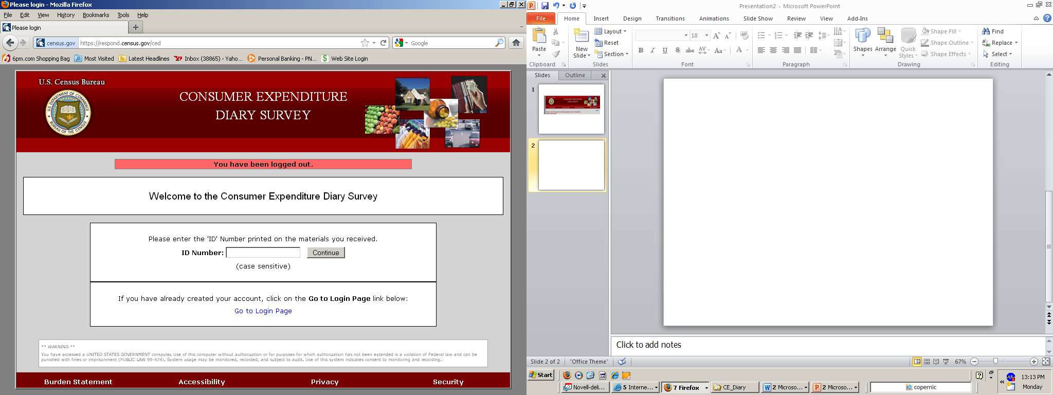
Figure 2: Current Logout message
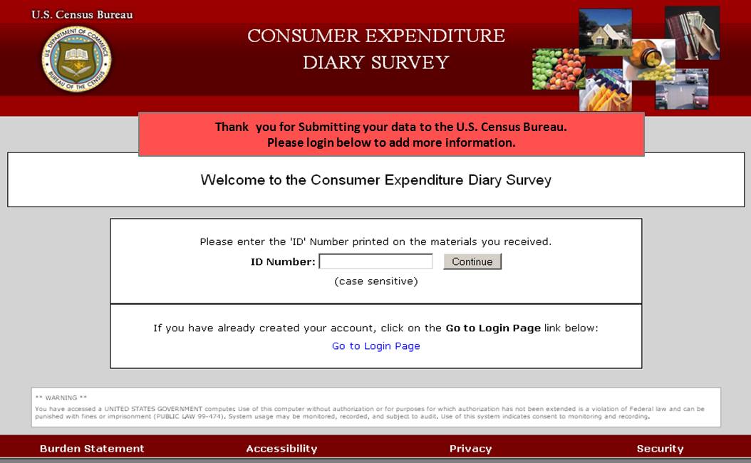
Figure 3: Example "Submit" Screen
3.3.5 There is no validation message for the “Clear” button; data can very easily be erased without the participant noticing
This happened in one session when the participant clear a row of data (ice cream sandwich) and only noticed a while later when pondering why there was a blank line in the list. During debriefing, she said that she had no clue that she had accidentally erased that row of data.
Recommendation: Add a soft edit validation message that says something along the lines of “Are you sure you want to clear this row of data?” before that row is cleared.
3.3.6 Data entered blank out after password fails on password creation page
Participants were extremely frustrated with the fact that if they failed to create a password that complied with the requirements, they received an error message and all of the other data on the page, including their email address that they typed twice and new username they created, were wiped out. ASD informed the DSD team that this was a security requirement. However, hitting the browser “Back” button restored the previously entered information, which means it was not securely wiped out. All participants who had this happen commented that they were frustrated that the information disappeared. One participant said, “This is a nightmare.”
Other surveys conducted by the U.S. Census Bureau make use of an auto-generated PIN that is provided to the respondents and the account creation process is much more streamlined (e.g., ACS- Ashenfelter, Holland, Quach, Nichols, & Lakhe, 2011; CQS-Ashenfelter, Holland, Quach, & Nichols, 2011).
Recommendation: We recommend implementing a PIN login screen to reduce participant frustration and cognitive burden and to reduce the amount of time it takes Rs to log into the survey diary. This should be tested as soon as possible.
Data are lost when the browser back button is clicked (without clicking Save & Submit first) on the first data entry page used (Default: Food and Drink Away from Home) and it navigates back to the roster page. One participant did this and expressed great frustration at having to enter all of the data again for the Food and Drink Away from Home tab.
Recommendation: Save the data each time something is entered into a new “Description” field to prevent data loss in cases like this, especially if the R becomes frustrated and breaks off.
3.3.7 The Summary Screen Pie Chart is Illegible
The pie chart that comes up when the “Summary Screen” button is clicked uses white numbers against light-colors in the graphic. Compounding the problem is that when the “slices” of the pie are close together, the numbered labels are displayed on top of one another, making it impossible to read any of them (Figure 4).
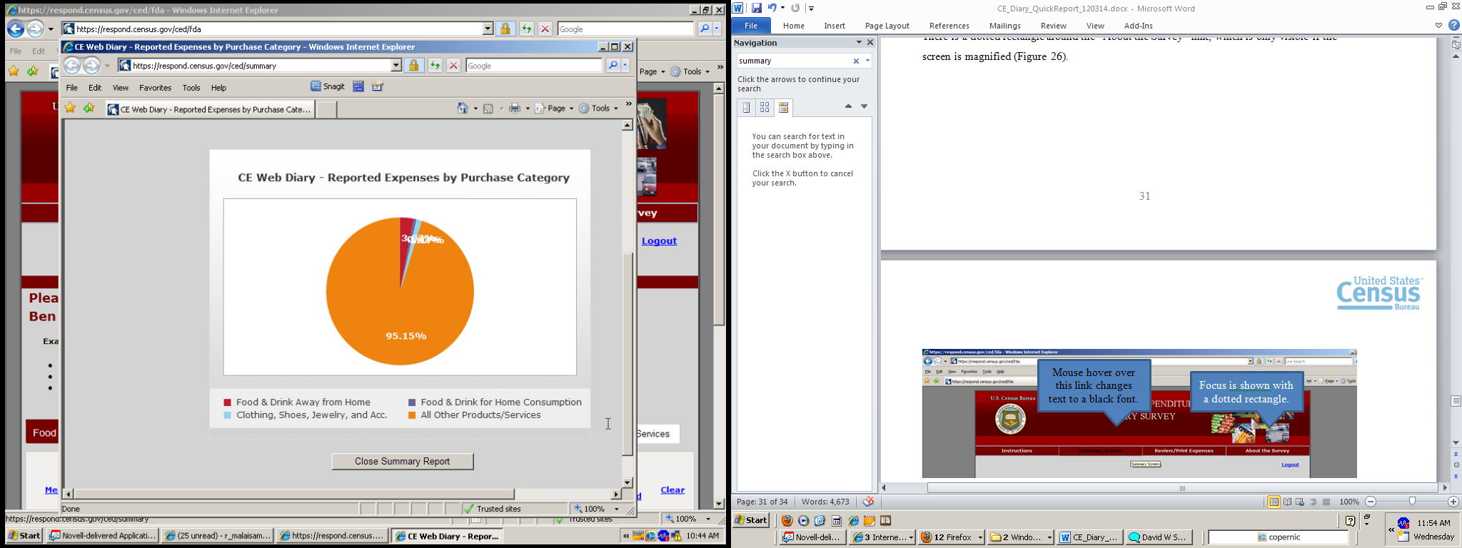


Figure 4: The Summary Screen labels cannot be differentiated and/or read.
Recommendation: Use a black or dark font for the pie chart labels. In addition, program the pie-chart generator to have lines pointing to each slice with the labels displayed a set distance away from each other so that each label can be read (Figure 5). Each label should be at least in 12-point font, which is a Web standard. We recommend that they are also bolded for contrast and visibility.
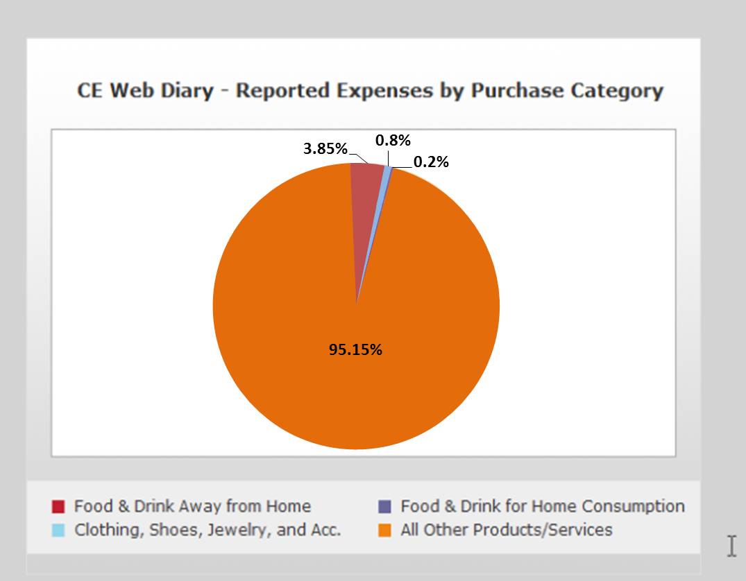
Figure 5: Recommended changes to the Summary Screen pie chart
3.4 Medium-Priority Issues
These problems causes some difficulty or confusion, but the test participant is able to successfully complete the task.
3.4.1 Over-reporting of alcohol& soda entered into “Total Alcohol Cost” column (Also, this column and the checkboxes may put too much emphasis on alcohol specifically)
Despite the instructions being read directly to them, 32 participants (76.19%) incorrectly entered the alcohol purchase, and one participant entered the soda from the roast beef sandwich item as alcohol by checking “other”. At least 15 participants over-reported the $20.00 bottle of wine purchased on Day 1 by Dan and Amanda Smith by including its cost in both the “Total Cost with tax and tip” column and the “Total Alcohol Cost” column.
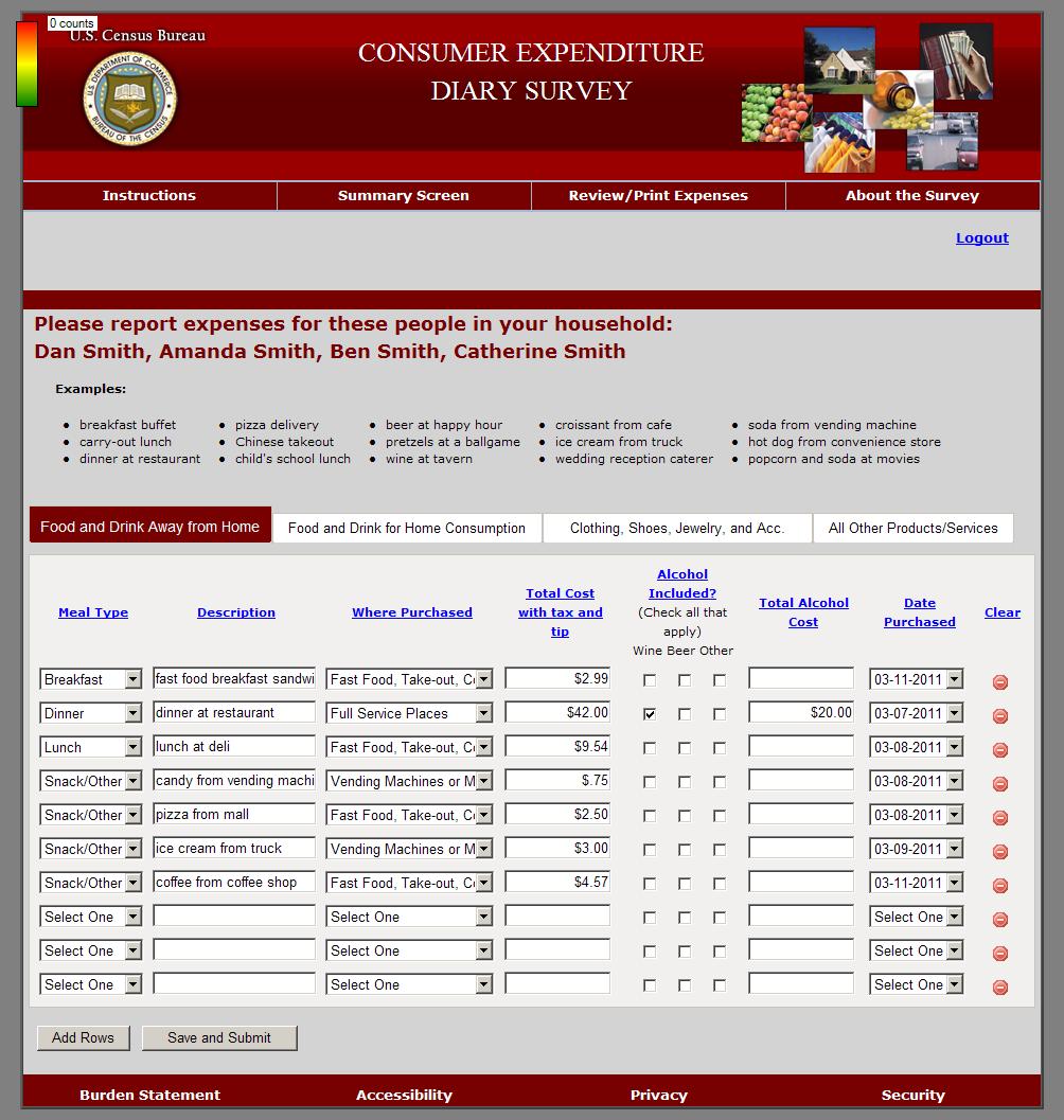
Figure 6: Correct Reporting of Alcohol with meal(P4)
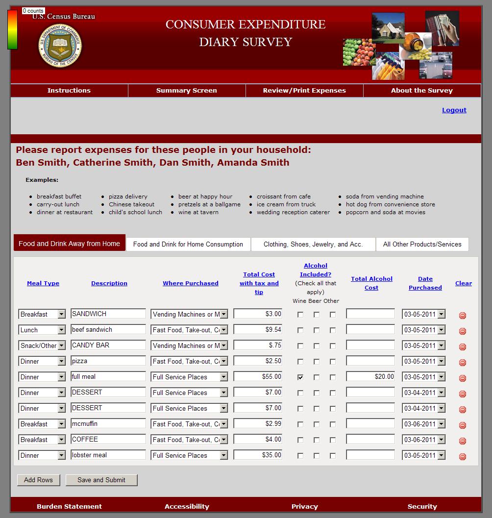
Figure 7: Over-reporting of alcohol with meal (P2)
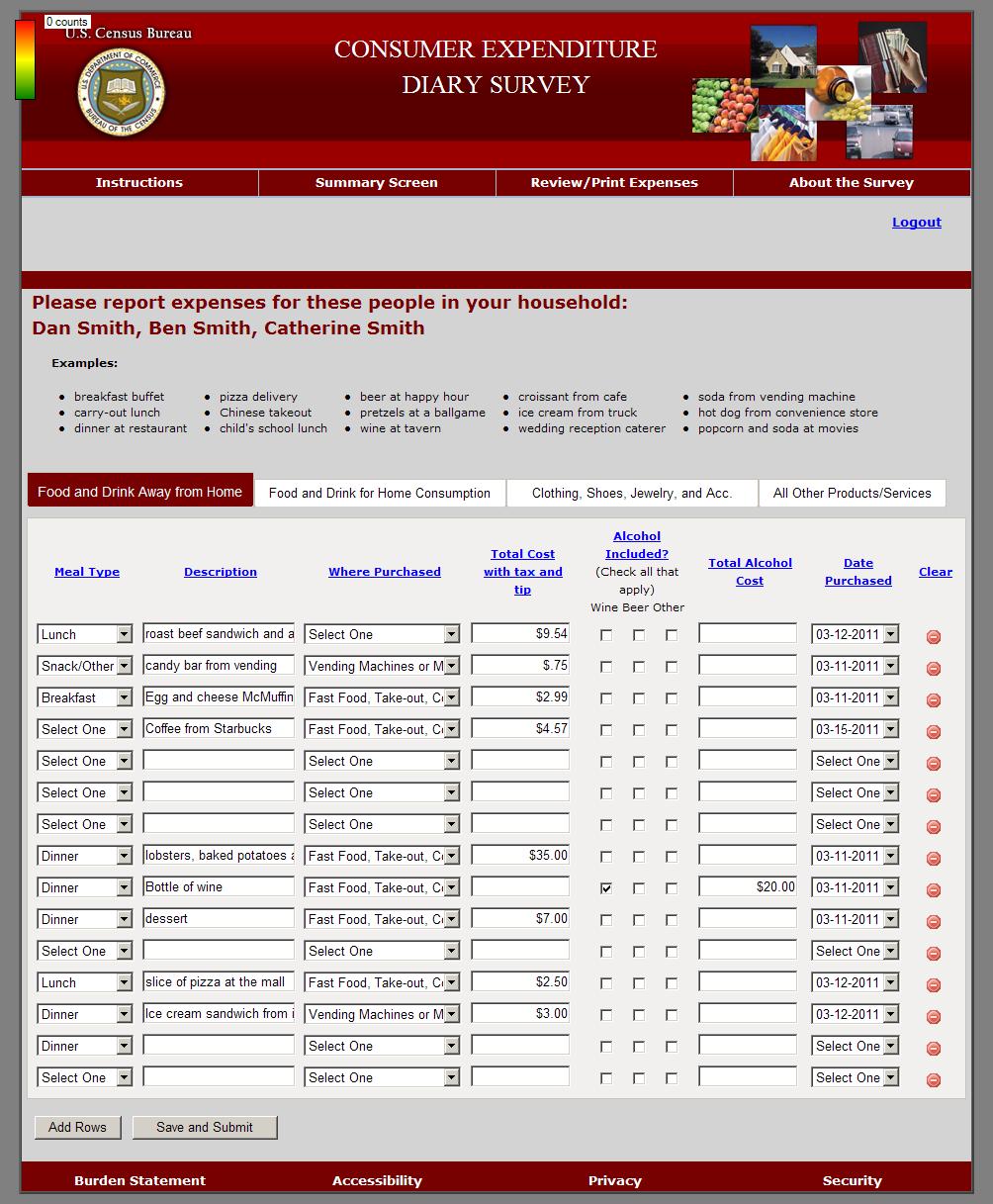
Figure 8: Correct reporting of alcohol itemized
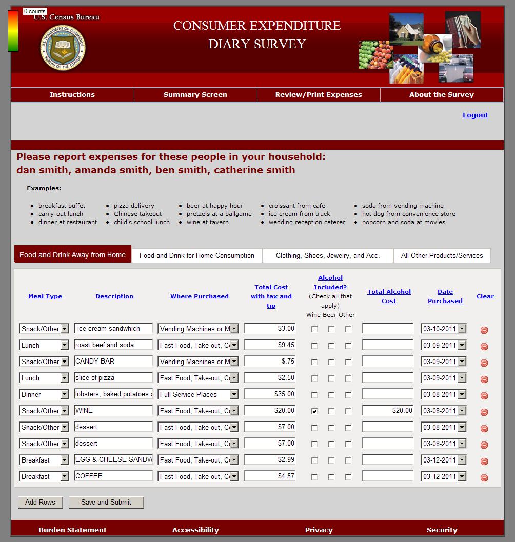
Figure 9: Over-reporting of alcohol itemized (P5)
Some participants included the soda from Ben Smith’s “roast beef sandwich and soda” expense under the “Total Cost for Alcohol” column.
Recommendation: Put less visual emphasis on the Alcohol portion of the data entry screen. Layout suggestions are forthcoming in the final report.
3.4.2 Stuffed Animals and Health and Beauty Aids
Several (4) participants classified the Stuffed animals under the clothing and accessories category and many others pondered doing so. Still others were not sure where to put the men’s deodorant. One participant had serious doubts about the classification of the deodorant. "I feel like I've made a mistake."
Participant 17 entered the stuffed animal under clothing. For task 2, he first looked under “Other” when going to change the dollar amount. Next, he checked the clothing section, saw it, and said, “Oh, I was dumb. I entered it in the wrong category. I would have changed it anyway” and used the clear button to delete it from “Clothing” andre-entered it under “Other,” this time using the pre-fill he did not use the first time.
Recommendation: Perhaps there needs to be a Health and Beauty Aids general example for the Other category. Also, add “Stuffed Animals” to the list of examples there.
3.4.3 The Account Creation Page does not function correctly in Mozilla Firefox.
The Account Creation Page went from the Account Creation Page to the login screen with the time-out error message at the top when we attempted to create an account using Firefox. The latest we observed this happening was 3/15/2012. It functioned correctly in using Microsoft Internet Explorer.
Recommendation: Make sure that the programming works across all of the top 5 or 10 most popular browsers, especially Firefox, before it is released.
3.4.4 No way to specify which family members purchased which items
Although the participants were required to complete a roster for their vignette household members, no drop-down list was provided to select which family members purchased what items.
If the diary requires that a roster of household members be created, it is only logical that household members are then somehow linked to their purchases. Several participants looked for a way to specify which family member made which purchases and then commented that they either could not find the way or that there should be one.
About half (19) of the participants commented that they were looking for a place to specify which family member made each purchase. For instance, one participant said, “I can’t really tell so much if it’s going to be Amanda or Dan [lobster dinners].”Some asked the Test Administrator whether such an option for specification existed after unsuccessfully searching for it, at which point they were told (reminded really– it was in the FR talking points) that the list of names at the top of the screen was a reminder for whom to keep in mind when completing the CE Diary.
Recommendation: We recommend testing two main options for resolving this issue. 1) Remove the roster all together. The reminder to include everyone in the household (“economic unit”) can be reinforced in the FR talking points (See the suggested revised FR talking points in Appendix A) and on the instrument itself. 2) Test a way to specify family members at the item entry level, such as a drop-down menu based on the names entered on the roster screen.
3.4.5 Level of specificity is unclear
“It doesn’t ask me how much Pepsi, like a 6-pack.” Bread. How much bread? How many loaves? Case of soda or one can? For the wine, even though he entered it under “Food and drink away from home,” one participant wrote “wine away from home” for the wine that Amanda Smith purchased because, as he said, “I don’t think Amanda is drinking it in the car.” He did not think there was enough specification in the dropdown options for the intended consumption of the item.
3.4.6 Prefills/Predictive Text are outdated, unnecessary, and satisficing may lead to incorrect or inaccurate, or answers – participants sometimes selected “ice cream product” or “orange drink”
The prefills that come up as suggestions for entries into the “Description” field are outdated and can lead to inaccurate answers. Participants did not use the prefills for the most part and preferred to type their own answers. One participant commented that “By the time the right thing comes up on the list, I’ve already typed the whole word anyway, which defeats the purpose.”
The participants do not need to know the coding categories that NPC uses to code the data. P25 and a few other participants commented that “COMPUTER GAME CARTRIDGES” (Figure 16)is an outdated term and that video games have not come on cartridges for quite a while, except for some handheld exceptions.
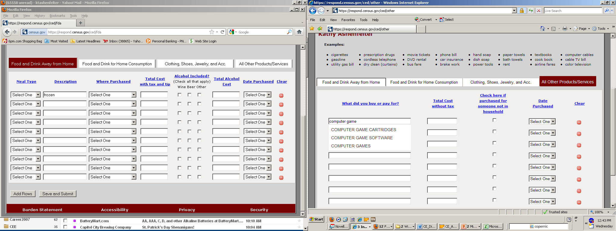
Figure 10: COMPUTER GAME CARTIDGES Prefill
Figure 17 shows that ORANGE DRINK and ORANGE PASSION come up when “orange is entered into the Food and Drink for Home Consumption tab. ORANGE JUICE does not come up until almost the whole phrase is entered.
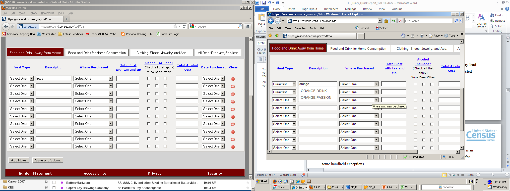
Figure 11: ORANGE DRINK and ORANGE PASSION
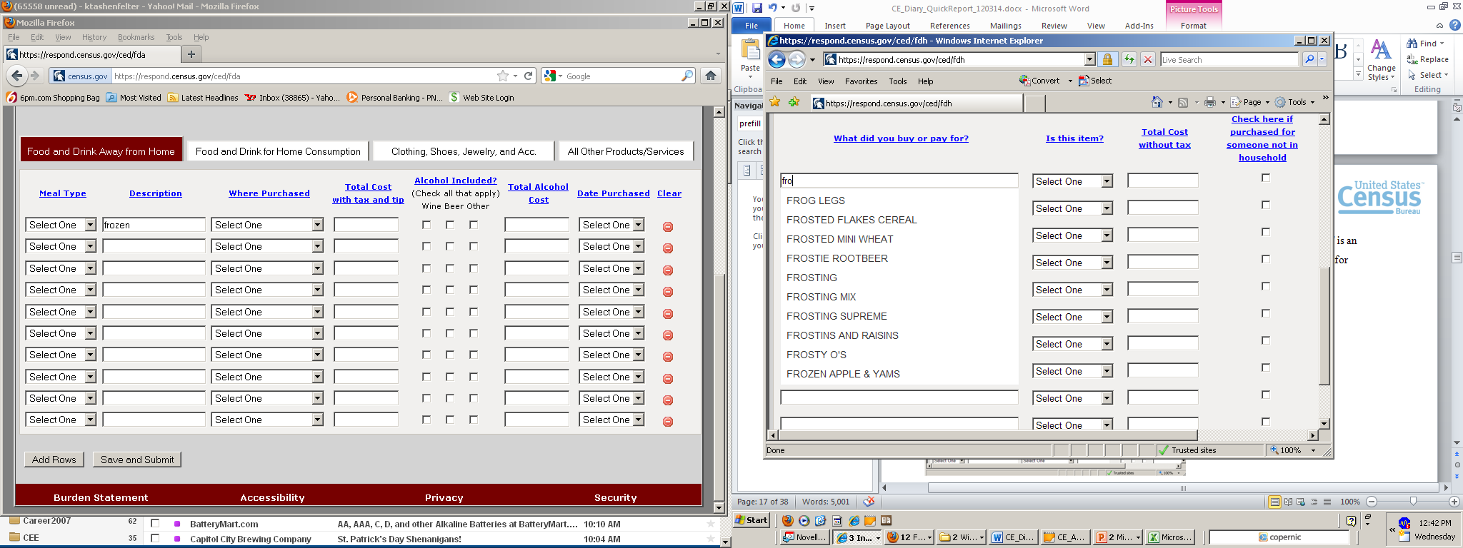
Figure 18 shows that “FROG LEGS” is the first option to come up in the Prefill list when “Fro” is entered, and not a much more frequently used word like “Frozen.” The first phrases starting with “Frozen” is “FROZEN APPLES AND YAMS,” which is not something that someone would enter in 2012.
3.4.7 All of the actions required by the R are “below the fold” – not visible when the screen initially loads (and it jumps back to the top of the page when moving from tab to tab)
When the first data entry screen loads on the Consumer Expenditure Diary Survey, the data entry fields for the diary itself are not even visible. Participants in Round 1 usability testing sometimes expressed confusion over what to do first because there are no clear actions that they can take to enter data when they get to this screen. Three participants commented negatively about the data entry page starting below the fold (when a tab is clicked or after the roster screen is completed).
There are many ways that the top portion of this screen could be reduced. First, the reddish burgundy banner at the very top of the page is unnecessarily wide. The title of the survey only takes about half of the space. The six images in the right-hand corner of the screen seem to be the only reason this banner is so wide (Figure XX). These images, starting at the upper-left and moving clockwise, depict a house [presumably representing a mortgage payment – Other], a wallet with cash showing, cars [Other], clothing [Clothing, Jewelry, and Accessories], produce [Food and Drink for Home Consumption], and pills/medications in the center [Other]. There are no images that represent the first category that appears to respondents when they open the diary – Food and Drink Away from Home.
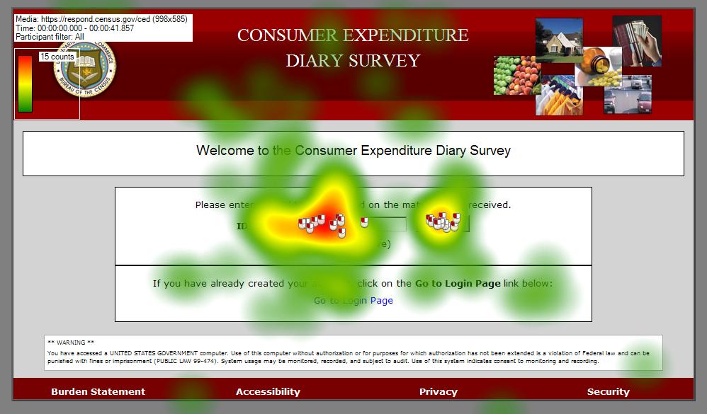
Figure 13: Set of 6 images from the upper-right corner Instrument
Although these images are the only images on the page and are the most colorful feature, participants do not look at these images on any of the pages. We provide heatmaps as evidence that these images can be eliminated or consolidated.
The heatmaps also show that the list of examples in the header of the four categories is also likely unnecessary. The terms used are outdated and tended not to be read by participants.
Figure 7 shows the first screen that participants saw, the ID Entry page, and a heatmap indicating the pattern of eye fixations that were distributed on the screen. The areas in red received the most eye fixations (i.e., active attention) and the green areas received the least fixations. Figure 7 shows that participants did not attend to the images even though this was the first time they saw they page and were exploring the content in order to proceed.

Figure 14: ID Entry Screen (n=15)
Figure 8 shows a gaze opacity version of the same heatmap of the ID Entry page, which shows the areas that received the most attention in white and the areas that were not looked at in black. The images do not appear in the white areas, meaning participants did not look at them.
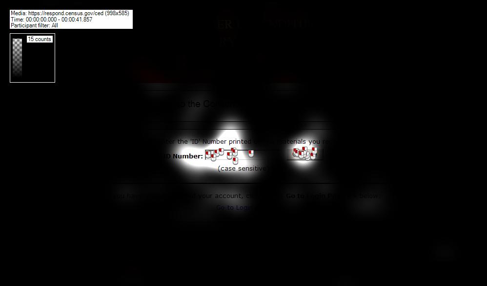
Figure 15: Gaze Opacity Plot of the the ID entry page (n=23)
Figure 9 shows a gaze opacity plot for the account creation page, which is the next screen of the CE Diary that participants saw. They still did not look at the images (or anything else in the header).
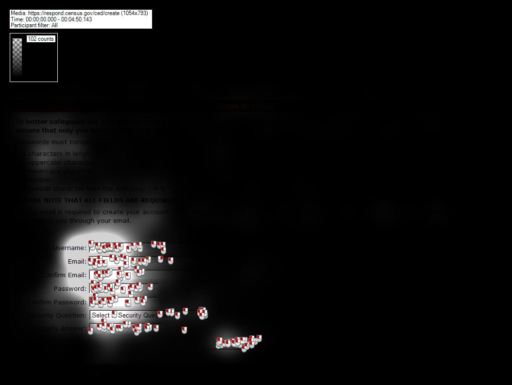
Figure 16: Gaze Opacity Plot for the Account Creation Page (n=23)
Figure 10 displays the gaze opacity plot for the Login screen, which the participants saw after they verified their account information through a link in an email they received from the Census Bureau. They still did not look at the images.

Figure 17: Gaze Opacity Plot for the Login screen (n=23)
Figure 11 provides a gaze opacity plot for the Food and Drink Away from Home data entry page, which is the first page that appears after the participant enters the roster information and begins the survey diary. In addition to not looking at the images, the participants also did not attend much to the list of examples above the data entry fields. These did not seem to provide a significant amount of information to participants and could be removed.
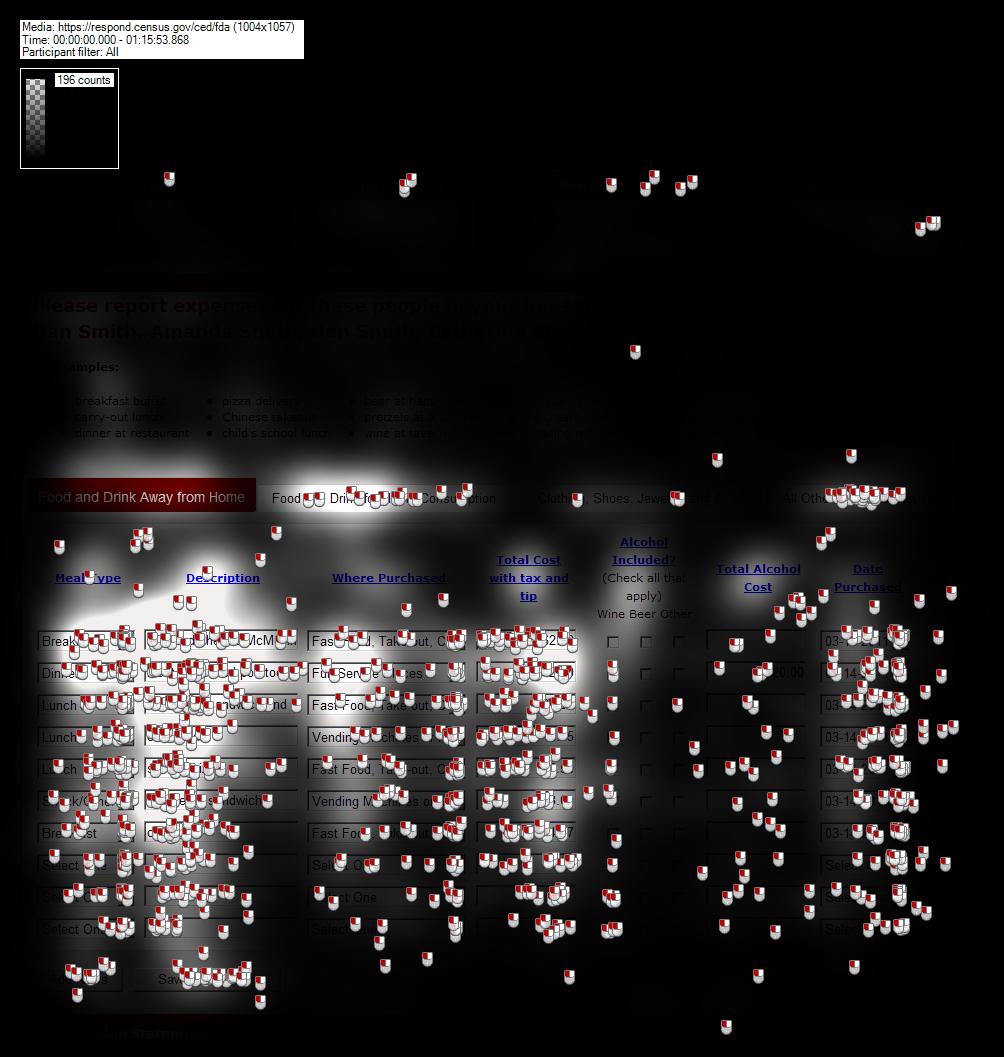
Figure 18: Gaze Opacity Plot for the Food and Drink Away from Home data entry page (n=23)
Figure 12 shows a gaze opacity plot for the Food and Drink for Home Consumption page. Again, participants did not look at the images and did not actively attend to the list of examples in the header above the text entry fields.
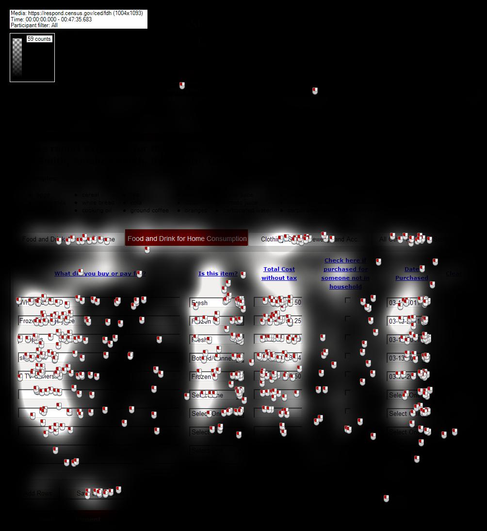
Figure 19: Gaze Opacity Plot for the Food and Drink for Home Consumption Page (n=23)
Figure 13 displays a gaze opacity plot for the Clothing, Jewelry, and Accessories page. Since there were only two items that fit this category for this round of usability testing, participants only fixated upon and clicked on the first few data entry fields. They did not attend to the images in the upper-right-hand corner of the screen, nor did they look at the list of examples very many times. One participant did comment that she was reading the examples to see if stuffed animals were listed here; stuffed animals were not listed there, so she commented that the list of examples was not helpful.
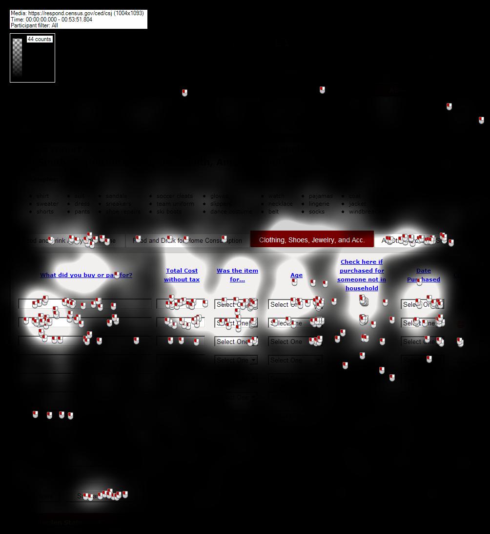
Figure 20: Gaze Opacity Plot for the Clothing, Jewelry, and Accessories Page
Figure 14 provides a gaze opacity plot for the Other Purchases page. Participants did not attend to the images in the upper-right-hand corner of the screen, nor did they look at the list of examples very many times.
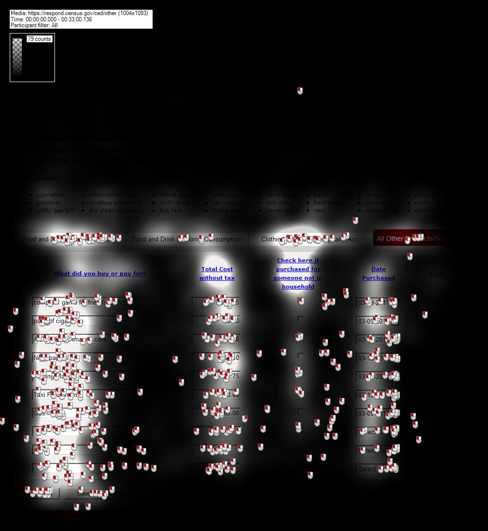
Figure 21: Gaze Opacity Plot for the Other Purchase Page
Recommendation: We recommend getting rid of the pictures in the header, since the Web design is part of the outdated look and feel on which many participants commented. The banner can be trimmed down a great deal once the pictures are removed. If a picture must be kept here, we recommend keeping only one and making it the more generalizable wallet picture. An even better option would be to have the instructional video that we recommend elsewhere in this report available to the R in this location.
Another reason that the top section of page takes up too much space is that the gray bar between the header at the top of the page and the roster section is extremely wide, although it only contains one “Logout” link (Figure 15).
Recommendation: This entire section could be eliminated and the “Logout” link could be moved next to the “About the Survey” link.
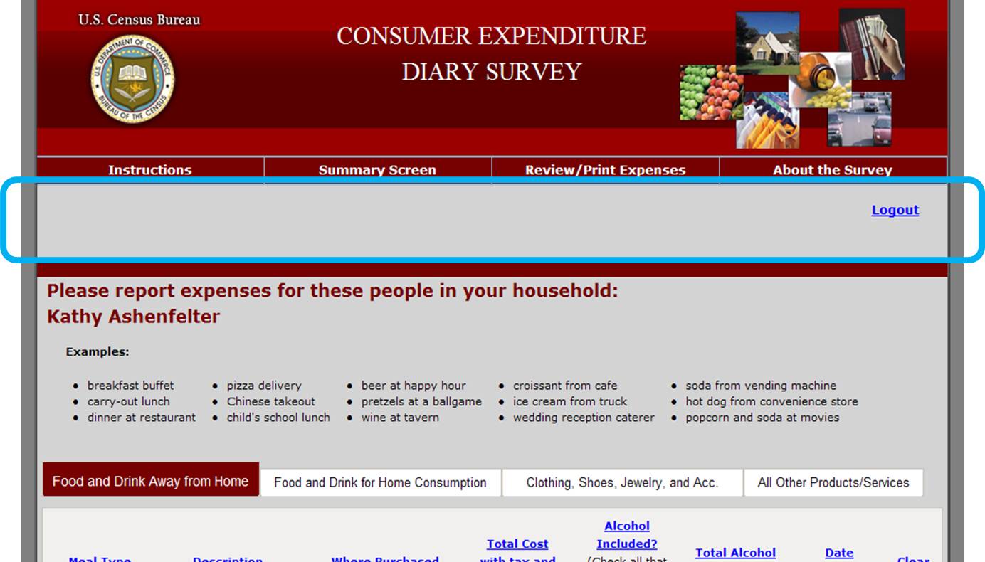
Figure 22: Wasted space between the header and the roster and examples section
3.4.8 The name of the Survey Diary is overly complex
The name “Consumer Expenditure Survey Diary” is unnecessarily long and confusing for that data it actually collects. One participant astutely pointed out that non-native English speakers might have a very hard time understanding what the survey is all about.
In order to demonstrate the difference in usage between “expenditure” and similar, simpler words like “purchase” and “cost,” a word frequency analysis was performed using the SUBTLEX database (Bysbaert & New, 2009). The SUBTLEX word frequency database was compiled on based on the frequency of occurrence in print of American subtitles (51 million total words). The data base provides a word’s frequency per million words. The word “consumer” versus “household” and “economic unit” was also analyzed.
The noun “expenditure” occurred 14 times per 1 million.
Word |
Freq/1 Million |
Word |
Freq/1 Million |
expenditure |
14 |
consumer |
106 |
purchase |
325 |
household |
354 |
expense |
380 |
economic |
253 |
cost1 |
2801 |
unit |
1845 |
“Expenditure”
is only used 14 times per million words, which makes it a rarely used
word.
Recommendation: We recommend testing a version of this survey diary with a title that utilizes simpler and more frequently used terminology. We suggestor “Household Expense Diary.” The R does not need to know that we use the term “economic unit” to describe the category that the Census Bureau is really looking to capture. The word “household” is used in the FR talking points and appears in the survey instrument repeatedly as well.
This recommendation for simpler terminology is in line with the Plain Language initiative that is being implemented across the Federal government and across the Census Bureau.
3.5 Low-Priority Issues
These problems cause minor annoyances but do not interfere with the flow of the tasks.
3.5.1 Summary Screen should say “Summary Graph”
The current label is not an adequate description of the content that pops up when the button is clicked.
Recommendation: Using the phrase “Summary Graph” gives the R a better idea of what can be found by clicking on the link.
3.5.2 The Review/Print Expenses button does not indicate that a PDF will be generated.
This lack of information violates Census IT Standard 15.0.2 and user expectations. There is nothing to indicate that a message asking Rs whether they want to save or open a PDF will pop up.
Recommendation: Change the button label to “PDF Expense Summary” or “Expense Summary Document (PDF). There also needs to be a link to an Adobe Reader somewhere on every screen where this button is shown. We recommend utilizing an intermediary screen between the data entry page and opening the PDF file where the R has the clear choice whether or not they want to open a PDF.
3.5.3 The screen jumps to the top of the page when “Add more Rows” is clicked at the bottom of the screen.
This is potentially very irritating for Rs, since they were just working at the very bottom of the screen when they clicked “Add more Rows.” Four participants commented negatively about the page jumping above the fold after adding rows
Recommendation: Program the screen stay stable and not jump to the top when “Add more Rows” is clicked.
3.5.4 The “Clear” buttons do not actually get rid of the row of data.
If the red “Clear” icon is clicked, the data values that were entered in the row are deleted, but an empty row of text entry fields remains. Some of the participants commented that they expected the entire row, including the text entry boxes, to be deleted when they clicked the “clear” button. 8 participants (19.05%) verbally expressed wishing the clear button would remove the blank row from the screen. The empty row carries over to the “Review/Print Expense” Tab, which produces a PDF with a blank row of data for each cleared row. One participant who saw this row produced on the PDF commented that the technology for the survey was “extremely dated” and that the blank row should have automatically been deleted before a PDF report was produced.
Recommendation: Have the rows actually disappear once they are cleared. Another recommendation suggests a warning message before data are deleted to prevent accidental data loss.
3.5.5 The “Clear” buttons do not line up with their corresponding columns.

Figure 23: The "Clear" icons and the corresponding data rows
3.5.6 The Census Bureau logo is a past version and not the current 2011 version.


Figure 24: Past Census Bureau Log from Round 1 Testing Figure 25: New Census Bureau logo
3.5.7 Lack of Updated Grocery Terms for current times
No “Organic” or “Green” terminology. Is milk “fresh” or “bottled?” If it is in a carton in the grocery store, it is not as fresh as from the farm, but it is not powdered or canned either. Is Wonder bread “fresh” or “Other.” What does “Other” mean?
Some Health and Beauty Aids (HBA) are also labeled “Fresh” because they contain fruit and vegetable ingredients.
Recommendation: Test at least one version of the survey diary that contains options for marking whether something is “organic” versus just “fresh.” We recommend adding three categories, “Organic fresh,” “Organic canned/bottled,” and “Organic other” for this test.
3.5.8 The layout appears outdated and overly “busy”
The layout of the page, as described by one participant was like a “Pre-2000 design” and “extremely outdated.” The large header and overall look and feel most likely contribute to this perception. There is also a great deal of information contained on each screen, much of it not used by participants (see the discussion of the eye-tracking results above). One participant said, “I can see it’s going to take a while just trying to navigate the pages.”
Recommendation: Get rid of all unnecessary content. Also, consider using a color scheme that is more pleasant for Rs. There is scientific evidence that blue is the most preferred color and generates the most positive emotional response (Schloss & Palmer, 2009).
3.5.9 Comments in Group 3 about lack of organization and need for “streamlining”
All of the participants in Group 3 made at least comment about the unorganized list of purchases being difficult to enter because there was not enough structure to that list. One participant in Group 3 said, “ There’s got to be a way to make entering this data a bit more streamlined.” He suggested having Rs organize purchases by day.
Recommendation: Test a version of the FR talking points that suggests that Rs organize their receipts by category to the best of their ability for easier data entry later.
3.5.1 Although the instructions in FR talking points say that the roster cannot be adjusted once it is complete, it can actually be altered if you use the browser “back” button.
Changes to the roster can be made if the R uses the browser “back” button during his or her first session in the CE Web Diary.
Recommendation: Another recommendation in the report suggests eliminating the roster, which is the most efficient solution. An alternative solution would be to make sure that the roster screen expires once the “next” button is clicked on that screen. On the data entry pages, the browser “back” button should lead back to an expired page notice, or be locked to prevent backing up to the roster screen.
3.6 Satisfaction Data
The average scores for satisfaction by question across all participants on a ten point scale appear in Table 1 below.
-
Question
Score
1-Overall Reaction
7.57
2-Overall Appearance
7.79
3-Terminology
8.42
4-Instructions Displayed
7.83
5-Ease of Movement
8.16
6-Knowing Where You Are
7.98
7-Organization
7.21
8-Forward Navigation
8.12
9-Overall Completing Diary
7.79
Table 1: Satisfaction Questionnaire Scores
Between groups, the satisfaction scores for Group 2 were significantly higher than the scores for both Group 1 and Group 3 (see Figure 26 below). There was no significant relationship between the average Satisfaction Questionnaire scores and the participants’ age, sex or education level.
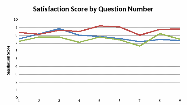
Figure 26: Satisfaction Scores Graph with Associated Means
4.0 Results from iPad testing
Two participants completed the CE Diary on an Apple iPad 2 before completing it on a desktop computer. It was very clear that the instrument was not optimized to be completed on mobile devices.
4.0.1 Auto-capitalization interferes with password entry
The first participant who completed the diary on the iPad had trouble logging into the instrument because the password entry fields were auto-capitalizing what he typed. Since the entry cannot be seen as the participant is typing (i.e., bullet dots are shown instead of the characters being typed for security reasons), he did not realize what the problem was until he tried it a few times.
4.0.2 Date entry is not in native language (Apple wheel)
The date selection fields and pre-fill suggestions are obviously not programmed to be used on a mobile device. They do not allow the iPad’s Apple wheel and other native features to be utilized. Since more and more people complete surveys on mobile devices in current times, it is important to optimize each Census Bureau survey for mobile completion, especially those that must be completed over several a longer period of time like the CE Diary. The survey diary completion should be as convenient as possible for Rs.
4.0.3 The data entry “Clear” icons do not line up with the rows – even more pronounced
The second participant who completed the survey on an iPad commented that he had trouble telling which “Clear” icon went with each row because they did not line up correctly.
More iPad results and eye-tracking results will be included in the final report.
5.0 High-Priority Accessibility Findings
5.0.1 The programmed tabbing order makes this screen inaccessible to screen-reader users.
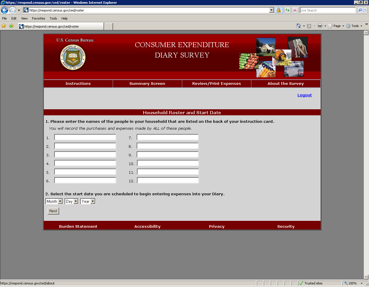
Since the tab order does not match the visual order as shown above in Figure 26, screen reader users never hear the instructions on how to enter names or details about the starting date prior to providing this data. This behavior violates 1194.22 paragraph N of the Section 508 regulation.
Figure 27: The tabbing order does not match the visual presentation.
Recommendation: Tag the question numbers as headers. Tab order should proceed through the top links, logout, 12 data-entry fields for names, followed by the month, day, and year drop-down box.
5.0.3 The checkboxes for the “Alcohol Included?” option are not labeled.
The labels beer, wine, or other, respectively, are not associated with the checkboxes below the “Alcohol Included?” header link (Figure 27). That is, Rs using screen readers will not hear the response options as it reads across the row. This implementation violates 1194.22 paragraph N of the Section 508 regulation.
Finding 1
Finding 2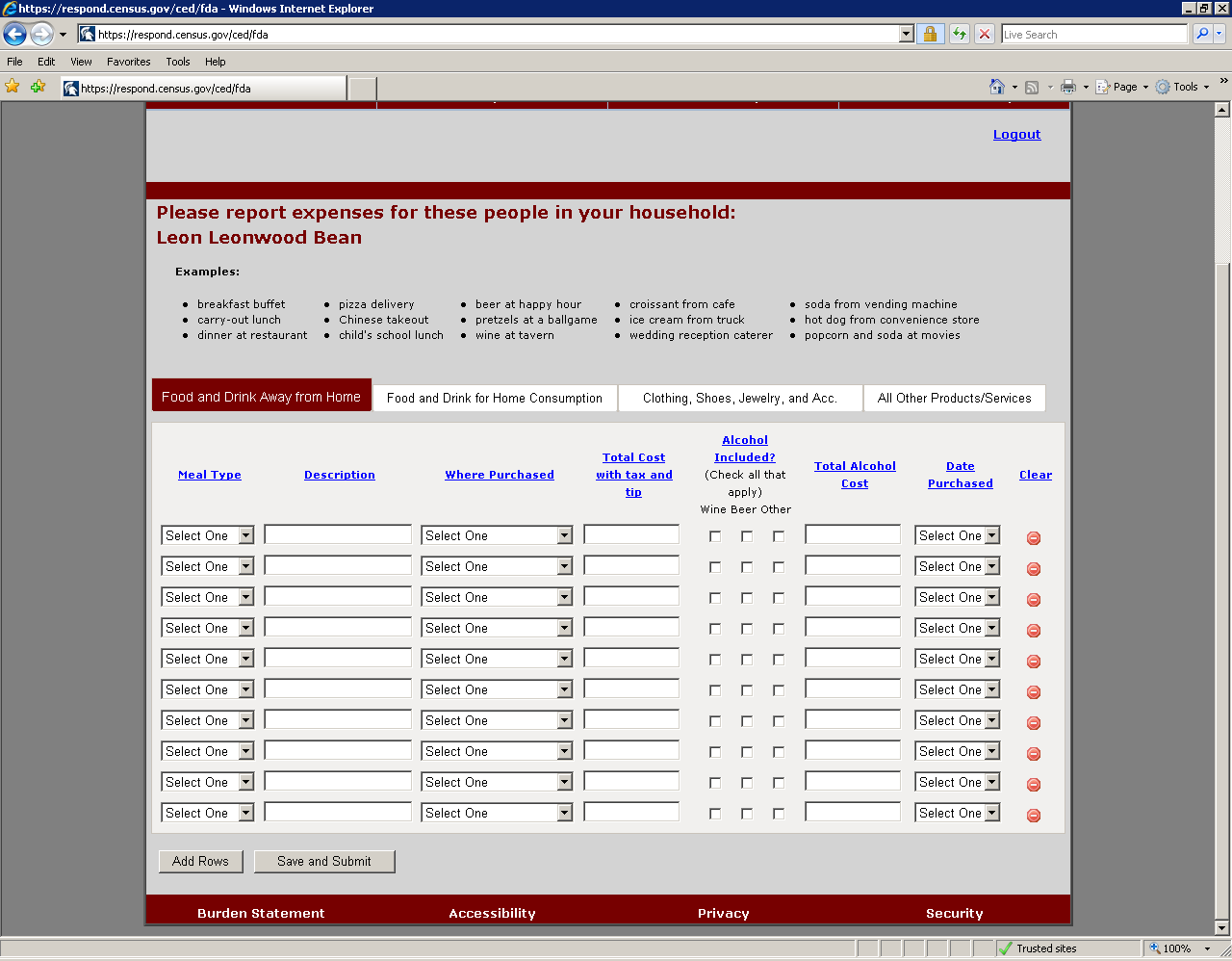


Figure 28: The “Food and Drink Away from Home” screen checkboxes are inaccessible.
Recommendation: The checkboxes do not need to have explicit labels, but they should be vocalized using title text matching the visible column headings of beer, wine, or other.
5.0.4 Screen-reader users are not informed of the presence of predictive text that appears after typing in the first three letters of a description.
A drop-down list appears below the data-entry field with suggested descriptions of food (Figure 28). The user can use arrow keys to select the correct item. This implementation violates 1194.22 paragraphs L and N of the section 508 regulation because the text is not vocalized by the screen-reader.
Finding 1
Finding 2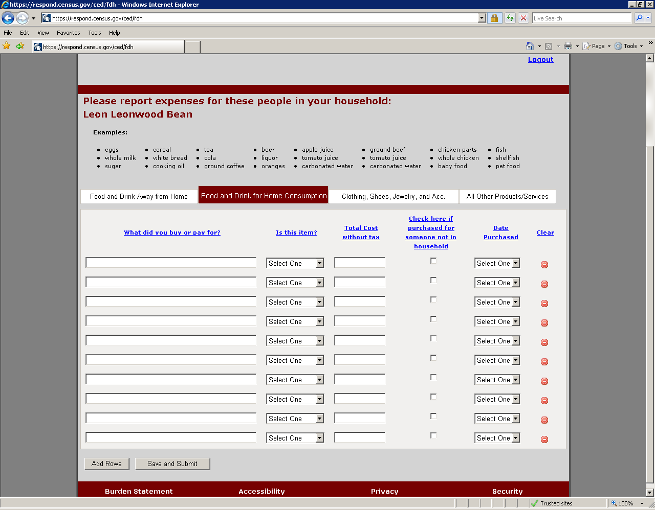
Figure 29: The “Food and Drink for Home Consumption” screen has two accessibility violations.
Recommendation: Associate title text with the Description data-entry field stating "key in the first 3 letters of your food item and press the down arrow until you hear the name of your item, then press enter to select it."
5.0.5 Screen-reader users are not informed about the predictive text that appears after typing in the first three letters of a description on the data entry pages.
A drop-down list appears below the data-entry field with suggested descriptions of the item that was bought or paid for. The user can use arrow keys to select the correct item. This implementation violates 1194.22 paragraphs L and N of the section 508 regulation because the text is not vocalized by the screen-reader.
Recommendation: We recommend removing the predictive text all together. If it is kept, associate title text with the “What did you buy or pay for?” data-entry field stating "key in the first 3 letters of your food item and press the down arrow until you hear the name of your item, then press enter to select it."
5.0.6 The checkbox for the “Check here if purchased for someone not in household” is not labeled on the Clothing, Jewelry, and Accessories and Other data entry pages.
When a screen-reader user tabs to the checkbox all they hear is “checkbox not checked” (Figure 29). This implementation violates 1194.22 paragraph N of the Section 508 regulation.
Finding 1
Finding 2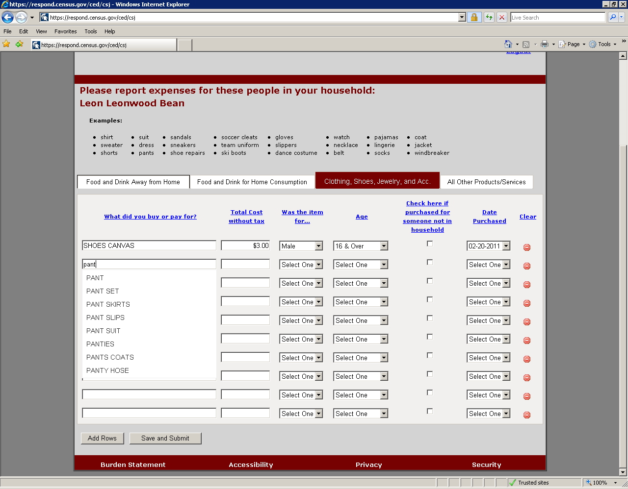
Figure 30: The “Clothing, Shoes, Jewelry and Accessories” screen has two accessibility violations.
Recommendation: The checkboxes do not need to have explicit labels, but they should be vocalized using the header link text.
5.0.7 Screen-reader users are not informed about the predictive text that appears after typing in the first three letters of a description of apparel purchased.
A drop-down list appears below the data-entry field with suggested descriptions of apparel. The user can use arrow keys to select the correct item. This implementation violates 1194.22 paragraphs L and N of the section 508 regulation because the text is not vocalized by the screen-reader.
Recommendation: Associate title text with the “What did you buy or pay for?” data-entry field stating "key in the first 3 letters of your purchased item and press the down arrow until you hear the name of your item, then press enter to select it."
5.0.8 The table corresponding to the first category of expenses is not tagged as a table.
Screen reader users cannot access this table, “Food and Drinks Away From Home.”, which reads as plain text, from left to right, and top to bottom (Figure 30). Tables 2-4 are accessible for the other CED topics: Food and Drinks for Home Consumption; Clothes, Shoes, Jewelry, and Accessories; and All Other Products, Services, and Expenses. This lack of access violates 1194.22 paragraph G of the section 508 regulation, which describes proper markup of tables.
Finding 1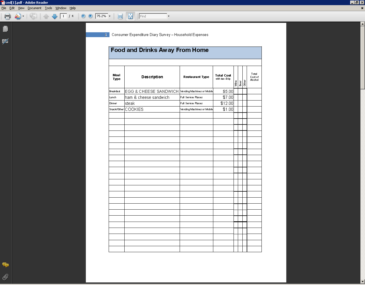
Figure 31: The Review/Print Expenses button generates one table that is incorrectly formatted.
Recommendation: Examine the table markup code used for tables 2-4 and apply it to table 1 to make it accessible.
5.0.9 Sighted users cannot see the current focus when using the tab key.
There is a dotted rectangle around the “About the Survey” link, which is only visible if the screen is magnified (Figure 31).
Focus is shown with a dotted rectangle.
Mouse hover over this link changes text to a black font.
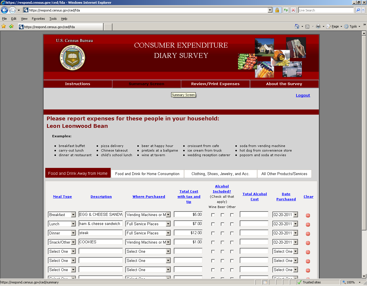
Figure 32: The display of the current focus needs improvement.
Recommendation: WebAim (webaim.org) recommends that the keyboard focus style and the mouse hover style be identical for better visibility of the current focus. This means as the user is tabbing through the links, the white text should turn black.
References
Ashenfelter, K.T., Holland, T, Quach, V., Nichols, E., and Lakhe, S. (2011). ACS Internet 2011 Project: Report for Rounds 1 and 2 of ACS Wireframe Usability Testing and Round 1 of ACS Internet Experiment. Center for Statistical Research & Methodology Study Series (Survey Methodology #2012-01). U.S. Census Bureau. Available online at <http://www.census.gov/srd/papers/pdf/ssm2012-01.pdf>.
Ashenfelter, K.T., Holland, T, Quach, V., and Nichols, E. (2011). Final Report for Rounds 1 and 2 of Usability Testing of the 2010 Census Quality Survey Online Instrument in Conjunction with the 2010 Decennial Census.Center for Survey Measurement, Research and Methodology Directorate (Survey Methodology #2011-08). U.S. Census Bureau. Available online at <http://www.census.gov/srd/papers/pdf/ssm2011-08.pdf>.
Brysbaert, M. and New, B. (2009). Moving beyond Kučera and Francis: A critical evaluation of current word frequency norms and the introduction of a new and improved word frequency measure for American English.Behavior Research Methods, 41(4), 977-990.
Schloss, K. B. and Palmer, S. E. (2009). An Ecological Valence Theory of Human Color Preferences. Journal of Vision, 9 (8), pg. 2663-2668.
Appendix A: Recommended Revisions to FR Talking Points
Hello, my name is _________. You have been selected to participate in the CE Web Diary Survey. The diary helps us learn about the buying habits of people in the United States. People who complete the diary helps us understand more about the products and services that are bought by people in this country.
Your first login to the CE Web Diary requires a unique secure ID Number that is assigned to each household in our study.
Your ID number is: _____________. The start date for you to enter expenses is _________________, and the time period for the diary will continue for two weeks.
After creating your account, you will receive an email from the Centurion Electronic Data Collection System that will provide a link for you to click on to verify your CE Web Diary account. The email will also contain a short video containing instructions for how to complete the diary.
For two weeks, please record of all of the expenses for everyone in your household. Please enter all of the purchases and anything else that your household spent money on, like bills, contributions, auto-payments, or anything else you can think of. Remember to include expenses for all members of your household, which is anyone that usually lives or stays here.
Please keep the letter that I have given you for your records because you will need your ID number and start date to access the online survey. Do you have any questions?
Appendix B: Introductory Protocol
Date_______________________; Participant #________; Researcher: _______________
General Introduction: Consumer Expenditure Diary Instrument
Thank you for your time today. My name is XX and I work here with the Human Factors and Usability group. I will be working with you today. If you have a cell phone, please turn it off or put it on vibrate. We will be evaluating the design of the online Consumer Expenditure Diary Survey by having you interact with it. The diary helps us learn about the buying habits of people in the United States. People who complete the diary helps us understand more about the products and services that are bought by people in this country. Your experience with the survey is an essential part of our work. I did not create the diary, so please feel free to share both your positive and negative reactions to it. We are not evaluating you or your skills. Rather, you are helping us see how well the survey works. The entire session should last about an hour. Your comments and feedback will be used to improve the online diary.
First, I would like to ask you to read and sign this consent form (Attachment B).
Hand the participant the consent form; give time to read and sign; sign your own name and date it if you have not already done so.
It explains the purpose of today’s session and informs you of your rights as a participant. It also tells you that we would like to videotape the session, with your permission. Only those of us connected with the project will review the tape and any other data collected during the session, and the information will be used solely for research purposes. We may use clips from the tape to illustrate key points about the survey to the online diary design team. In addition, observers from the project team may observe this session in another room.
I would like you to tell me your impressions and thoughts about the diary screens as you look at them. In other words, I would like you to ``think aloud'' and talk to me about your impressions. If anything was confusing on the screen, please let me know. If you expect to see some item of information let me know if you see it or not.
Pull up www.wtop.com in Firefox.
Before we get started, let's practice thinking aloud, since it's not something that you would normally do while working online. Pretend that you have a minute or two to kill at your desk at work or at home and talk me through your thought process as you try to find something interesting to read on this news site.
Ok, that’s exactly what I would like for you to do throughout the session. If at any time during the session you get quiet, I may remind you to talk to me. This is not to interrupt your thought process, but simply to remind you to keep talking to me. Please focus on verbalizing what you are thinking as you complete the survey.
While you are completing the diary, we will record the movements of your eyes with our eye-tracking monitor to get a record of where you are looking on the screen.
Now I am going to calibrate your eyes for the eye-tracking.
Now that we have your eyes calibrated, we are ready to begin. Please respond to the survey online as you would at home.
Please imagine that you received this packet from me, a Census Bureau field representative, at your home. Please use the training and the packet materials to access the online Consumer Expenditure diary. I will tell you when to begin the tasks, which are printed on the sheets of paper on the left-hand side of your desk. Please be sure to take a moment to read the training handout (Attachment C) on how to use the diary.
First, you will need to log into the system using the information provided in the handout. You will need access to an email account to complete the login process. You may use your own email account, or you may use an account created by our team for this study. Please let me know which option you prefer.
Pull up Internet Explorer.
If they choose the lab account, it is cediary@yahoo.com and the password is census.
Please complete the login process and remember to think aloud as you proceed.
I am going to go around to the other room to do a sound check. While I am doing that, please take a moment to complete this questionnaire. [Hand Participant questionnaire on Computer experience and demographics (Attachment D)]
I’m going to leave but we will still be able to communicate through a series of microphones and speakers. Do you have any questions before we begin?
Leave room. Once in control room do a sound check and start the eye-tracking software: Tobii Studio.
Allow the participant to proceed through the entire instrument without probing. You may answer their questions if they have trouble, but hold all probes until debriefing.
Appendix C: Consent Form
Consent Form

Usability Study of the Consumer Expenditure Diary
Each year, the Census Bureau conducts many different usability evaluations. For example, the Census Bureau routinely tests the wording, layout and behavior of products, such as Web sites, online surveys, and letters sent through the mail in order to obtain the best information possible from respondents.
You have volunteered to take part in a study to improve the usability of the Consumer Expenditure Diary. In order to have a complete record of your comments, your usability session will be videotaped. We plan to use the tapes to improve the design of the product. Staff directly involved in the usable design research project will have access to the tapes. We also plan to perform an eye-tracking analysis of your session. Your participation is voluntary and your answers will remain strictly confidential.
This usability study is being conducted under the authority of Title 13 USC. The OMB
control number for this study is 0607-0725. This valid approval number legally certifies this information collection.
I have volunteered to participate in this Census Bureau usability study, and I give permission for my tapes to be used for the purposes stated above.
Participants Name: ___________________________________
Participants Signature:________________________ Date:________________
Researcher’s Name:___________________________
Researcher’s Signature:_________________________Date:_________________
Appendix D: Participant Instructions and Data Lists
Participant
Instructions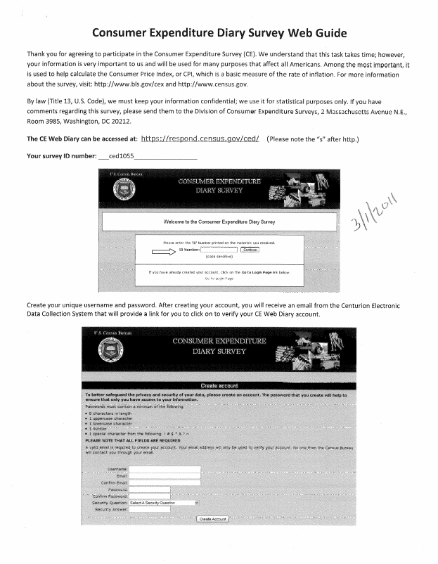
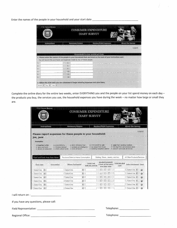
Group 1 Purchase/Task List:
Task 1
The members of your household are Dan Smith, Amanda Smith, Ben Smith, and Catherine Smith. You are either Dan or Amanda.
Each member of the family gave you their receipts and lists of purchases for the past two weeks. Enter all the following purchases into the Consumer Expenditure online diary. Please remember to ‘think aloud’ as you work through this task.
On Day 5, Dan Smith purchased:
Newspaper $1.50
Fishing Magazine $3.75
Egg and cheese McMuffin from McDonald’s for breakfast for $2.99 (including tax)
Coffee from Starbucks for $4.00 (including tax)
Taxi Fare and tip $20.00
Sneakers for his 6 year old niece $29.99
Sweatshirt for 18 year old nephew $25.99
On Day 1, Dan and Amanda Smith went out to dinner. They each spent:
$35 on lobsters, baked potatoes and green beans. (including tax and tip)
$20 on a bottle of wine. (including tax)
$7 on dessert. (including tax)
Dan alone spent:
$65.43 on gas for their car (including tax)
On Day 2, Ben Smith purchased:
Computer game for friend’s birthday present, $50.85
Roast beef sandwich and a soda from a deli for lunch for $9.54 (including tax)
Candy bar from vending machine for $0.75 (including tax)
A slice of pizza at the mall for $2.50 (including tax)
A pack of cigarettes $6.00 (excluding tax)
On Day 3, Catherine Smith purchased:
Stuffed animal for $15.99
Ice cream sandwich from ice cream truck $3.00
A DVD from Amazon.com for $15.76 (including tax)
Amanda Smith went grocery shopping on Day 4, and purchased:
White bread $12.50 (excluding tax)
Frozen orange juice $1.25 (excluding tax)
3 apples $1.99 (excluding tax)
Skim milk $3.34 (excluding tax)
5 TV dinners $10.50 (excluding tax)
Pepsi six-pack $3.99 (excluding tax)
Chicken wings, frozen $5.99
Men’s deodorant $2.99 (excluding tax)
Dan Smith paid the bills on Day 1, and made the following payments:
Mortgage payment $4,000
Health Insurance bill $375
Wrote a check for a church contribution $50.00
Task 2
After you finished entering all the purchases the Smith household made for the week, you review the entries to make sure you entered every entry listed, and the correct price.
As you are doing this, you notice that Catherine made a mistake on her list. The stuffed animal she purchased did not cost $15.99, it cost $25.99. Please make this correction now.
Remember to think aloud as you work.
Task 3
Ben Smith remembers that his friend actually purchased the computer game (and Ben did not). Please make this correction now.
Remember to think aloud as you work.
Task 4
Dan Smith notes that the coffee from Starbucks on [INSERT DATE] actually cost $4.57. Please make this correction now.
Task 5
Please submit your data for the week.
Group 2 Purchase/Task List:
Task 1
The members of your household are Dan Smith, Amanda Smith, Ben Smith, and Catherine Smith. You are either Dan or Amanda.
Each member of the family gave you their receipts and lists of purchases for the past two weeks. Enter all the following purchases into the Consumer Expenditure online diary. Please remember to ‘think aloud’ as you work through this task.
Food and Drink Away from Home
Ice cream sandwich from ice cream truck $3.00 purchased by Catherine Smith on Day 3.
Roast beef sandwich and a soda from a deli for lunch for $9.54 (including tax) purchased by Ben Smith on Day 2.
Candy bar from vending machine for $0.75 (including tax) purchased by Ben Smith on Day 2.
A slice of pizza at the mall for $2.50 (including tax) purchased by Ben Smith on Day 2.
$35 on lobsters, baked potatoes and green beans. (including tax and tip) purchased by Dan Smith on Day 1.
$35 on lobsters, baked potatoes and green beans (including tax and tip) purchased by Amanda Smith on Day 1.
$20 on a bottle of wine. (including tax) purchased by Dan and Amanda Smith on Day 1.
$7 on dessert. (including tax) purchased by Dan Smith on Day 1.
$7 on dessert (including tax) purchased by Amanda Smith on Day 1.
Egg and cheese McMuffin from McDonald’s for breakfast for $2.99 (including tax) purchased by Dan Smith on Day 5.
Coffee from Starbucks for $4.00 (including tax) purchased by Dan Smith on Day 5.
Food and Drink for Home Consumption
White bread purchased by Amanda Smith on Day 4for $12.50 (excluding tax)
Frozen orange juice purchased by Amanda Smith on Day 4for $1.25 (excluding tax)
3 apples purchased by Amanda Smith on Day 4 for $1.99 (excluding tax)
Skim milk purchased by Amanda Smith on Day 4 for $3.34 (excluding tax)
5 TV dinners purchased by Amanda Smith on Day 4 for $10.50
Clothing, Shoes, Jewelry, and Accessories
Sneakers purchased by Dan Smith on Day 5 for his 6 year old niece for $29.99
Sweatshirt purchased by Dan Smith on Day 5 for 18 year old nephew for $25.99
All Other Products/Services
Newspaper purchased by Dan Smith on Day 5 for $1.50
Fishing magazine purchased by Dan Smith on Day 5 for $3.75.
Computer game for friend’s birthday present, purchased by Ben Smith on Day 2 for $50.85
Stuffed animal purchased by Catherine Smith on Day 3 for $15.99
Taxi Fare and tip spent by Dan Smith on Day 5 for $20.00
Gas for the family car purchased by Dan Smith on Day 1 for $65.43
A pack of cigarettes purchased by Ben smith for $6.00 (excluding tax) on Day 2.
A DVD from Amazon.com purchased by Catherine Smith for $15.76 (including tax) on Day 3.
Men’s deodorant purchased by Catherine Smith for $2.99 (excluding tax) on Day 4.
A mortgage payment made by Dan Smith for $4,000.00 on Day 1.
A Health Insurance bill payment made by Dan Smith on Day 1 for $375.00
A church contribution payment made by Dan Smith on Day 1 for $50.00
Task 2
After you finished entering all the purchases the Smith household made for the week, you review the entries to make sure you entered every entry listed, and the correct price.
As you are doing this, you notice that Catherine made a mistake on her list. The stuffed animal she purchased did not cost $15.99, it cost $25.99. Please make this correction now.
Remember to think aloud as you work.
Task 3
Ben Smith remembers that his friend actually purchased the computer game (and Ben did not). Please make this correction now.
Remember to think aloud as you work.
Task 4
Dan Smith notes that the coffee from Starbucks on [INSERT DATE] actually cost $4.57. Please make this correction now.
Task 5
Please submit your data for the week.
Group 3 Purchase/Task List:
Task 1
The members of your household are Dan Smith, Amanda Smith, Ben Smith, and Catherine Smith. You are either Dan or Amanda.
Each member of the family gave you their receipts and lists of purchases for the past two weeks. Enter all the following purchases into the Consumer Expenditure online diary. Please remember to ‘think aloud’ as you work through this task.
Stuffed animal for $15.99 purchased by Catherine Smith on Day 3.
A church contribution payment made by Dan Smith on Day 1 for $50.00
Coffee from Starbucks for $4.00 (including tax) purchased by Dan Smith on Day 5.
Frozen orange juice $1.25 (excluding tax) purchased at grocery store by Amanda Smith on Day 4.
5 TV dinners $10.50 purchased at grocery store by Amanda Smith on Day 4.
$35 on lobsters, baked potatoes and green beans. (including tax and tip) purchased at restaurant by Dan Smith on Day 1.
$35 on lobsters, backed potatoes and green beans (including tax and tip) purchased at restaurant by Amanda Smith on Day 1.
Pepsi six-pack $3.99 (excluding tax) purchased by Amanda Smith on Day 4.
Chicken wings, frozen $5.99 (excluding tax) purchased by Amanda Smith on Day 4.
$1.50 for newspaper purchased by Dan Smith on Day 5.
Sneakers for Dan Smith’s 6 year old niece for $29.99 purchased by Dan on Day 5.
Men’s deodorant $2.99 (excluding tax) (excluding tax) purchased by Catherine Smith on Day 4.
A slice of pizza at the mall for $2.50 (including tax) on Day 2.
Ice cream sandwich for $3.00 purchased by Catherine Smith from ice cream truck on Day 3.
Fishing magazine purchased by Dan Smith on Day 5, for $3.75.
3 apples for $1.99 (excluding tax) purchased by Amanda Smith on Day 4.
Skim milk for $3.34 (excluding tax) purchased by Amanda Smith on Day 4.
Roast beef sandwich and a soda for $9.54 (including tax) purchased from a deli for lunch by Ben Smith on Day 2.
Computer game, $50.85 purchased for friend’s birthday present by Ben Smith on Day 2.
$7 on dessert. (including tax) purchased by Dan Smith at restaurant on Day 1.
$7 on dessert (including tax) purchased at restaurant by Amanda Smith on Day 1
A mortgage payment made by Dan Smith for $4,000.00 on Day 1.
$20 on a bottle of wine (including tax) purchased at restaurant by Amanda Smith on Day 1.
$20 on a bottle of wine (including tax) purchased by Dan Smith at restaurant on Day 1
Sweatshirt purchased by Dan Smith for $25.99 for an 18-year-old nephew on Day 5.
A Health Insurance bill payment made by Dan Smith on Day 1 for $375.00
Taxi Fare and tip for $20.00 spent by Dan Smith on Day 5.
Egg and cheese McMuffin from McDonald’s for breakfast for $2.99 (including tax) purchased by Dan Smith on Day 5.
A DVD from Amazon.com purchased by Amanda Smith for $15.76 (including tax) on Day 3.
Candy bar from vending machine for $0.75 (including tax) purchased by Ben Smith on Day 2.
Gas for the family car purchased by Dan Smith on Day 1 for $65.43
A pack of cigarettes purchased by Ben smith for $6.00 (excluding tax) on Day 2.
White bread purchased by Amanda Smith on Day 4 for $12.50 (excluding tax).
Task 2
After you finished entering all the purchases the Smith household made for the week, you review the entries to make sure you entered every entry listed, and the correct price.
As you are doing this, you notice that Catherine made a mistake on her list. The stuffed animal she purchased did not cost $15.99, it cost $25.99. Please make this correction now.
Remember to think aloud as you work.
Task 3
Ben Smith remembers that his friend actually purchased the computer game (and Ben did not). Please make this correction now.
Remember to think aloud as you work.
Task 4
Dan Smith notes that the coffee from Starbucks on [INSERT DATE] actually cost $4.57. Please make this correction now.
Task 5
Please submit your data for the week.
Appendix E: Talking Points
CE Web Diary Usability Test
FR Talking Points (v. Feb 1, 2012)
Logging In to the Web Diary
ID Number
Your first login to the CE Web Diary requires a unique secure ID Number that is assigned to each household in our study.
The ID Number assigned to you is: _____________.
Enter your ID Number in the field found in the middle of the screen at the Web Diary welcome page. Be sure to enter the ID Number exactly as it is written since it is case-sensitive.
1. (Point out the ID Number field on the user guide).
2. (Write the ID Number in the space provided on the Web Diary user guide, if not already pre- printed).
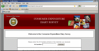

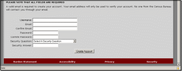
Setting Up Your Account
Once you’ve entered a valid ID Number, you will then be asked to create your own username and password. Note that the password must contain:
at least 8 characters, have at least 1 uppercase character,
at least 1 lowercase character, at least 1 number, and
at least 1 special character from the following: ! # $ * & ? ~. (Point to list of acceptable special characters on user guide)
You will also need to provide a current email address so that our IT security system can send you an email that contains a link that will be used to verify your account creation.
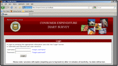
Validating Your Email, Future Log-in
After creating your account, you will receive an email from the Centurion Electronic Data Collection System that will provide a link for you to click on to verify your CE Web Diary account.
Clicking on the link will bring you to the CE Web Diary log-in screen. Here you’ll enter the username and password created to set up your account. Be sure to check your spam folder if the email does not readily appear in your inbox.
Roster Creation
On this screen you will enter the names of all of the people in your household that don’t have another residence where they usually stay. These names will then appear on the Web Diary data entry page as a reminder of the people to keep in mind when recording purchases for all household members.
Note that you only have to do this once, and will not be able to change the roster once it is created.
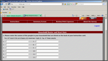
Start Date
This START DATE is the date that you begin enter all purchases during the two-week period that is unique to your household.
You enter the START DATE by using the dropdown boxes to select the month, day, and year.
The date for you to begin recording expenses into your Web Diary is __________________.

Navigation
T

Purchases of:
- Food and Drink Away from Home,
- Food and Drink for Home Consumption,
- Clothing, Shoes, Jewelry, and Accessories, and
- All Other Products and Services
All of the data you’ll be entering for the survey will be done on the data entry page.
(Point out the data entry page on the user guide).
To enter expenses for any of the four categories, simply click on the respective tab and begin entering the appropriate information in the data fields.
(Explain how the data fields change for each tab)
To move from field to field, you can use your mouse to click in the appropriate fields or use the TAB key on your keyboard. If you’re using a mobile device, you may have to use your device’s prescribed method for entering web form data into the Web Diary application.
You can find examples of the types of items to enter, and the type detail required for each Diary section, in the area above the tabs. These examples change according to the active Diary section.
(Point out the examples area on the user guide).
If you are ever unsure about what type of information to include in each field, you can click on the column heading to bring up more information and help screens.
(Point out column-heading hyperlinks).
Logging Out of the Web Diary
To help protect your privacy, the CE Web Diary will require you to log back in to the survey if the browser window has been inactive for more than 15 minutes. You can also log out at any time by clicking on the “logout” link in the top-right corner of the data entry page.
(Point out the ‘logout’ link on main dashboard page on the user guide).
Resources
At any time, you may click on the “Instructions/FAQs” link at the top of the page to bring up detailed instructions for the Web Diary and answers to Frequently Asked Questions. (Point out link)
You may also print out a record of your expenses at any time by clicking on the “Print Expenses” link to produce a .pdf file that you may save or print for your reference. (Point out link)
Further, you may learn more about the CE Diary Survey by clicking on the “About the Survey” link at the top right of the page. (Point out link)
Entering Expenses
Section 1 – Food and Drink Away from Home
In Section 1, you will enter food and drink purchases made by anyone on your list that were consumed outside of the home. This does not include purchases, such as groceries, that were intended for home consumption then ultimately consumed outside of the home (e.g., bringing lunch from home).
First, select whether the food or drink purchase was for breakfast, lunch, dinner, or snack, by using the dropdown box in the “Meal Type” column. (Point out the column on the user guide).
Next, you enter the description of what you purchased in the “Description” column. (Point out the column on the user guide). An extensive list of items has been preloaded into the system so that once you start typing in this field a few suggested items will appear. You should select these pre-listed items by hitting ENTER on the item that matches the description of your purchase. However, you can type over the suggested item(s) and fully enter your specific purchase if the suggested item description(s) do not adequately describe your purchased item.
Note that you should use only one line for one item or meal. (Point out the column on the user guide).
Next, in the “Where Purchased” column, you select the place that best matches the description of where your purchase was made, such as: a full service restaurant place; fast food, take-out, or concession; vending machine; or employer or school cafeteria. (Point out the column on the user guide).
Next, you will enter the amount of the purchase in dollars and cents, including tax and tip, in the column labeled “Total Cost with Tax and Tip”. (Point out the column on the user guide).
If alcohol was included with meal purchase, you may check any or all of the wine, beer, or other checkboxes in the “Alcohol Included?” column, as appropriate. Enter the separate cost of the alcohol in dollars and cents in the “Total Alcohol Cost” column, or simply leave blank if no alcohol was included with the meal purchase. (Point out these columns on the user guide).
Finally, in the “Date Purchased” column, use the dropdown box to select the date when your purchase was made. (Point out the column on the user guide).
Clearing Purchases
For all sections of the Web Diary, you have the option to clear all entries for a row if necessary. Under the “Clear” column, simply click on the red icon at the end of a given row to clear the data for that row.
(Point out the column on the user guide).
Section 2 – Food and Drink for Home Consumption
In Section 2, you will enter food and drink purchases made by anyone on your list that were intended for home consumption or storage. Usually these purchases are at places like grocery stores, farmers’ markets, and similar stores.
First, you enter the description of your food or drink purchase in the “What did you buy or pay for?” column. (Point out the column on the user guide). An auto-fill feature is also available in this section, as it is for each section of the Web Diary.
Note that we’ll need you to be specific when recording your purchases in this section. For example, for bread, we need to know the type of bread, such as: white, wheat, rye, etc. If you purchased meat, we need to know the cut of the meat, such as: whole chicken, chicken legs, chicken wings, ground beef, round roast, whole ham, spare ribs, bacon, etc.
Next, you will select whether the item purchased was either: fresh, frozen, or bottled/canned, using the dropdown box under the column “Is this item?”. (Point out the column on the user guide).
Next, you will enter the amount of the purchase in dollars and cents, without tax, in the column labeled “Total Cost without tax”. (Point out the column on the user guide).
Next, in the column “Check here if purchased for someone not in household”, you will click in the checkbox if the purchase was as such.
Finally, in the “Date Purchased” column, use the dropdown box to select the date when your purchase was made. (Point out the column on the user guide).
Section 3 – Clothing, Shoes, Jewelry, and Accessories
In Section 3, you will enter all clothing, shoes, jewelry, and accessories purchases made by anyone on your list.
First, enter the description of what you purchased in the “What did you buy or pay for?” column. (Point out the column on the user guide). These descriptions should be similar to the ones in the examples found in the section header. (Point out the section header on the user guide).
Next, you will enter the amount of the purchase in dollars and cents, without tax, in the column labeled “Total Cost without tax”. (Point out the column on the user guide).
Next, you will select whether the item purchased was for a male or female, using the dropdown box under the column “Was the item for…”. (Point out the column on the user guide).
Next, you will select whether the items was purchased for someone: under 2 years old, 2 to 15 years old, or 16 years and over, using the dropdown box under the column “Age”.
Next, in the column “Check here if purchased for someone not in household”, you will click in the checkbox if the purchase was as such.
Finally, in the “Date Purchased” column, use the dropdown box to select the date when your purchase was made. (Point out the column on the user guide).
Section 4 – All Other Products and Services
In Section 4, you will enter all other purchases made by anyone on your list that are not included in the other three parts of the Diary.
First, enter the description of what you purchased in the “What did you buy or pay for?” column. (Point out the column on the user guide). You can refer to the examples in the section header for the types of items we’re looking for. (Point out the section header on the user guide).
Next, you will enter the amount of the purchase in dollars and cents, without tax, in the column labeled “Total Cost without tax”. (Point out the column on the user guide).
Next, you will select whether the item purchased was for a male or female, using the dropdown box under the column “Was the item for…”. (Point out the column on the user guide).
Next, in the column “Check here if purchased for someone not in household”, you will click in the checkbox if the purchase was as such.
Finally, in the “Date Purchased” column, use the dropdown box to select the date when your purchase was made. (Point out the column on the user guide).
Saving Your Entries, Adding More Rows
The CE Web Diary system will automatically save your entries whenever you click on the “Save and Submit” button, or switch from tab to tab (section to section). (Point out Save and Submit button).


For each section of the Web Diary, you can add more expense rows as needed by clicking on the “Add Rows” button at the bottom of the screen. Five rows are added to the bottom of the Diary section each time this button is clicked. (Point out Add Rows button)


Appendix F: Demographic/Computer Background Questionnaire
Questionnaire on Statistical Background, Computer Use, Internet Experience
YOUR ANSWERS ARE CONFIDENTIAL
Demographics
1. What is your age? _______________
2. Are you male or female?_________________
3. What is your level of education?
___grade school
___some high school
___high school degree
___some college
___2-year college degree
___4-year college degree
___some postgraduate study (e.g., M.A., M.B.A., J.D., Ph.D., M.D., programs)
___postgraduate degree (e.g., M.A., M.B.A., J.D., Ph.D., M.D.)
Computer Experience
1. Do you use a computer at home, at work, or both?
(Check all that apply.)
___Home
___Work
___Somewhere else, such as school, library, etc.
2. If you have a computer at home,
a. What kind of modem do you use at home?
___Dial-up
___Cable
___DSL
___Wireless (Wi-Fi)
___Other __________
___Don’t know _____
b. Which browser do you typically use at home? Please indicate the version if you can recall it.
___Firefox
___Internet Explorer
___Netscape
___Other ___________
___Don’t know
c. What operating system does your home computer run in?
___MAC OS
___Windows 95
___Windows 2000
___Windows XP
___Windows Vista
___Other ___________
___Don’t know
3. On average, about how many hours do you spend on the Internet per day?
___0 hours
___1-3 hours
___4-6 hours
___7 or more hours
If you have a tablet PC like an iPad, how many hours do you use it per day?
____ Don’t have a tablet or iPad
___0 hours
___1-3 hours
___4-6 hours
___7 or more hours
5. Please rate your overall level of experience with the following:
Circle one number.
No experience Very experienced
Computers 1 2 3 4 5 6 7 8 9 10
Internet 1 2 4 5 5 6 7 8 9 10
6. What computer applications do you use?
Mark (X) for all that apply
___E-mail
___Internet
___Word processing (MS-Word, WordPerfect, etc.)
___Spreadsheets (Excel, Lotus, Quattro, etc.)
___Accounting or tax software
___Engineering, scientific, or statistical software
___Other applications, please specify____________________________
For the following questions, please circle one number.
7. How comfortable are you in learning to navigate new Web sites? |
Not Comfortable Comfortable
1 2 3 4 5 |
|
|
8. Computer windows can be minimized, resized, and scrolled through. How comfortable are you in manipulating a window?
9. How comfortable are you using, and navigating through the Internet?
10. How often do you work with any type of data through a computer?
11. How often do you perform complex analyses of data using a computer?
12. How often do you use the Internet or Web sites to find information? (e.g., printed reports, news articles, data tables, blogs, etc.)
13. How familiar are you with the Census (terms, data, etc.)? |
1 2 3 4 5
1 2 3 4 5
Never Very Often
1 2 3 4 5
1 2 3 4 5
1 2 3 4 5
|
||
Appendix G: Participant Task List
Task 1:
The members of your household are Dan Smith, Amanda Smith, Ben Smith, and Catherine Smith. The participant will be either Dan or Amanda Smith and will be referred to as YOU during the session and not “Dan” or “Amanda.”
Each member of the family gave you their receipts and lists of purchases for the past two weeks. Enter all the following purchases into the Consumer Expenditure online diary. Please remember to ‘think aloud’ as you work through this task.
Task 2:
After you finished entering all the purchases the Smith household made for the week, you review the entries to make sure you entered every entry listed, and the correct price.
As you are doing this, you notice that Catherine made a mistake on her list. The stuffed animal she purchased did not cost $15.99, it cost $25.99. Please make this correction now.
Remember to think aloud as you work.
Ben Smith remembers that his friend actually purchased the computer game (and he did not). Please make this correction now.
Remember to think aloud as you work.
Dan Smith notes that the coffee from Starbucks on [INSERT DATE] actually cost $4.57. Please make this correction now.
Task 3:
Please submit your data for the week.
Appendix H: Satisfaction Questionnaire
Questionnaire for User Interaction Satisfaction (QUIS)
Please circle the numbers that most appropriately reflect your impressions about using
the CE Web Diary.
1. Overall reaction to the Web Diary: terrible wonderful
1 2 3 4 5 6 7 8 9 10 not applicable
2. Overall Appearance: illogical logical
1 2 3 4 5 6 7 8 9 10 not applicable
3. Use of terminology throughout the diary: inconsistent consistent
1 2 3 4 5 6 7 8 9 10 not applicable
4. Instructions displayed on the screens: inadequate adequate
1 2 3 4 5 6 7 8 9 10 not applicable
5. Ease with which you could move: difficult easy
1 2 3 4 5 6 7 8 9 10 not applicable
6. Knowing where you were in the form: confusing clear
1 2 3 4 5 6 7 8 9 10 not applicable
7. Organization of question, instructions, confusing clear
and response categories in the diary: 1 2 3 4 5 6 7 8 9 10 not applicable
8. Forward navigation: difficult easy
1 2 3 4 5 6 7 8 9 10 not applicable
9. Overall experience of completing the diary: difficult easy
1 2 3 4 5 6 7 8 9 10 not applicable
10. Additional Comments:
Appendix I: Debriefing Questionnaire
Debriefing Questions:
How easy or difficult did you think the login process was?
1 |
2 |
3 |
4 |
5 |
Very easy |
Somewhat Easy |
Neither easy or difficult |
Not Very Easy |
Very Difficult |
How secure did you think the login procedure was?
1 |
2 |
3 |
4 |
5 |
Very secure |
Somewhat secure |
Neither secure or insecure |
Not Very Secure |
Very Insecure |
How easy or hard was it for you to log in and create your password?
1 |
2 |
3 |
4 |
5 |
Very easy |
Somewhat Easy |
Neither easy or hard |
Not Very Hard |
Very Hard |
How easy or hard was it for you to find the email from the Census Bureau?
1 |
2 |
3 |
4 |
5 |
Very easy |
Somewhat Easy |
Neither easy or hard |
Not Very Hard |
Very Hard |
Do you have comments regarding the email from the Census Bureau? (text)
How easy or hard was it for you to log on to the diary once you had your account and password?
1 |
2 |
3 |
4 |
5 |
Very easy |
Somewhat Easy |
Neither easy or hard |
Somewhat Hard |
Very Hard |
Do you remember the email address that sent your login information?
No |
Yes |
What was your reaction to that email address, if any?
9. How easy or hard was it for you to select the correct dates for each purchase?”
1 |
2 |
3 |
4 |
5 |
Very easy |
Somewhat Easy |
Neither easy or hard |
Somewhat Hard |
Very Hard |
Did you understand the difference between the sections of the diary?
No |
Yes |
How easy or hard was it for you to decide what section to put purchases in?
1 |
2 |
3 |
4 |
5 |
Very easy |
Somewhat Easy |
Neither easy or hard |
Somewhat Hard |
Very Hard |
Once you decided which section to enter a purchase in, how easy or hard was it for you to enter each purchase?
1 |
2 |
3 |
4 |
5 |
Very easy |
Somewhat Easy |
Neither easy or hard |
Somewhat Hard |
Very Hard |
How easy or hard was it for you to enter the dollars and cents into the purchase price?
1 |
2 |
3 |
4 |
5 |
Very easy |
Somewhat Easy |
Neither easy or hard |
Somewhat Hard |
Very Hard |
14. If you had entered information about purchases that might be embarrassing to you, how comfortable or uncomfortable would you be to learn that your spouse or another household member, would also be able to access the information in the instrument?
1 |
2 |
3 |
4 |
5 |
Very Comfortable |
Somewhat Comfortable |
Neither comfortable or Uncomfortable |
Somewhat Uncomfortable |
Very Uncomfortable |
15. Were there some purchases that were easier to enter than others? Which?
-
No
Yes, specify: ___________________________________________
16. Were there some purchases that were more difficult to enter than others? Which?
-
No
Yes, specify: ___________________________________________
17. Was it clear when you should submit data?
No |
Yes |
18. Was it clear when you were finished entering information for the Consumer Expenditure Diary Survey?
No |
Yes |
19. How clear was it that you had submitted your data to the Census Bureau?
1 |
2 |
3 |
4 |
5 |
Very Clear |
Somewhat Clear |
Neither clear or Unclear |
Somewhat Unclear |
Very Unclear |
20. Is there any information that you would have like to have known while entering information into the online survey?
-
No
Yes, specify: ___________________________________________
2
Open the summary screen.
21. Did you utilize the 'Summary' tab, which allows the user to see a total amount of their expenses by category?
No |
Yes |
21b. If YES, Is this a feature that you found useful?
No |
Yes |
21c. If YES, How likely would you be use this information if you were completing this survey at home?
1 |
2 |
3 |
4 |
5 |
Very Likely |
Somewhat Likely |
Neither Likely nor Unlikely |
Somewhat Unlikely |
Very Unlikely |
22. Looking at the pie chart, how interesting is this to you?
1 |
2 |
3 |
4 |
5 |
Very Interesting |
Somewhat Interesting |
Neither Interesting or Uninteresting |
Somewhat Uninteresting |
Very Uninteresting |
23. Would you use this to change any of your responses?
No |
Yes |
24. Do you think you would change your spending habits based on this information?
No |
Yes |
Open the Print Expenses Tab
25. Did you utilize the 'Print Expenses' tab, which allows the user to see and print a table showing all of the expenses they reported?
No |
Yes |
25b. If YES: Is this ‘Print Expenses’ tab a feature that you found useful?
No |
Yes |
25c. If YES: How likely would you be to print and use this information if you were completing this survey at home?
1 |
2 |
3 |
4 |
5 |
Very Likely |
Somewhat Likely |
Neither Likely nor Unlikely |
Somewhat Unlikely |
Very Unlikely |
26. How comfortable would you be with sharing this information with other members in your household if you were completing this with your own expenses?
1 |
2 |
3 |
4 |
5 |
Very Comfortable |
Somewhat Comfortable |
Neither comfortable or Uncomfortable |
Somewhat Uncomfortable |
Very Uncomfortable |
2
Open the Welcome Screen.
28. How easy or difficult was it locating the “Go to Login Page” link?
1 |
2 |
3 |
4 |
5 |
Very easy |
Somewhat Easy |
Neither easy or hard |
Somewhat Hard |
Very Hard |
For the iPad participants in Group 2:
29. Was it easier to enter the information for the CE Diary on the computer or the iPad?
Computer |
iPad |
30. If you were completing this survey at home, would you be more likely to complete it using a computer or a tablet like an iPad?
Computer |
iPad |
31. Please describe overall experience with completing the survey on the iPad.
1 Includes “cost” in all parts of speech categories, including verbs, which inflates this estimate.
| File Type | application/vnd.openxmlformats-officedocument.wordprocessingml.document |
| Author | Misa |
| File Modified | 0000-00-00 |
| File Created | 2021-01-29 |
© 2026 OMB.report | Privacy Policy
