Attachment I - Web Diary Usability Round 2
Attachment I - Web Diary Usability Round 2 (Final).docx
The Consumer Expenditure Surveys: The Quarterly Interview and the Diary
Attachment I - Web Diary Usability Round 2
OMB: 1220-0050
M E M O R A N D U M
To: John Gloster, and Lauren Kirkpatrick, DSD and the BLS Team
From: MisaGareau and Kathy Ashenfelter, CSM
Date: July 2012
Title: Full Report from Round 2 Testing of the Consumer Expenditure Web
Diary Survey
Contents
2.0 Accuracy and Efficiency Results 5
3.1 High-Priority Usability Issues 6
3.2 Medium-Priority Usability Issues 8
3.3 Low-Priority Usability Issues 11
Appendix B: Demographic/Background Questionnaire 15
Appendix C: Testing Protocol 18
Appendix D: Satisfaction Questionnaire 26
Appendix E: Suggested FR Talking Points 28
The CE diary examines the buying habits of people in the United States and the products and services that are bought by people in this country. Respondents to the CE Web Diary in the field complete the diary for two weeks for all of the items that they buy or for which they spend money (i.e., all of their “expenses”). Twenty-two participants were run before the completion of this full report.
Following initial testing of a prototype of the Consumer Expenditure Web Diary, a second round of Usability testing was performed on the revised Web Diary system. Revisions to the CE Web Diary and results of Round 2 Usability testing will be discussed in this report, along with eye-tracking findings.
Twenty-two participants who expressed interest in participating in usability studies were recruited internally from the Census Bureau through a database of employees. Participants were between 22 and 60 years of age, with a median age of 31 years of age. All participants had at least some college experience, with 95 percent having at least a college degree. All participants reported that they spent at least 1-3 hours on the internet per day and rated themselves at least 6 on a ten point scale for internet experience, with a rating of 10 being the most experienced. Fourteen of 20 participants were female, and 8 of 22 were male. It should be noted that this participant sample consisted of Census Bureau employees only, and tended to have a higher level of education than the general population participants from Round 1. The average level of education for Round 1 testing was between “Some College” and “2-year College Degree”, whereas the average education level for Round 2 participants was between “Some post-graduate study” and “Post-graduate Degree (e.g. Master’s or Doctorate). About 25 percent of participants from Round 1 testing reported having post-graduate degrees, while 55 percent of participants from Round 2 testing reported having post-graduate degrees. These statistics were recorded using a background questionnaire administered before each session (Appendix B)
As in the first round of testing (Quick Report from Round 1 Testing of the Consumer Expenditure WebDiary Survey, Unpublished Document), each participant was given verbal explanation of the study and of the purpose of the CE Web Diary, signed a Consent Form (Appendix A), filled out a Demographic Questionnaire (Appendix B), and was given verbal instructions for completing the Diary according to a testing protocol (Appendix C).
Instead of the mocked- up lists given to participants in the first round of testing, participants were given “receipts” of the “purchases” that they were to enter (Appendix D). This modification of the protocol was intended to be more realistic than the narrative lists from the first round, and were created in an attempt to yield more realistic results. Each participant was randomly assigned to one of three sorting conditions for the receipts: Group 1 was instructed to sort the receipts in any way they liked, Group 2 was instructed to sort the receipts according to the four categories represented in the CE Diary, and Group 3 was given no instruction for sorting the receipts. All sorting instructions were given after the protocol was read and before the data entry portion of the session.
After the protocol was read aloud to them by the Testing Administrator (TA), each participant logged into the CE Web Diary and entered the data for the purchases given to them into the Web Diary form. At the conclusion of testing, all participants completed a Satisfaction Questionnaire (Appendix D).
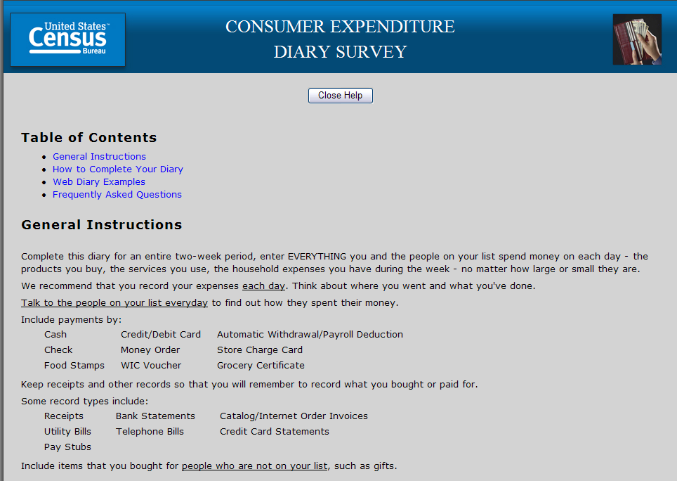
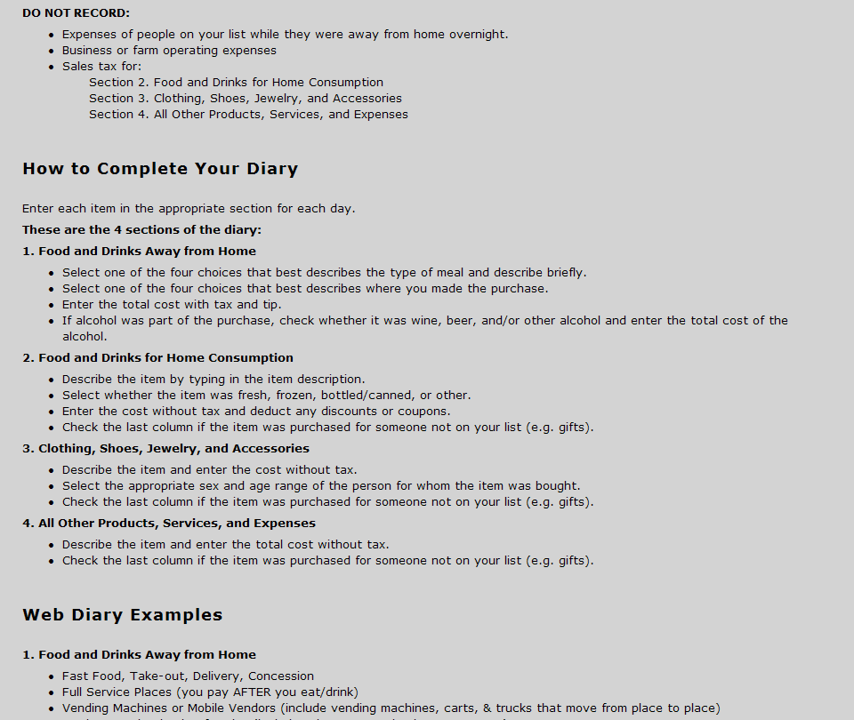
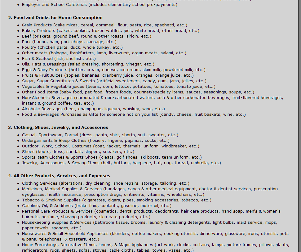
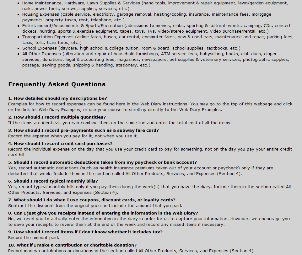
The Round 2 version of the CE Web Diary included several revisions from the previous round of testing, including changes in appearance, content, functionality, and log-in procedure. Screenshots of these changes can be found in Appendix F.
The appearance of the Round 2 version of the Diary was modified greatly from the first round of testing based on the recommendations from the first round of usability testing.
The color scheme was changed from red to blue and the Census Bureau logo was updated to the current version.
The “About the Survey” link was moved to the far left of the Top Bar, the “Instructions” link was moved to the second position and relabeled “Help,” and the “Logout” link was added to the Top Bar on the far right.
The “Save and Submit” button was divided into a “Save” button which appeared in the same position as the previous “Save and Submit” button, and a “Submit” link was added to the third-to-right position on the Top Bar.
Pictures of various goods and expenses which previously appeared on the top right of the page were removed, and one picture of a person removing cash from a wallet remained.
The “Examples” content was removed from the area above the tabs, and the “Review/Print Expenses” functionality was removed, as was the auto-fill feature which provided coding terms when the user began typing.
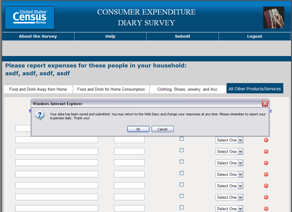
A verification/notification was added to the “Clear” function, allowing respondents/participants to check before clearing the data in a given row. Another verification/notification was added to the “Submit” function, which notified the respondents/participants of the impending submission of data, and reminded them to log their expenses daily. This function also logged the participants out in Round 2 testing.
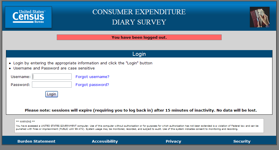
The previous log-in procedure consisted of a multi-step verification process including the creation of an account with a username, complex password, security question, and email verification. This was replaced with a single-step log-in procedure including a username and password provided by the Census Bureau. This change resulted in all of the participants completing a successful log-in using only 1 attempt.
The “Forgot Username?” and “Forgot Password?” links on the log-in screen resulted in error screens during Round 1 testing. They did not result in error in Round 2 testing, although their functionality is limited. Retrieving a password still refers to the username or email address that had been required for account creation in the first round of testing, which no longer exists. Furthermore, entering the “id number” for a user account results in an error which tells the user to “Please come back later”.
Twenty-eight items were scored for accuracy based on whether or not they were entered into the correct section of the diary. On average, participants accurately selected the correct category for each item 96.59 percent of the time. This is a 10 percent improvement from Round 1 testing. However, it is important to keep in mind that the difference in education level of the participant pool in the second round may have contributed to this improvement.
The most commonly misplaced item was “Men’s Deodorant”, which appeared on the grocery list with items in the category “Food and Drink for Home Consumption”. Nine out of 22 (41 percent) of the participants misplaced “Men’s Deodorant” into the “Food and Drink for Home Consumption” category while adding the items from the grocery receipt. This suggests that non-food items that appear on grocery receipts may be erroneously entered as a “Food and Drink for Home Consumption” purchases because participants may not recognize that these items must be separated from the food items on a grocery receipt or may not wish to take the time to separate the non-food items out.
The average amount of time spent entering the purchases was 26 minutes and 2 seconds, which is similar to the average time from Round 1 testing (27 minutes and 54 seconds). Fifteen of 22 (68 percent of) participants chose to organize the receipts by category, regardless of group. Because the protocol mentioned the four categories, this may suggest that people think that organizing the receipts in accordance with the organization of the instrument will benefit them. However, there did not appear to be a significant difference, using both a one-way analysis of variance and an independent samples t-test, between those who reorganized their receipts into categories to match the instrument and those that did not.
High-priority usability issues bring the test participant to a stand still. He or she is not able to successfully complete the task.
The FR talking points are currently seven pages long and reading them aloud took about 15 minutes. Three participants told the TA that they had not been listening, or expressed concern about having to remember the directions.
The image of the data entry page is too small, so the FR/TA could not refer to it reliably while reading the directions.
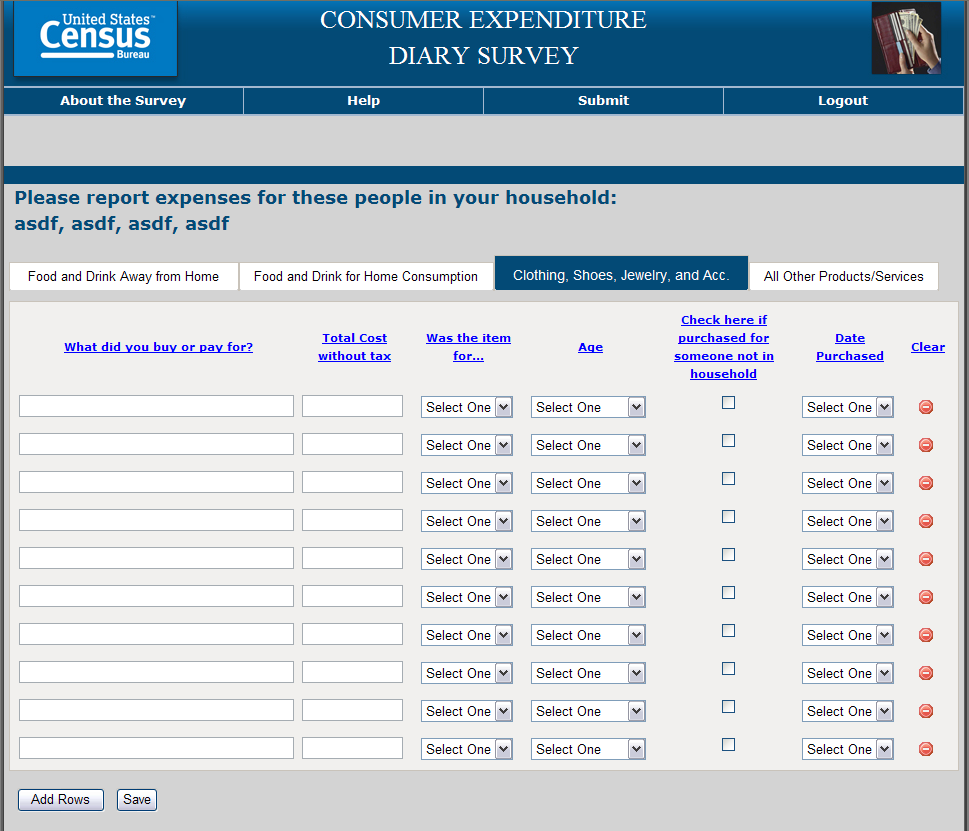
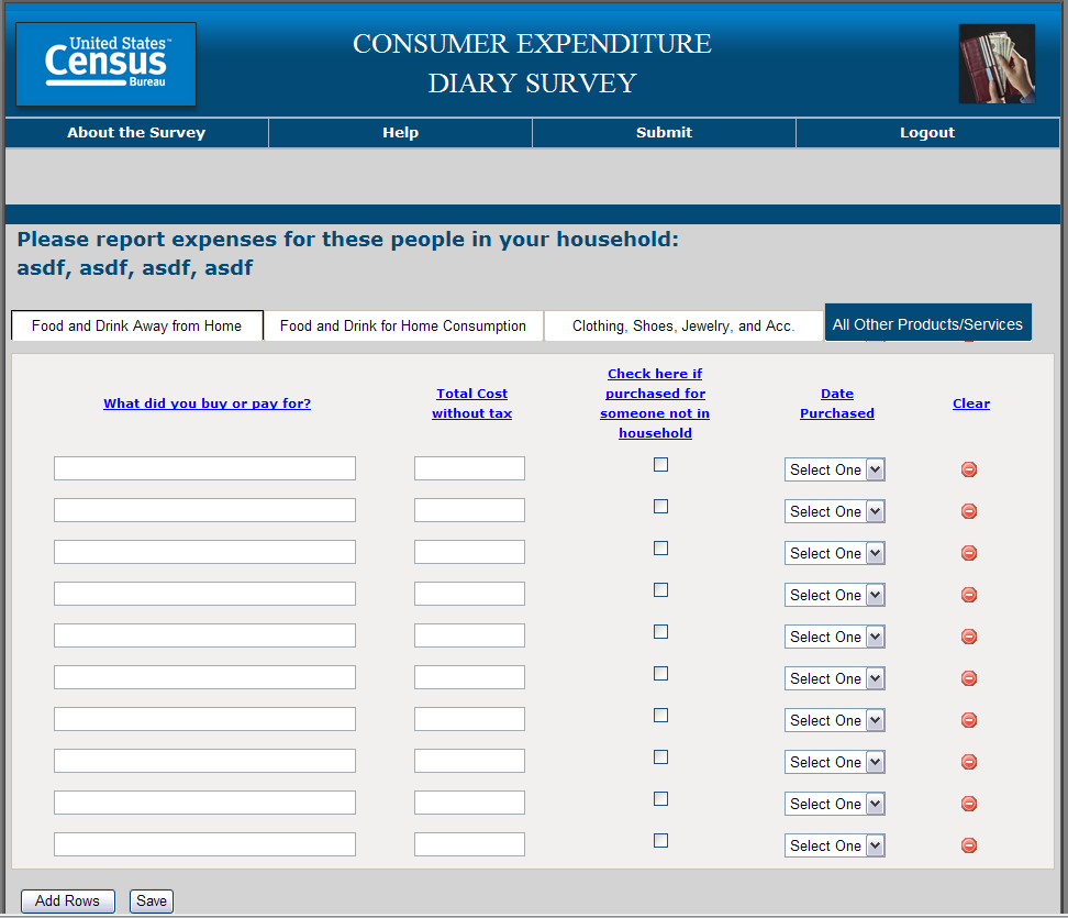
On page 6, the “Section 4” instructions refer to the “Was the item for…” column, which does not appear on “All Other Products and Services” data entry page.
Six out of 22 (27 percent) of the participants reported that they would share the log-in and password information to allow other household members to record their own purchases. If the Talking Points are long and complicated, the other members of the household (especially if they are young) may not listen to, remember, or even be given the full set of instructions as the primary family member who is given instructions by the FR.
Recommendation: As we also suggested after Round 1 of usability testing, we suggest a much abridged suggested version of the FR talking points along with this quick report as Appendix E.
As we also suggested after Round 1, we suggest providing a video clip of a demonstration of someone entering expenses into the CE Web Diary because talking about hypothetical Web screens does not work as well as a real visual example where the R can see the actual screen and someone really using it. Furthermore, this will increase the consistency of the delivery of the directions, leading to more consistent results.
If
the current Talking Points are to be kept, we suggest supplying
images of each data entry page that are large enough for the FR and
the respondent to see. These images should be located on the page to
which the image refers, so that the respondent may see what the FR is
talking about.
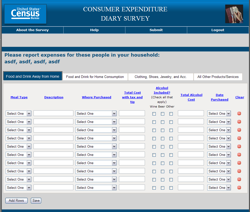
Sixteen out of 22 (73 percent) of the participants incorrectly recorded the purchase of a bottle of wine with the restaurant meal. Participants who incorrectly recorded the purchase either placed the bottle of wine on a separate line, or over-reported the alcohol cost. In other words, they entered the total cost of the meal, and additionally recorded the price of the wine in the “Total Alcohol Cost” column.
Recommendation: The FR Talking Points for this particular instruction should clearly indicate how the purchase is to be recorded, with a sample image. For example, the Talking Point could read as follows:
“If alcohol was included with the meal purchase, you may check any or all of the wine, beer, or other checkboxes in the “Alcohol Included?” column on the same line as the rest of the meal, as appropriate. Enter the separate cost of the alcohol in dollars and cents in the “Total Alcohol Cost” column on the same line as the rest of the meal, or simply leave it blank if no alcohol was included in the meal purchase. Be sure to remove the cost of the alcohol from the “Total Cost with Tax and Tip” column.
This could clarify the instruction and lead to more accurate reporting of alcohol purchases.
Seven participants verbally mentioned while recording the purchases that the task was burdensome or too time-consuming. One participant said with frustration “Why are there categories? This is ridiculously stupid.” Another complained “Ugh, there is so much for me to do.” A third wondered, “Why doesn't "the system" figure out the category? Sneakers will not be eaten at home or away, for example.”
Categorizing the data for entry is a cognitive task that takes time and effort, and is open to error. This can lead to drop-off, unnecessary burden, and erroneous data.
Recommendation: Several options could improve this problem. As we recommended after Round 1, we recommend testing a version of this diary survey that utilizes a single data entry page.
One option for a single data entry page would be to eliminate the categorization altogether, and have the participant choose the location and nature of the purchase from the drop-down menus that appear on the page.
Another option could be to have all possible data entry fields on each line greyed-out, with a drop-down box to the left of each line indicating the category of the purchase. When a particular category is selected, the appropriate data fields become active. Or, if possible, dynamically populate the row with the appropriate data fields upon selection of a category.
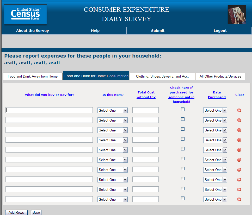
As stated previously, 41 percent of the participants erroneously categorized “Men’s Deodorant” as a “Food and Drink for Home Consumption” purchase. Because the FR Talking Points mention that “Usually these purchases are at places like grocery stores, farmers’ markets, and similar stores”, participants who made this error simply recorded all of the items on the grocery store receipt in the “Food and Drink for Home Consumption” Section of the Diary. For longer grocery receipts, with non-food items interspersed throughout the list, this could lead to many non-food items being recorded in the wrong category.
Recommendation: One way to control for this error could be to include a checkbox in the “Food and Drink for Home Consumption” Section on each line that indicates whether the item is “Non-Food item”. This relieves the burden from the respondent to go through possibly long receipts of grocery items and separate out the non-food items. It also decreases the likelihood of non-food items being recorded as food purchases.
Another way to avoid this error would be to include a brief reminder in the FR Talking Points about non-food items that appear on grocery receipts. One possible suggestion would be “Remember that non-food items, such as deodorant or toothpaste, belong in the All Other Products and Services Section.”
These problems causes some difficulty or confusion, but the test participant is able to successfully complete the task.
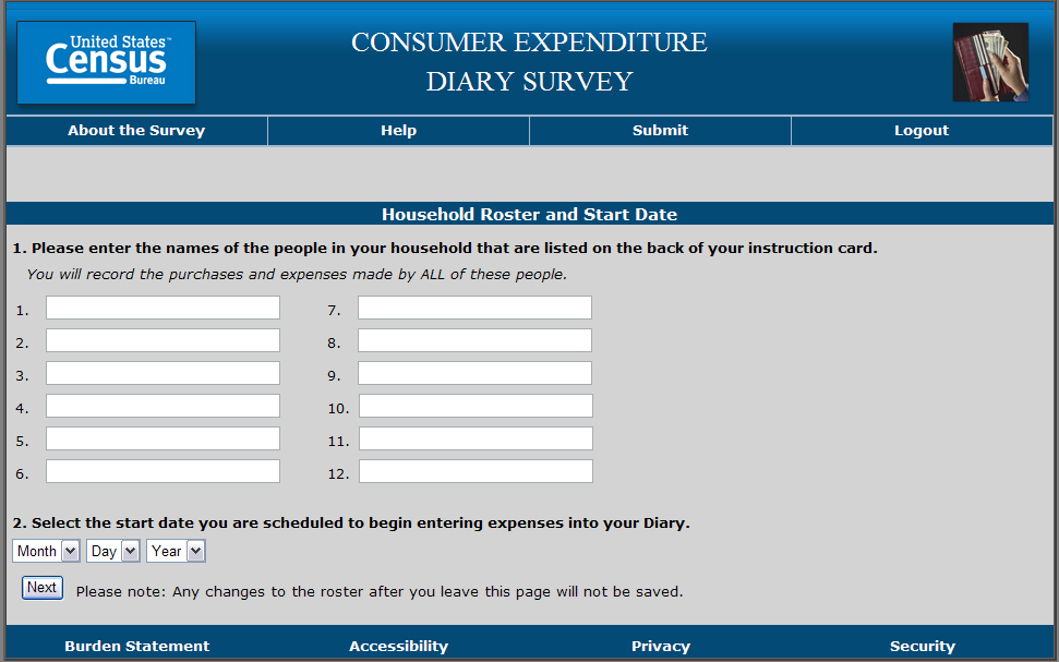
Although the participants were required to complete a roster for their vignette household members, no drop-down list was provided to select which family members purchased what items.
If the diary requires that a roster of household members be created, it is only logical that household members are then somehow linked to their purchases. Several participants looked for a way to specify which family member made which purchases and then commented that they either could not find the way or that there should be one.
Forty-five percent of the participants commented that they were looking for a place to specify which family member made each purchase. Some asked the Test Administrator whether such an option for specification existed after unsuccessfully searching for it, at which point they were told (reminded really– it was in the FR talking points) that the list of names at the top of the screen was a reminder for whom to keep in mind when completing the CE Diary.
Recommendation: As we recommended after Round 1, we recommend testing two main options for resolving this issue. 1) Remove the roster all together. The reminder to include everyone in the household (“economic unit”) can be reinforced in the FR talking points and on the instrument itself. 2) Test a way to specify family members at the item entry level, such as a drop-down menu based on the names entered on the roster screen.
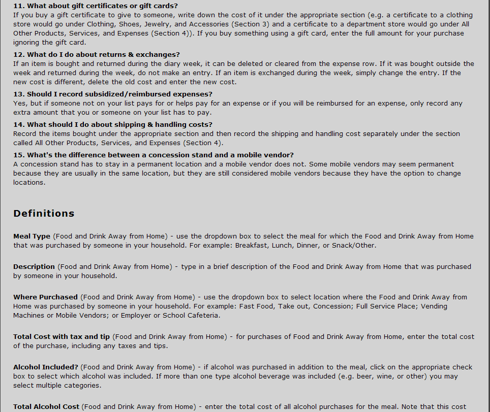
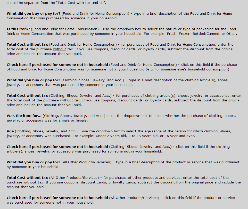
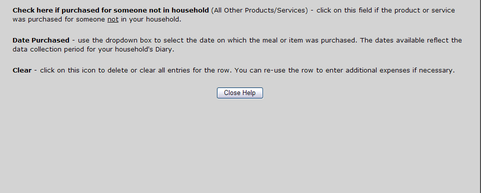
Only 3 out of 22 participants viewed the “Help” screen, and 2 of these participants mentioned that it was poorly organized or “cluttered”. Three participants suggested that the instructions should appear in a roll-over fashion, or an “i” button that appears upon rollover for particular data fields and on the tabs themselves.
In Opacity Heat Maps, dark areas represent portions of the screen on which there were few fixations, while visible areas represent areas of the screen on which participants did fixate. As shown in this Opacity Heat Map Image of all participants (Figure 1), the “Help” link has a relatively low amount of eye fixations, which suggests that despite having various questions about entering the data, participants did not look to the “Help” link for answers, by and large.
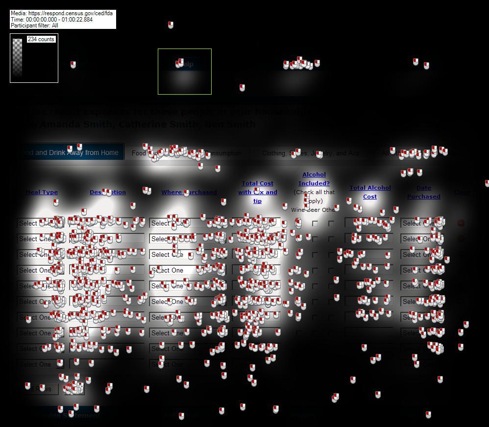
Figure 1: Opacity Heat Map for the "Help" link.
Furthermore, then the three participants who did click the “Help” link are removed from the analysis, there are hardly any fixations on the “Help” link, as shown in Figure 2 below. This suggests that the participants who did click the “Help” link may customarily use such links, but the other participants did not notice the link or do not customarily use “Help” links.
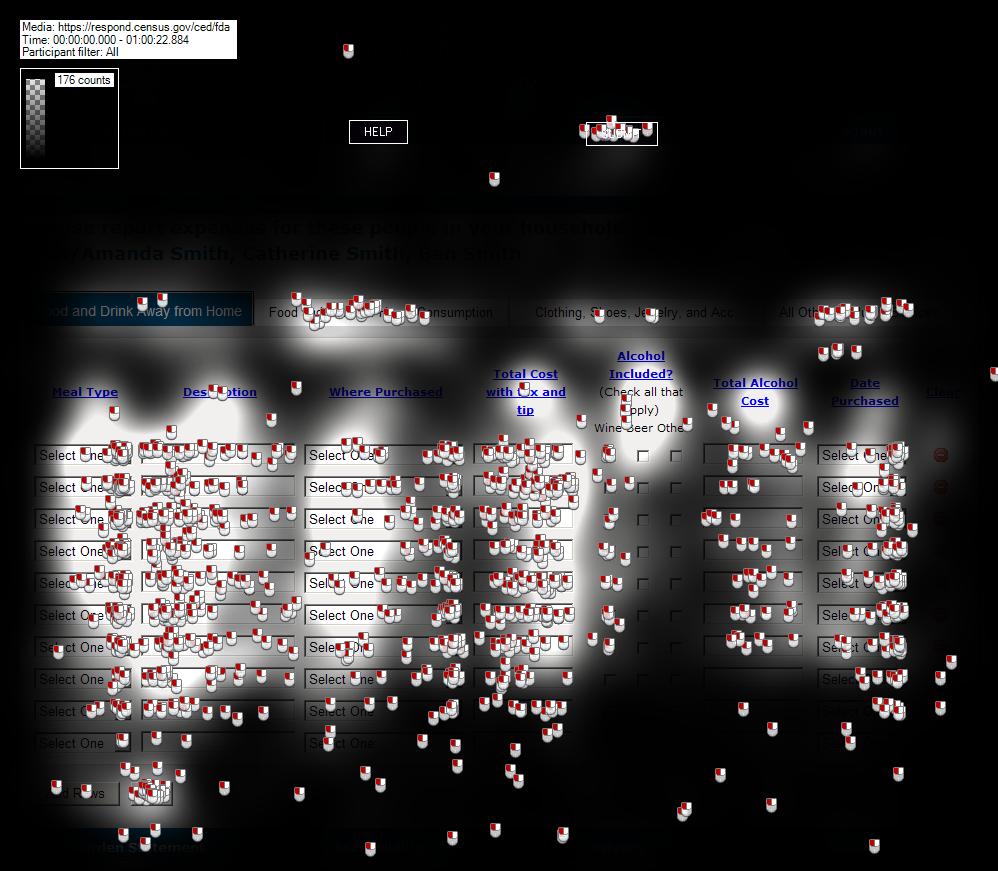
Figure 2: Opacity Heat Map with Participants Who Clicked "Help" Removed
The gaze plot for the three participants who clicked on the “Help” link is shown in the figure below. Each color represents a separate participant. The gaze patterns suggest that these participants initially read or scanned the information near the top of the document, but did not look very much at the information in the second half of the page. This may indicate that the participant’s tolerance for searching for information ended about halfway through the page.

Figure 3: Gaze Plot of 3 Participants who Clicked the "Help" Link
When using a Web site, people do not like to read lengthy instructions or use Help menus. However, valuable information exists within these menus on the CE Web site.
Recommendation: Brief instructions, or an “i” or “?” button should appear upon mouse-over in a small window on the column headers or tabs. The information contained should be brief and should fit into a small window which does not eclipse the page.
Fourteen out of 22 (64 percent) of the participants reported that they would have one member of the household record all purchases for the household, and 2 reported that they would prefer separate log-ins for household members which did not show the purchases of the other members.
Some of the participants (8) mentioned that they would not want children in the household to be able to view their purchases, and five reported that if they had sensitive items, they would not report them at all if another member of the household could see them.
If respondents feel that others may view their responses to the survey, they will under-report expenses that may be sensitive. Because this may include items that many people would not necessarily consider sensitive, this under-reporting may not be limited to items typically not considered sensitive. This can lead to misleading or missing data.
Recommendation: Test a version of the CE Diary that allows for separate passkeys to the same account, which cannot be viewed by every member of the account.
When the participants needed to add rows to the page or scroll down, the column headers were no longer visible, which required frequent scrolling up and down the page. This can lead to frustration and users losing their place on the page, which could lead to missing data.
Four of the participants suggested that the column headers scroll down with the page, or continue to be visible when at the bottom of a lengthy list.
Recommendation: The column headers should be visible no matter how far down the page the list goes.
Seven participants mentioned that they wanted to break down the “All Other Products and Services” category further, because that section included too broad a range of items as compared to the prior three categories. Participants were sometimes hesitant to enter purchases into this category because “there were so many things that went into there, but the other categories were so specific. I mean, you have food, and clothes, and everything else? Why does a $4,000 mortgage payment go in the same place as a DVD?”
Recommendation: This can be avoided by eliminating the categories, or by allowing participants to specify if something in the “All Other Products and Services” category was a monthly payment or an item. A simple breakdown like this may make the category seem more consistent with the specificity of the other three categories.
Alternatively, a category for monthly payments or services may make more sense to respondents.
When participants clicked on the “Add Rows” button, it often did nothing until the participant clicked it once more, at which time it added 10 blank rows.
These problems cause minor annoyances but do not interfere with the flow of the tasks.
Because only the first Section of the Diary required you to include tax, some participants (4) commented that they were confused about the tax that they were to report. Although this is explained in the FR Talking Points, some participants were not fully listening, as discussed before.
Recommendation: In the column header, use bold lettering to remind the respondents that they are not to include tax in the purchases for Sections 2, 3, and 4.
Several (3) of the participants suggested that it would be easier for them to use a pop-up mini calendar rather than drop-down boxes. One person said that it would make the Web site feel “more modern” and another mentioned that she could more easily remember dates visually by looking at a calendar.
Recommendation: Test a version of the CE Web Diary with this option.
Several (5) of the participants mentioned that the text size in this box was difficult to read.
Recommendation: Make the text in this drop-down box the same size as the rest of the text on the screen.
At least 9 of the participants asked the TA if they should record the restaurant meal purchase on one line or on multiple lines, although it is mentioned in the FR Talking Points that one meal should be recorded on one line.
The “Description” column is different from the fields in the other sections of the Diary that have the same purpose, which is to record what was bought or paid for. The word “Description” may be too vague.
Recommendation: Rather than the word “Description” in the “Description” column, use a phrase such as “Description of Meal or Item”.
Confusion with the Save/Submit Button was much improved on this round of testing. None of the participants in this Round expressed uncertainty about the function of these buttons.
At least 2 of the participants looked for the submit button at the bottom right of the page. Although all participants were able to find the button, it is common on Web sites for a button like this to be located on the bottom right of the web page. One participant commented “If it’s not moved to the bottom right-hand side, then it should at least look different from the rest of the tabs up there.”
Recommendation: Test a version of the CE Web Diary with the “Submit” button to the lower right hand side of the page, in a way that stands out visually.
Several High-Priority issues were identified, including the following:
The FR talking points are too long, too complex, and not attended to by the participants.
The FR Talking Points does not adequately explain how to record the purchase of alcohol.
Having the participant categorize the items into 4 categories adds unnecessary burden, time, potential drop-offs, and error.
Grocery receipts could lead to problems with reporting non-food items
Most of the recommendations given regarding these findings were also given after Round 1 testing, and we still recommend these changes and improvements.
Appendix A: Consent Form


Consent Form
Usability Study of the Consumer Expenditure Diary
Each year, the Census Bureau conducts many different usability evaluations. For example, the Census Bureau routinely tests the wording, layout and behavior of products, such as Web sites, online surveys, and letters sent through the mail in order to obtain the best information possible from respondents.
You have volunteered to take part in a study to improve the usability of the Consumer Expenditure Diary. In order to have a complete record of your comments, your usability session will be videotaped. We plan to use the tapes to improve the design of the product. Staff directly involved in the usable design research project will have access to the tapes. We also plan to perform an eye-tracking analysis of your session. Your participation is voluntary and your answers will remain strictly confidential.
This usability study is being conducted under the authority of Title 13 USC. The OMB
control number for this study is 0607-0725. This valid approval number legally certifies this information collection.
I have volunteered to participate in this Census Bureau usability study, and I give permission for my tapes to be used for the purposes stated above.
Participants Name: ___________________________________
Participants Signature:________________________ Date:________________
Researcher’s Name:___________________________
Researcher’s Signature:_________________________Date:_________________
Appendix B: Demographic/Background Questionnaire
Questionnaire on Statistical Background, Computer Use, Internet Experience
YOUR ANSWERS ARE CONFIDENTIAL
Demographics
1. What is your age? _______________
2. Are you male or female?_________________
3. What is your level of education?
___grade school
___some high school
___high school degree
___some college
___2-year college degree
___4-year college degree
___some postgraduate study (e.g., M.A., M.B.A., J.D., Ph.D., M.D., programs)
___postgraduate degree (e.g., M.A., M.B.A., J.D., Ph.D., M.D.)
Computer Experience
1. Do you use a computer at home, at work, or both?
(Check all that apply.)
___Home
___Work
___Somewhere else, such as school, library, etc.
2. If you have a computer at home,
a. What kind of modem do you use at home?
___Dial-up
___Cable
___DSL
___Wireless (Wi-Fi)
___Other __________
___Don’t know _____
b. Which browser do you typically use at home? Please indicate the version if you can recall it.
___Firefox
___Internet Explorer
___Netscape
___Other ___________
___Don’t know
c. What operating system does your home computer run in?
___MAC OS
___Windows 95
___Windows 2000
___Windows XP
___Windows Vista
___Other ___________
___Don’t know
3. On average, about how many hours do you spend on the Internet per day?
___0 hours
___1-3 hours
___4-6 hours
___7 or more hours
If you have a tablet PC like an iPad, how many hours do you use it per day?
____ Don’t have a tablet or iPad
___0 hours
___1-3 hours
___4-6 hours
___7 or more hours
5. Please rate your overall level of experience with the following:
Circle one number.
No experience Very experienced
Computers 12 3 4 5 6 7 8 9 10
Internet 1 2 4 5 5 6 7 8 9 10
6. What computer applications do you use?
Mark (X) for all that apply
___E-mail
___Internet
___Word processing (MS-Word, WordPerfect, etc.)
___Spreadsheets (Excel, Lotus, Quattro, etc.)
___Accounting or tax software
___Engineering, scientific, or statistical software
___Other applications, please specify____________________________
For the following questions, please circle one number.
7. How comfortable are you in learning to navigate new Web sites? |
Not Comfortable Comfortable
1 2 3 4 5 |
|
|
8. Computer windows can be minimized, resized, and scrolled through. How comfortable are you in manipulating a window?
9. How comfortable are you using, and navigating through the Internet?
10. How often do you work with any type of data through a computer?
11. How often do you perform complex analyses of data using a computer?
12. How often do you use the Internet or Web sites to find information? (e.g., printed reports, news articles, data tables, blogs, etc.)
13. How familiar are you with the Census (terms, data, etc.)? |
1 2 3 4 5
1 2 3 4 5
Never Very Often
1 2 3 4 5
1 2 3 4 5
1 2 3 4 5
|
||
Appendix C: Testing Protocol
Date_______________________; Participant #________; Researcher: _______________
Group__________
General Introduction: Consumer Expenditure Diary Instrument
Thank you for your time today. My name is XX and I work here with the Human Factors and Usability group. I will be working with you today. If you have a cell phone, please turn it off or put it on vibrate. We will be evaluating the design of the online Consumer Expenditure Diary Survey by having you interact with it. The diary helps us learn about the buying habits of people in the United States. People who complete the diary help us understand more about the products and services that are bought by people in this country. Your experience with the survey is an essential part of our work. I did not create the diary, so please feel free to share both your positive and negative reactions to it. We are not evaluating you or your skills. Rather, you are helping us see how well the survey works. The entire session should last about an hour. Your comments and feedback will be used to improve the online diary.
First, I would like to ask you to read and sign this consent form (Attachment B).
Hand the participant the consent form; give time to read and sign; sign your own name and date it if you have not already done so.
It explains the purpose of today’s session and informs you of your rights as a participant. It also tells you that we would like to videotape the session, with your permission. Only those of us connected with the project will review the tape and any other data collected during the session, and the informationwill be used solely for research purposes. We may use clips from the video to illustrate key points about the survey to the online diary design team. In addition, observers from the project team may observe this session in another room.
I would like you to tell me your impressions and thoughts about the diary screens as you look at them. In other words, I would like you to ”think aloud” and talk to me about your impressions. If anything was confusing on the screen, please let me know. If you expect to see some item of information let me know if you see it or not.
Pull up www.wtop.com in Firefox.
Before we get started, let's practice thinking aloud, since it's not something that you would normally do while working online. Pretend that you have a minute or two to kill at your desk at work or at home and talk me through your thought process as you try to find something interesting to read on this news site.
Ok, that’s exactly what I would like for you to do throughout the session. If at any time during the session you get quiet, I may remind you to talk to me. This is not to interrupt your thought process, but simply to remind you to keep talking to me. Please focus on verbalizing what you are thinking as you complete the survey.
While you are completing the diary, we will record the movements of your eyes with our eye-tracking monitor to get a record of where you are looking on the screen.
Now I am going to calibrate your eyes for the eye-tracking.
Now that we have your eyes calibrated, we are almost ready to begin. Please respond to the survey online as you would at home.
Please imagine that you received this packet from me, a Census Bureau field representative, at your home.
(BEGIN FR TALKING POINTS HERE). For this test, enter the purchases made by your pretend household, Dan/Amanda Smith, which is you, Dan/Amanda Smith – your spouse, Catherine Smith, your daughter, and Ben Smith- your son.
These receipts are the purchases that your household made. They will say Day 1, Day 2, etc. instead of having an actual date on them. Day 1 is the same day as your Start Date.
Group 1: Before start entering the purchases into the diary, please take a moment to categorize them into whatever categories you like.
Group 2: Before start entering the purchases into the diary, please take a moment to categorize them into food and drink away from home, food and drink for home consumption or storage, clothing jewelry and accessories, and other expenses.
Group 3: <<No categorization instructions.>>
Pull up Internet Explorer.
Please complete the login process and remember to think aloud as you proceed.
I am going to go around to the other room to do a sound check. While I am doing that, please take a moment to complete this questionnaire. [Hand Participant questionnaire on Computer experience and demographics (AttachmentD)]
I’m going to leave but we will still be able to communicate through a series of microphones and speakers. Do you have any questions before we begin?
Leave room. Once in control room do a sound check and start the eye-tracking software: Tobii Studio.
Allow the participant to proceed through the entire instrument without probing. You may answer their questions if they have trouble, but hold all probes until debriefing.
Things to watch for to ask about in debriefing:
Expressions of confusion or frustration
Expressions of satisfaction or being pleased with the outcome of interacting with the diary
Issues with including or excluding items
Awareness or use of help
Attempts to change entries
Overall ability to navigate within the web diary
Verbal requests for help
_____________________________________________________________________________________
Tasks These have been partially adapted from Shields (2004). Each participant will only receive one set of tasks. The tasks involve asking respondent to complete the diary with differently-organized receipt information.
Group 1: Receipts organized according to Participants’ own categories
Task 1:
The members of your household are Dan/Amanda Smith, which is you, Dan/Amanda Smith – your spouse, Catherine Smith, your daughter, and Ben Smith- your son. Each member of the family gave you their receipts and lists of purchases for the past two weeks. Enter all the following purchases into the Consumer Expenditure online diary. Please remember to ‘think aloud’ as you work through this task.
Task 2:
You will no longer need your receipts. After you finished entering all the purchases the Smith household made for the week, you review the entries to make sure you entered every entry listed, and the correct price.
As you are doing this, you notice that Catherine made a mistake on her list. The stuffed animal she purchased did not cost $15.99, it cost $25.99. Please make this correction now.
Remember to think aloud as you work.
Task 3:
Ben Smith remembers that his friend actually purchased the computer game (and he did not). Please make this correction now.
Remember to think aloud as you work.
Task 4:
Dan Smith notes that the coffee from Starbucks on [INSERT DATE] actually cost $4.57. Please make this correction now.
Task 5:
Please submit your data for the week.
Post-Session Segment
After the session is complete, tell the participant:
Thank you for completing the Consumer Expenditure Diary. I will be back to ask you some more questions about your experience shortly. In the meantime, please complete the paper satisfaction questionnaire at the upper right-hand corner of your desk (Attachment E).
Debriefing Questions (Read Aloud):
How easy or difficult did you think the login process was?
1 |
2 |
3 |
4 |
5 |
Very easy |
Somewhat Easy |
Neither easy or difficult |
Not Very Easy |
Very Difficult |
How secure did you think the login procedure was?
1 |
2 |
3 |
4 |
5 |
Very secure |
Somewhat secure |
Neither secure or insecure |
Not Very Secure |
Very Insecure |
How easy or hard was it for you to log in?
1 |
2 |
3 |
4 |
5 |
Very easy |
Somewhat Easy |
Neither easy or hard |
Not Very Hard |
Very Hard |
1 |
2 |
3 |
4 |
5 |
Very easy |
Somewhat Easy |
Neither easy or hard |
Somewhat Hard |
Very Hard |
9. How easy or hard was it for you to select the correct dates for each purchase?”
1 |
2 |
3 |
4 |
5 |
Very easy |
Somewhat Easy |
Neither easy or hard |
Somewhat Hard |
Very Hard |
Did you understand the difference between the sections of the diary?
No |
Yes |
How easy or hard was it for you to decide what section to put purchases in?
1 |
2 |
3 |
4 |
5 |
Very easy |
Somewhat Easy |
Neither easy or hard |
Somewhat Hard |
Very Hard |
Once you decided which section to enter a purchase in, how easy or hard was it for you to enter each purchase?
1 |
2 |
3 |
4 |
5 |
Very easy |
Somewhat Easy |
Neither easy or hard |
Somewhat Hard |
Very Hard |
How easy or hard was it for you to enter the dollars and cents into the purchase price?
1 |
2 |
3 |
4 |
5 |
Very easy |
Somewhat Easy |
Neither easy or hard |
Somewhat Hard |
Very Hard |
10. If you had entered information about purchases that might be embarrassing to you, how comfortable or uncomfortable would you be to learn that your spouse or another household member, would also be able to access the information in the instrument?
1 |
2 |
3 |
4 |
5 |
Very Comfortable |
Somewhat Comfortable |
Neither comfortable or Uncomfortable |
Somewhat Uncomfortable |
Very Uncomfortable |
11. Were there some purchases that were easier to enter than others? Which?
-
No
Yes, specify: ___________________________________________
12. Were there some purchases that were more difficult to enter than others? Which?
-
No
Yes, specify: ___________________________________________
13. Was it clear when you should submit data?
No |
Yes |
14. Was it clear when you were finished entering information for the Consumer Expenditure Diary Survey?
No |
Yes |
15. How clear was it that you had submitted your data to the Census Bureau?
1 |
2 |
3 |
4 |
5 |
Very Clear |
Somewhat Clear |
Neither clear or Unclear |
Somewhat Unclear |
Very Unclear |
16. Is there any information that you would have like to have known while entering information into the online survey?
-
No
Yes, specify: ___________________________________________

17. How would you find out more about what to include or exclude in certain expense categories? (allow them to open up the page for this)
Open the summary screen.
18. How comfortable would you be with sharing this information with other members in your household if you were completing this with your own expenses?
1 |
2 |
3 |
4 |
5 |
Very Comfortable |
Somewhat Comfortable |
Neither comfortable or Uncomfortable |
Somewhat Uncomfortable |
Very Uncomfortable |

19. If you have other people in your household, how would you share the login and password information or would you have one person doing the entering?

20. Do you have any other comments or questions that we haven’t already talked about?
Appendix D: Satisfaction Questionnaire
Questionnaire for User Interaction Satisfaction (QUIS)
Please circle the numbers that most appropriately reflect your impressions about using
the CE Web Diary.
1. Overall reaction to the Web Diary: terrible wonderful
1 2 3 4 5 6 7 8 9 10 not applicable
2. Overall Appearance: illogical logical
1 2 3 4 5 6 7 8 9 10 not applicable
3. Use of terminology throughout the diary: inconsistent consistent
1 2 3 4 5 6 7 8 9 10 not applicable
4. Instructions displayed on the screens: inadequate adequate
1 2 3 4 5 6 7 8 9 10 not applicable
5. Ease with which you could move: difficult easy
1 2 3 4 5 6 7 8 9 10 not applicable
6. Knowing where you were in the form: confusing clear
1 2 3 4 5 6 7 8 9 10 not applicable
7. Organization of question, instructions, confusing clear
and response categories in the diary: 1 2 3 4 5 6 7 8 9 10 not applicable
8. Forward navigation: difficult easy
1 2 3 4 5 6 7 8 9 10 not applicable
9. Overall experience of completing the diary: difficult easy
1 2 3 4 5 6 7 8 9 10 not applicable
10. Additional Comments:
Appendix E: Suggested FR Talking Points
Hello, my name is _________. You have been selected to participate in the CE Web Diary Survey. The diary helps us learn about the buying habits of people in the United States. People who complete the diary helps us understand more about the products and services that are bought by people in this country.
Your first login to the CE Web Diary requires a unique secure ID Number that is assigned to each household in our study.
Your ID number is: _____________. The start date for you to enter expenses is _________________, and the time period for the diary will continue for two weeks.
For two weeks, please record of all of the expenses for everyone in your household. Please enter all of the purchases and anything else that your household spent money on, like bills, contributions, auto-payments, or anything else you can think of. Remember to include expenses for all members of your household, which is anyone that usually lives or stays here.
Please keep the letter that I have given you for your records because you will need your ID number and start date to access the online survey. Do you have any questions?
Appendix F: Screenshots of Changes to CE Web Diary
Login Screen
Roster Screen
Food and Drink Away from Home Screen
Food and Drink for Home Consumption Screen
Clothing, Shoes, Jewlery, and Acc. Screen
All Other Products/Services Screen
Screens from Help Window
Thank you for Submitting Box
| File Type | application/vnd.openxmlformats-officedocument.wordprocessingml.document |
| Author | garea001 |
| File Modified | 0000-00-00 |
| File Created | 2021-01-30 |
© 2026 OMB.report | Privacy Policy